Hard paywall vs soft paywall: How much of your app should be locked?
The pros and cons of each approach, with case studies from apps like Headspace, Lose It!, and TalkingParents.

“Lock up as much as you can,” says App Masters’ Steve P. Young on the Sub Club podcast. “Too many times I look at developers and I’m like, ‘you just give away too much for free.’”
As developers, we can often be the worst people when it comes to selling our apps. We fear being too “aggressive” with our marketing or monetization, lest it turns away those hard-earned downloads. There’s a similar fear when it comes to price testing — what happens if users start complaining?
But optimizing your paywall is an essential part of driving revenue with your app and becoming a successful app business. Experimenting with how much of your app you lock behind a paywall is one of the most fundamental of your optimizations: Whether you go the hard or soft paywall route has a substantial impact on everything from user acquisition to new feature prioritization.
The aim of this blog is to both encourage you to use a hard paywall and to warn you when using one is less suitable. I will share examples of apps who successfully utilize a hard paywall, explain what drove their decisions, and show you what they’ve managed to achieve. And to spoil the punchline, the key takeaway here is to experiment.
But first, a step back. What’s the difference between a hard and soft paywall?
The difference between a hard and soft paywall
A hard paywall is straightforward: users must subscribe to access your app’s features and content. It is straightforward in the sense that it’s easy to develop and plan around — convincing users to pay is another matter.
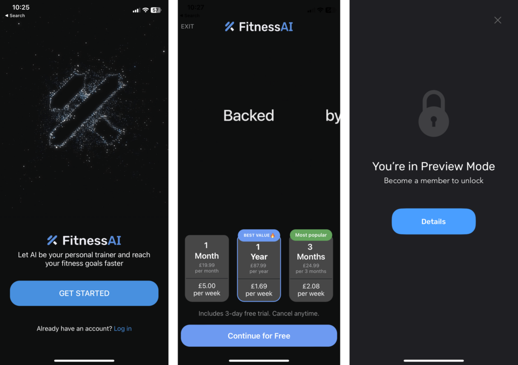
In the case of FitnessAI, all users can “get started”, which leads to a long onboarding flow to customize the user experience, but to continue beyond this point, the user needs to start a free trial. Dismissing the paywall lets the user browse the app, but only in “Preview Mode”.

A soft paywall, however, fits into the freemium app model. Certain, high-value features and content will be locked behind a subscription, while others will be made available for free. It’s more complex because you have more decisions to make; chiefly: which features should I lock?
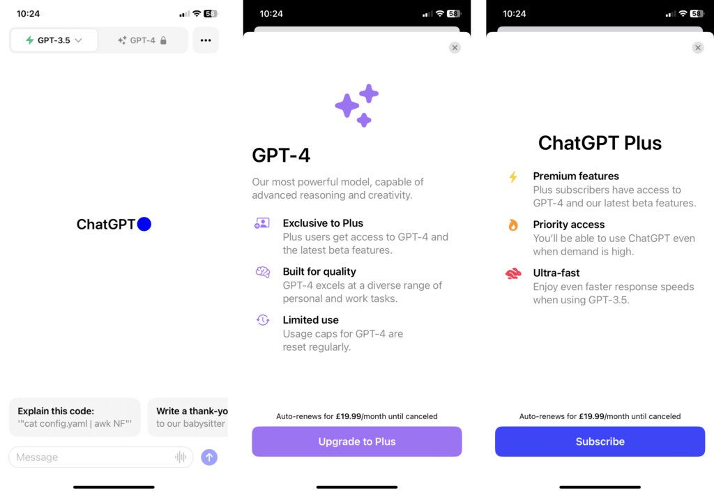
ChatGPT is a straightforward example. When downloading the app, you’re free to use GPT-3.5, but only subscribers can use GPT-4, the most advanced model. Clicking on the GPT-4 tab presents a paywall specifically about the model; navigating to the paywall from settings gives more general messaging. We write more about paywall personalization in our paywall test ideas blog.

The pros and cons of each approach
Each approach has unique considerations that need to be taken into account. Let’s have a look at what some of those are.
Soft paywall pros
User-friendly experience
A soft paywall gives users the chance to test-drive the app, offering a glimpse of its capabilities, without time pressure. This free sample can create a more enjoyable user experience, potentially leading to more (and better reviews) and more organic growth.
More mission-driven
As we’ll see with Lose It! further down, offering a great free experience can help app businesses better express their company mission. Lose It!’s mission is to “help the world achieve a healthy weight” — to fulfil that, the team believes that there needs to be an experience that helps users lose weight, no matter whether or not they’re able to pay. This is not a decision based on what will generate the most revenue.
Greater chance of (eventually) finding the value
Users who spend a long time using the free version of an app have more time to build a usage habit and have a greater likelihood of discovering what makes the app valuable to their needs. This means that users who subscribe after using a free version of an app for a long time are less likely to churn.
However, this doesn’t mean that users won’t need a guiding hand in finding that value — don’t expect them to find it by themselves. In the Lose It! podcast, Paul shared that if a user hasn’t converted within 30 days, there’s a tiny chance that the user will convert. And they will only convert if they’re a returning user. Bear in mind, this could be unique to Lose It! and weight loss apps in general, however, the principle still applies: Don’t leave users to float for day and months without nudges in the right direction.
Increased user base
With part of your app freely accessible, you’re likely to attract a broader user base. These users might not initially pay but could be valuable for ad impressions (in a hybrid monetization model), future upsells, or community building.
Soft paywall cons
Feature decision dilemma
Deciding which features to put behind a paywall is no small feat. The wrong choice could disappoint users or fail to incentivize subscription. We discuss this issue further down in our Lose It! case study.
The need for a large user base
When the majority of your users are using your app for free — assuming your free version is feature-rich enough to sustain long-term usage — to make the economics work, you need a large volume of users. Your conversion rates are smaller, and a much greater number of people need to enter that funnel.
Higher development complexity
Maintaining multiple user paths (free vs. paid) can add layers of complexity to your app’s development and upkeep. For example, onboarding becomes more complex — which features are you including in that onboarding experience? Phiture’s Alice Muir recommends that you provide a separate premium onboarding experience, to help users find the value of premium more quickly. And that experience needs to be customized depending on the journey the user took up until that point (were they previously a free user? Or are they learning about all of the features for the first time?).
Hard paywall pros
Streamlined revenue model
A hard paywall simplifies the revenue path. You immediately filter out users willing to pay from those who are not, making it easier to focus your marketing efforts.
User commitment
When a user crosses a hard paywall, you know they’re serious about using your app. In our paywall optimization best practices webinar, Superwall founder and CEO Jake Mor suggests that new apps should use a hard paywall for this very reason.
When you first launch your app, it’s the worst it’ll ever be. And when you have a user who’s willing to pay for that app without ever trying it, or at least starting a free trial, that user has such a huge problem in their life that they’re willing to try it. Those are the exact kind of early users you want. Those are the people who you want to be building for. And so lock out your entire app, at least when you just start… take their problems as gold and solve for them.
Jake Mor, Superwall founder and CEO
Greater conversion rates
Hard paywalls often result in higher conversion rates due to their no-nonsense approach to user acquisition. By requiring payment upfront for access, you immediately filter out casual browsers from committed users. The pool of users who do choose to cross the hard paywall are those who see immediate value in your app and are ready to pay for it.
If we look at the world of publishing as an example, Piano’s subscription benchmarks found that “hard paywalls have 10x higher conversion rates than soft paywalls”.
Easier to measure impact
Changes in conversion rates are easier to measure since the user journey is straightforward. This allows you to fine-tune your pricing strategy with a clearer understanding of user behavior.
Hard paywall cons
Limited user base
Putting all features behind a hard paywall will inevitably result in a reduced user base. Even with a free trial, some users are either not willing to pay at all or need a much longer time to be convinced to subscribe. If the goal is to build a large user base — for the sake of a community, for example — then a hard paywall is not the way to go.
Churn possibility
Since users have only a limited opportunity to test the app — assuming there is any free trial at all — there is a greater risk of churn as users are, in a sense, gambling on whether the app will deliver the value they seek. However, assuming that users aren’t being misled on what premium will deliver, the higher conversion rates will likely make up for increased churn.
Going from freemium to fully locked: A Headspace case study
Headspace, known for its guided meditation and mindfulness tools, was once a freemium app with 20% of its content available for free. Over time, they transitioned to a more restrictive model, unlocking only a few select pieces for non-paying users. So how did they make this change, and what can you learn from their journey?
In the early days, Headspace was generous — around 80% of the app was locked, leaving 20% free for everyone to enjoy. They operated this way to give users a taste of the most popular and cherished content, and because they were mission-driven.
The team started testing locking strategies that progressively reduced free content to 10%, 5%, and even 1%. This wasn’t just a sudden decision; it was a calculated move to nudge users towards paid subscriptions. What they found was an increase in conversion rates, mainly because people were encountering more paywalls, a familiar user experience in other consumer products like Spotify.
Surprisingly, despite locking most of their content, Headspace didn’t face the anticipated customer backlash. They made sure to keep a couple of popular items in each category (like sleep and meditation) free for users. The shift led to a significant lift in conversion rates, without overwhelming their customer support.
Later, Headspace took things even further by making their content library 100% locked. New users, unburdened by prior expectations, showed high levels of engagement, contributing to a double-digit lift in paid subscriptions.
Key takeaways from Headspace’s experience:
- Experimenting with different percentages of locked content can reveal what converts users best, helping you find the sweet spot for your app.
- The fear of user backlash from increasing paywalls may be overstated, as long as the transition is managed carefully.
- Keeping a select few popular items free in each content category can serve as a “hook,” encouraging users to explore more and eventually opt for a paid subscription.
The Headspace story reaffirms that the fears of locking down content might be outweighed by the benefits. Providing value is key, and if you do, people are willing to pay for it.
Deciding what features to lock in a freemium approach
The weight loss app Lose It!, founded in 2008, transitioned from being a completely free app to introducing a premium subscription in 2012. Because they’re such a mission-driven company, they’ve always strived to have an exceptional free app and despite their huge success with monetization, it’s been a huge challenge because the free app is so good. On the Sub Club podcast, VP of Marketing Erin Webster-Shaller shared their approach.
Over the years, we’ve developed this framework for how we think about what’s free and what’s premium. At this point, in 2023, we think of the free product as being enough to lose weight, primarily through calorie tracking. So if you’re really just focused on calories in and calories out, you can be very successful with our free product.
Macronutrient tracking, more advanced diets like keto or intermittent fasting, calorie cycling, like all of that is in premium. So if you’re really trying to level up from just basic calories in, calories out, premium’s got over 40 features that can help you do that. That’s how we think about today.
VP of Marketing Erin Webster-Shaller, Lose It!
When developing new features, it’s this mission-driven framework that helps determine whether they should be locked. Does the feature go above and beyond the core mission of helping users lose weight using a basic calories in, calories out fashion? That’s a premium feature.
Making the decision
Ultimately, there is no single best answer we can give you, but hopefully these pros, cons, and case studies have illuminated a path for your own app.
Going freemium
If you decide to take the freemium route, your most difficult decision and process will be figuring out what and how much to lock. Shaun Steingold of Momentum Labs is a vocal advocate of the freemium model — here is his advice:
Why do freemiums work? It gives somebody the opportunity to try before they buy.
The first concept around freemium is: can you give your customers enough of your product for them to try it, see if they like it, and then is there a hook or an incentive or an additional feature that will get them to start paying for it?
The strategy around where that point is, I think is 90% of the success of an app or of the app’s business model.
But in my opinion, I think developers spend 10% of their time thinking about it… and it’s not to say you get it right, right away: Test it. Put this feature on the side of the the paywall, now move it free. See what happens.
Shaun Steingold, Founder and managing director of Momentum Labs
Going fully locked
If you decide to take the hard paywall route, your biggest challenges will be focusing your efforts and spend on acquiring quality, qualified users to your app; and making your onboarding and paywall work hard. You have very little time to convince the user that they should pay, so do your best to communicate that value as quickly as possible.
There is a compromise, if introducing a hard paywall is totally against your mission. Ania, the founder of Rootd, a panic attack and anxiety relief app, was understandably reluctant to use a hard paywall. The whole purpose of the app is to provide relief when the user needs it most and forcing the user to pay at that moment just doesn’t sit right. The compromise? By moving her paywall to the front of onboarding, but making it dismissible, she increased revenue by 5x. So the app isn’t fully locked, but her paywall presentation is more upfront.
Jump to 17:49 in the Sub Club podcast:
Going hybrid
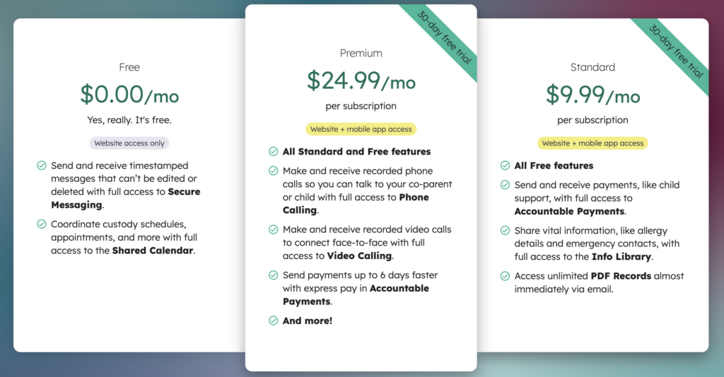
Some apps take a hybrid approach across web and mobile. TalkingParents is a co-parenting communication app and while the mobile app is available only via a range of different paid tiers, the web version is available for free.

Whatever you do: Help users reach the “a-ha” moment
Regardless of where you decide to sit on the hard—soft spectrum, there is no doubt that subscription apps need great paywalls and should invest heavily into their optimization.
Jake’s view is that the most important thing when turning users into subscribers is getting them to the “a-ha” moment as soon as possible. A great onboarding experience is certainly one of the best ways of nailing that a-ha moment — your paywall is the other. So even if you go the soft paywall route, make sure to use your paywall to help users discover your app’s (premium) value at strategic points in their journey.
Build better paywalls more quickly, with easy optimization and experimentation, using RevenueCat Paywalls.
You might also like
- Blog post
“As seen on TV is a real thing, as seen on Instagram isn’t” — Ryan Beck, Pray.com
The risk of ad creative concentration, how to reach older high-value demographics, and why the ultimate KPI is revenue.
- Blog post
How Applica redesigned Five Minute Journal’s onboarding to boost ARPU by 20%
How an onboarding experiment, designed by Applica, using the Jobs-to-be-Done framework helped improve engagement and revenue
- Blog post
Understanding lifetime value (LTV) for subscription apps
What is LTV? Understand why it matters, its limitations, and how RevenueCat helps.

