

For app developers, the paywall is not a “set it and forget it” affair: A good paywall requires regular testing and iteration to optimize the install-to-paid funnel.
If you can dial in the right combination of placement, pricing, strategy, and content, your paywall can dramatically boost your subscription revenue — in one example we share, a simple change led to a 5x increase.
“Users rarely subscribe to your app without a good paywall” says Jake Mor, Superwall founder and CEO in our paywall optimization webinar, because they don’t yet know what your app does or if it’s worth their while. Offering limited app access via a freemium model can help overcome some of these doubts, but Jake argues that a well-optimized paywall can be even more effective than a complimentary test drive.
Here is a detailed look at seven paywall elements and approaches you can test to turn your paywall into a conversion machine.
1. Placement: Show the paywall at the right time
“The number one metric that we focus on — that we see almost every app company not focusing on — is what percentage of your users are even seeing the paywall,” Jake says.
Whether or not a user sees your paywall is determined by when in the user journey the paywall appears. There are several options to choose from, including the following:
- Before onboarding
- After onboarding
- Before using a core feature
- After using a core feature
- Each time the app opens
Jake experimented with paywall placement in his own app, FitnessAI, moving it to appear before onboarding and adding a video to the paywall. With this one experiment, he immediately increased the number of people who saw the paywall by 50%, since users not previously completing onboarding were now seeing it right up front.
As a result of these changes, plus the video showing off the best features of the app, install-to-trial conversions doubled.
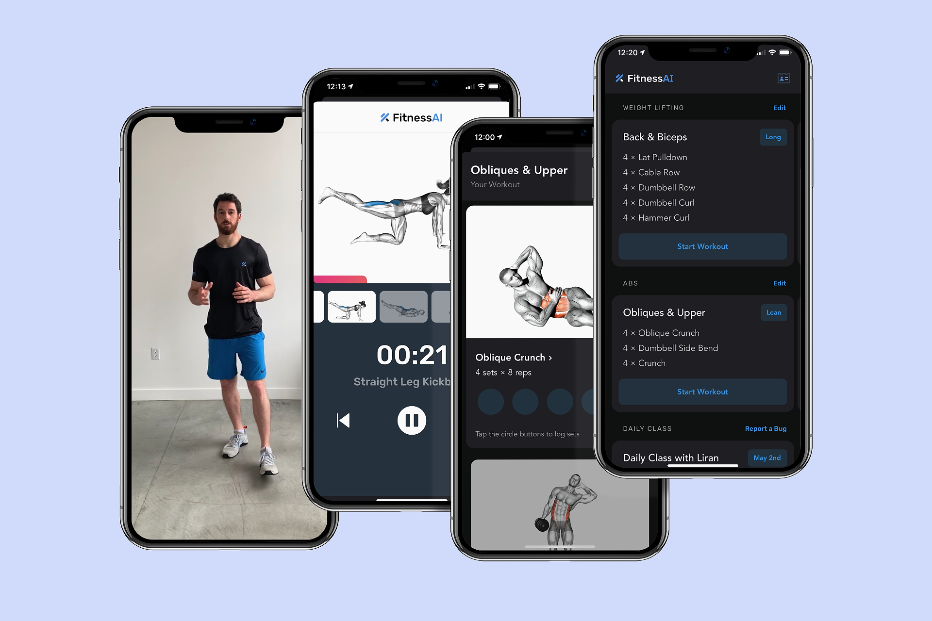
With a doubling of install-to-trial, you might expect a commensurate drop in trial-to-paid conversions, but that’s not what Jake experienced. Trial-to-paid conversions stayed the same, leading to a doubling of revenue!
Is up-front paywall placement too aggressive?
To test paywall placement in your app, Jake recommends showing the paywall in all the places listed above. After a few weeks, phase out one at a time until your conversion rate stabilizes.
Some may be concerned about one of these items, though: Is showing a paywall when a user opens the app for the first time too aggressive?
Not according to Jake.
App developers often underestimate the level of intent behind an app install and how fleeting that intent can be. Showing a user your paywall early in the journey can capture that demand while the user’s need is still top-of-mind.
“You miss 100% of the shots you don’t take,” Jake says. “People feel bad when they’re aggressive with their paywalls, but the truth is that you need money to invest into your app, and the user can always exit out. You’re not forcing them. It’s not as aggressive as you think.”
Pro tip: If your analytics show that your pre-onboarding paywall is scaring some users away, allow them an easy way out. Make your exit button larger, or place it right under your call to action (CTA) with a label like “not right now.”
Sub Club case study: Ania Wysocka, Rootd
Rootd is a panic attack and anxiety relief app. Rootd’s users often want that relief immediately so it’s understandable that founder, Ania Wysocka, would want to keep the paywall somewhat hidden, out of fear that it would disturb the user’s needs.
But back in 2020, Ania began noticing a trend with apps putting their paywalls near the beginning of the onboarding process. So she decided to test doing the same.
The results were remarkable: her revenue increased by 5x. All from that one simple change of moving the paywall to the beginning of the onboarding.
She received almost no negative feedback because “people are so used to seeing” paywalls. And from that moment, Ania was able to expand and fulfill the vision for the app.
2. Features: Decide what to lock behind the paywall
Developers have two choices when deciding which app features users will have to pay to access:
- Specific high-value features (a freemium model with a “soft” paywall)
- All features (a pay-to-play model with a “hard” paywall)
While freemium apps often work best without a free trial option, offering a timed free trial makes sense for pay-to-play apps, so users can see what the app is about before committing. One exception to this might be a freemium app with paid features whose value is best understood by experiencing them firsthand.
In that case, try offering a timed free trial to access the paid features. If the user doesn’t subscribe at the end of the trial period, send a push notification to remind them that they can still use half of the app’s features for free.
Which model should you choose for your new app?
Jake recommends the pay-to-play option for new apps, locking all features behind a hard paywall.
“When you first launch your app, it’s the worst it will ever be,” he says. Anyone willing to subscribe to something that new must have a very significant problem that justifies being willing to try such an early version in the hope that it offers a solution.
“Those are the people you want to be building for,” he says. “So, lock out your entire app — at least when you start — and listen to your users. Take their problems as gold and solve for them.”
Sub Club case study, Pok Pok: Where a hard paywall makes perfect sense
Pok Pok is a kids app that allows 2-7 year-olds play with educational and creative toys. When you dig deeper, it’s clear that a hard paywall is their best strategy. Why? Because kids apps cater to two audiences: the young users and their parents.
For parents, the goal is a safe space where their child can play without constant upsell interruptions. A hard paywall ensures just that — no sneaky in-app purchase prompts during playtime.
The real task lies in persuading parents that the app is worth the investment. While free trials offer a glimpse, the Pok Pok team focuses on relentless testing. They experiment with messaging, value propositions, and even creative elements like videos. We’ll be coming to the topic of content and copy later in the article.
3. Pricing: Meet users where their demand is
When it comes to app subscription pricing, the trick is to show the right price to the right person — or, as Jake puts it, to meet users where their demand is.
For example, if a user downloaded the app a few weeks ago and has made no move to purchase, show a paywall with a lower price. Consider adopting a geographic discount strategy where you offer cheaper pricing to areas with lower conversion rates.
Send users to your website, where they can check out on the web, instead of making the purchase in-app. Using RevenueCat and Stripe together makes this easy to test. Without Apple taking a cut of the revenue, you can offer users a lower price while actually keeping more of the profit.
Because you’ve already paid for the user to install the app — whether through advertising or the work required to make your app discoverable organically — it’s best to try to recoup any amount of that investment you can. Offering these kinds of discounts can easily amount to a 20 to 30% increase in revenue over time, Jake says.
Other pricing variables to test
Like every other aspect of your paywall, there are plenty of opportunities to experiment with pricing to see what resonates with your customers.
- Large Price Jumps: Instead of testing $30/year against $40, test it against $90 or $140. “I know it sounds crazy,” Jake says, “but it’s your job to figure out how you can generate the most revenue.”
- Offer a Lifetime Subscription: Start at 1.5-2× lifetime value (LTV), and keep track of how that metric shifts over time.
- Offer Sales on Every Holiday: Black Friday, Christmas, Mother’s Day, Father’s Day, etc.
- Vary Trial Lengths: Experiment with three, seven, 14, or 30 days
As you’re trying new things with pricing, pay close attention to your refunds.
“You might move to a three-day trial from a seven-day trial and jack your price up only to realize that all of your gravy is being lost to refunds because people are unhappy,” Jake says. “So, keep an eye on that.”
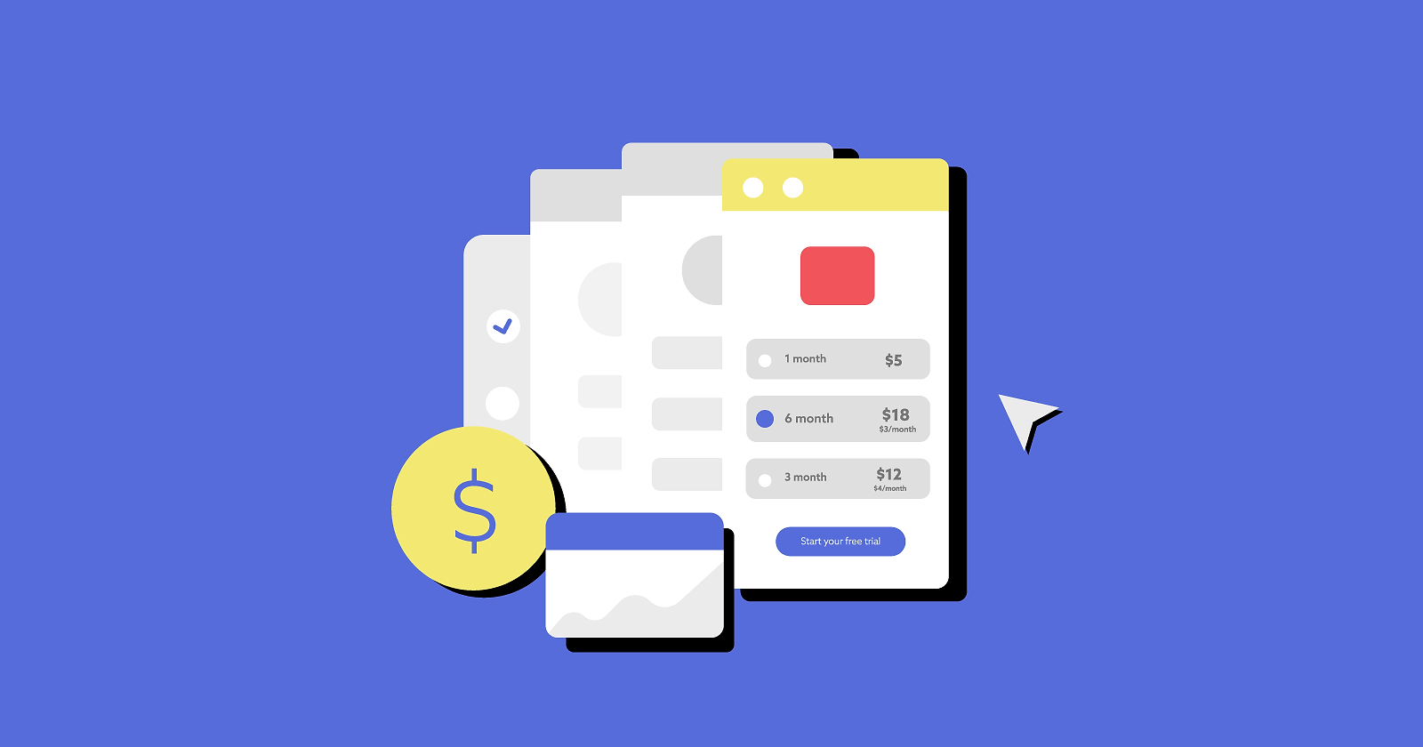
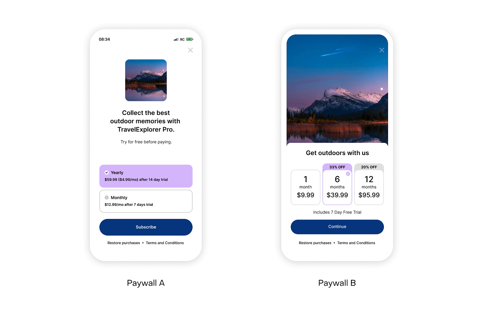
Pro Tip: While you can test showing one, two, or three subscription products on your paywall, Jake says that limiting your offer to a single annual product usually performs best. If you want to give users access to all the options without cluttering your paywall page, add a button for “other plans” underneath your primary CTA.
4. Annual: Increase uptake of your yearly plan
While annual subscriptions have the lowest renewal rates, they offer the most predictable revenue and guarantee the longest customer lifetime. And the good news is that if a user on an annual plan renews after the first year, they’re twice as likely to renew again in the future.
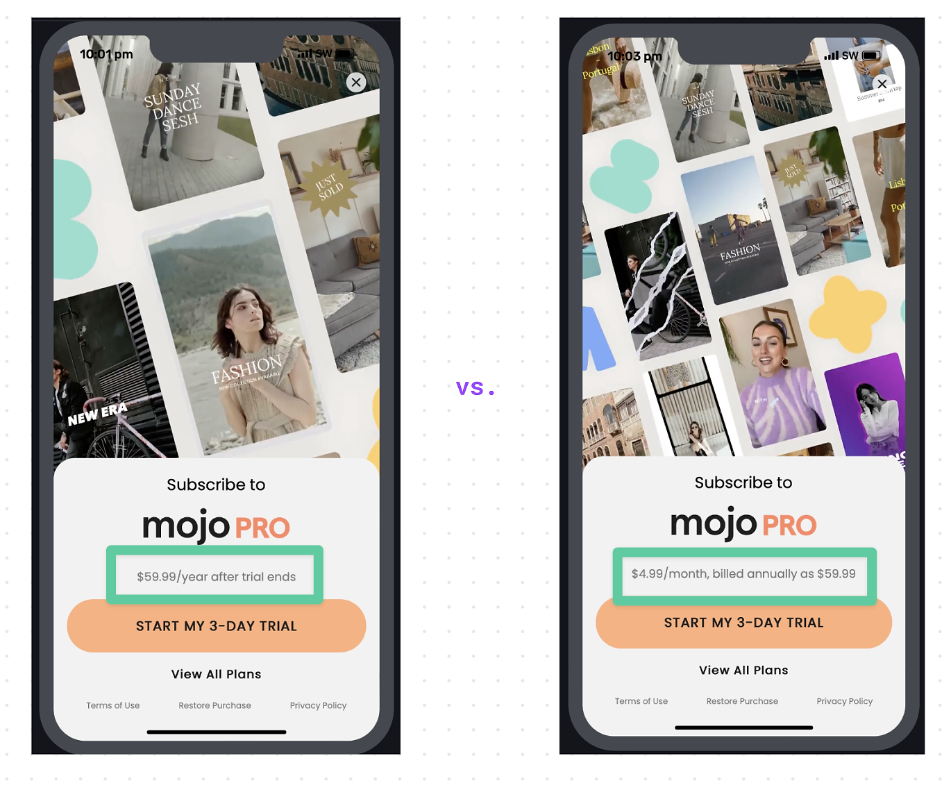
To increase the amount of users signing up to your yearly plan, there are two experiments that worked remarkably well for Mojo that you can try for yourself.
Rather than present monthly and yearly plans equally together on your paywall, present the yearly plan as the default and only choice. Mojo moved the monthly plan to behind a “view all plans” link and, in doing so, saw a 15-20% lift in yearly subscription take up (with only a minor increase in cancellations).
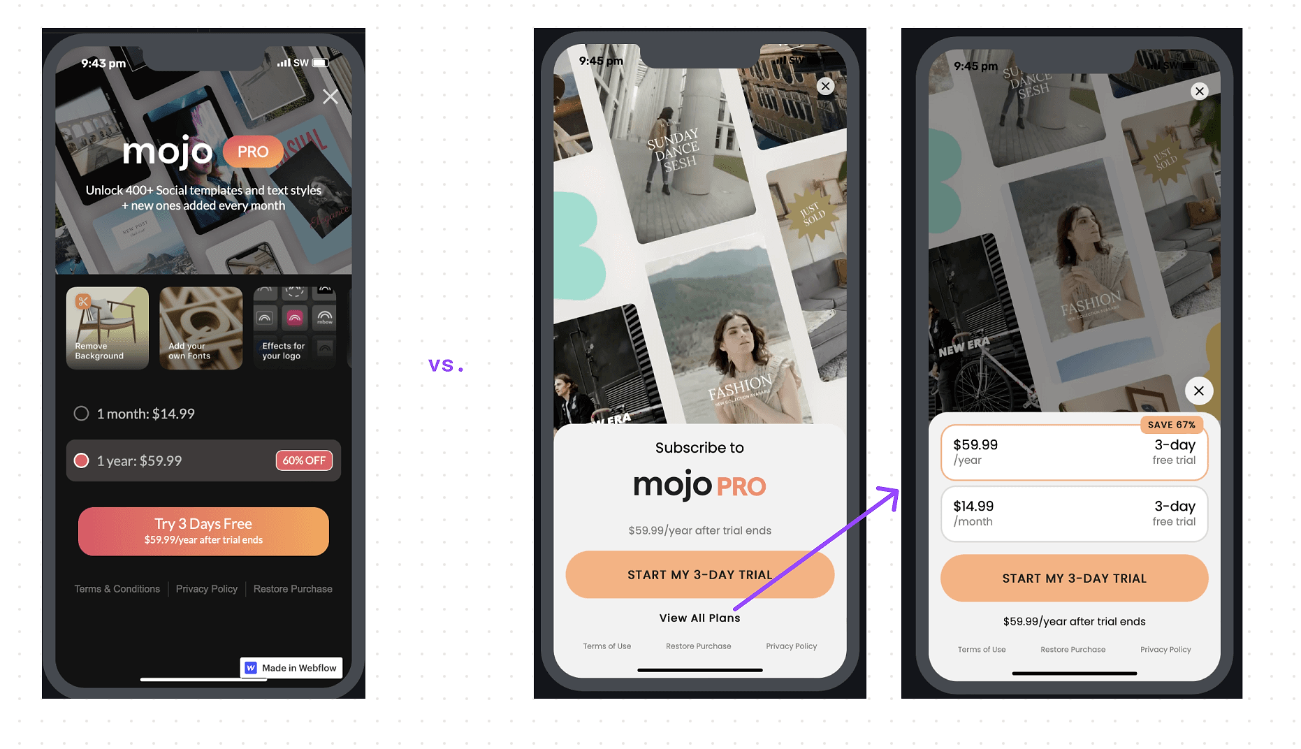
And secondly, use your monthly price as the anchor for your annual plan. Rather than saying the yearly plan cost $59.99 per year, Mojo said it cost $4.99 per month billed annually. This simple change of language saw a significant increase in revenue per paywall impression (especially in lower income regions), as the result of a higher conversion rate and more sign-ups to annual plans.
5. Visuals: Provide valuable context
Paywalls tend to be text-heavy by default, which offers an opportunity to mix things up, visually speaking. Here are some of Jake’s suggestions:
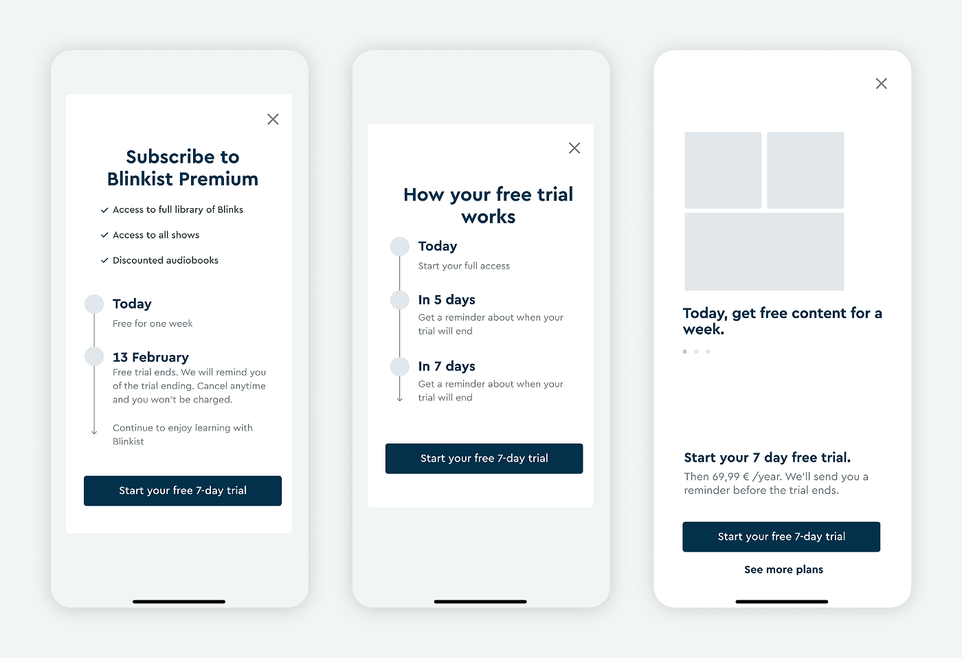
- Charts and infographics convey meaning about what the app offers or about how your trial period works. Blinkist famously instituted a “free trial timeline” on its paywall after exit survey respondents told the company they weren’t subscribing because they didn’t know when they would be charged. Many apps have since emulated Blinkist’s approach.
- Videos with high production value build trust in the product. The video that Jake added to his FitnessAI paywall showed the app in action without any sound or text — just a concise demonstration of the product. Jake recommends the Rotato app for turning simple screen recordings into a shiny product showcase.
- Q&A sections answer users’ questions and objections. These are commonly used on web-based paywalls and could be used more in apps.
- Real reviews from the App Store provide social proof and generate trust. You can use an API like Appfigures or a live web view to pull in the latest reviews — be sure to always include a name and a date.
One user experience best practice to put to work on your paywall: Make your CTA or purchase button the only colored element on the page. What color you choose is not important, but be sure you’re drawing users’ eyes only to where you want them to tap.
6. Copywriting: Explain the “Why,” not the “What”
Paywall copy is an important element to include in your optimization workflow because it is the cheapest change you can make, and it can have a big impact.
If advertising, try out the same messaging that you use in your top-performing ads. If you don’t know where to start, look at the best reviews that users have left in the App Store.
“That is literally, in a user’s words, why they love your app,” Jake says.
Remember that humans are emotional decision-makers: This is the foundation beneath the marketing wisdom that preaches focusing on outcomes over features. How will using your app make the user feel? How will your app change their life?
Jake encountered this when setting up his paywall for FitnessAI.
“There’s all this thought you could put into figuring out why FitnessAI makes more sense than a personal trainer,” he says. “The truth is that doesn’t work. What works is selling the outcome of, ‘you’re going to look your best and feel your best, and you’re going to save so much time that you don’t have to spend that much time at the gym.’
That works much better than ‘this is 20 times cheaper than a trainer.’”
7. Payramp: Not a paywall
Shaun Donnelly, the indie dev behind the workout tracking iOS app Personal Best, hit a growth plateau. Even with a steady user base, the rate of converting free users to subscribers stagnated. He realized that the conventional paywall might be more of a barrier than an invitation.
After discovering a blog post by Curtis Herbert who shifted his Slopes app from a paywall to a “payramp” — and in turn was inspired by the paywall used by Apple Arcade — Shaun got inspired. The idea was to reduce friction, making it simpler for users to start a free trial. As opposed to navigating through a secondary paywall screen, users could immediately activate their free trial at a single touch.
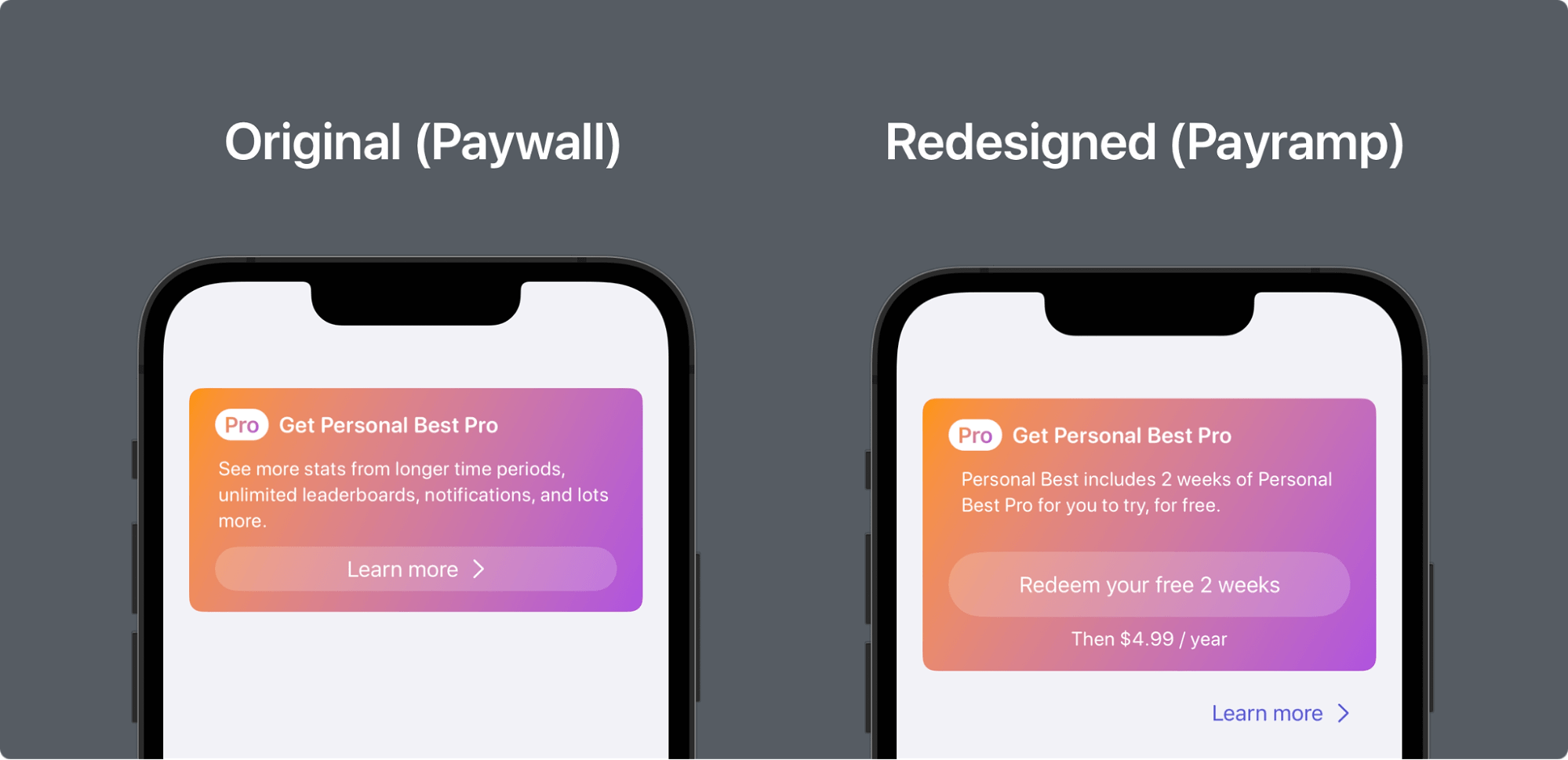
The change is simple and the paywall is now a quick-start mechanism for beginning a trial. The copy used for the CTA changes too: “Redeem your free 2 weeks”. Users feel like they’re gaining something, not giving something away.
The results for Shaun were brilliant.
If there’s an underlying message to many of the examples we’re sharing with you in this blog it’s that simple changes can have huge impacts!
Read Shaun’s story in more detail.
8. Personalization: Tailor the paywall to the user
In the same way that there’s not one correct paywall for every app, there’s not one correct paywall for every individual user. Small tweaks to your paywall that reflect back to the user their characteristics and goals can send a message that your app is for them. Some of the ways you could personalize your paywall include using:
- Broad segmentation: Tailor your paywall to broad categories like age groups, countries, or gender. This is a good start to make your paywall more relevant.
- Behavioral/contextual data: In our pricing experiments webinar, Jake shared a great example of using data to personalize the pricing you offer. For instance, if it’s been five days since install, offer a discount. Or if a user hits “x” on the paywall, you know they’re probably not willing to pay that price, so show them a cheaper price later. Another fantastic example was shared by Rosie Hoggmascall in her blog on Duolingo. Duolingo’s paywall is customized depending on where the user entered it — from the shop, the paywall focuses on unlimited hearts; from an ad, the paywall focuses on removing ads; and so on.
- Zero-party data: Collect specific data from users, such as their goals or preferences, to create personalized messaging. We recently wrote about the counter-intuitive trend of making onboarding flows longer in order to convert better. Part of this approach’s success comes down to the promise of personalization in the app (regardless of whether or not the answers given in onboarding are actually used). However, using this (zero-party) data is an excellent way to tailor your paywall — for instance, you could highlight the paid features that most closely align with the goals/preferences the user states in onboarding.
- Language preferences: Offer localized paywalls that appeal to users in their native language.
In all of these cases, you’re customizing your paywall based on what you think the user will care about or will resonate with the most.
How RevenueCat makes it easy to build and test your paywall
RevenueCat Paywalls is an easy-to-use paywall builder that helps you convert more of your downloaders into customers. A growing template library means that going from having nothing to having a flexible, intuitive paywall is quick and requires no coding.
However, as this blog has outlined, building your paywall is just the start. Next, you need to find the paywall that works best for your app. So we’ve made optimizing and testing your paywall easy too.
Paywalls allows you to test any configurable variable of your paywall using our A/B testing feature, Experiments. Some of these variables — such as the products you’re offering on your paywall — can be edited and controlled directly through our dashboard. Others can be remotely configured using offering metadata (this tutorial shows you how), giving you a huge amount of flexibility. Offering metadata can also be used to remotely configure and test your own custom-coded paywalls.