Preview paywalls on more devices
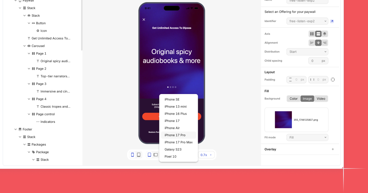
The Paywall Builder now lets you preview your design on a range of iOS and Android devices. Pick a phone or tablet, and the canvas updates to match its screen size, safe areas, and system chrome. You can switch devices in seconds without changing your layout.
This makes it easy to catch spacing issues, check font sizes, and confirm your paywall reads well on small screens and large ones alike. It also helps you validate image crops, scroll behavior, and button placement before you publish or start an experiment.
Device previews work for templates and custom builds, so you can review the final experience for every audience from one place. You’ll spend less time guessing how a paywall will render and more time tightening the details that drive conversion.