Creating Paywalls
How to build, customize, and publish paywalls using the RevenueCat Paywall Editor.
Use the Paywall Editor to design a fully customizable paywall.
Key concepts
| Concept | Description |
|---|---|
| Components | RevenueCat's predefined UI elements that can be added to a paywall. (e.g. text, an image, a purchase button, etc.) |
| Component properties | The properties of each component that can be configured to modify its style and behavior. (e.g. its width, height, border, etc.) |
| Templates | The paywalls that RevenueCat has already created that you can use as a starting point to build your own paywall from. |
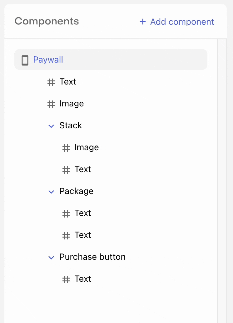
Components
Components are the individual building blocks of your paywall that can be arranged and configured to create your own custom layout.
Core
| Component | Parent | Description |
|---|---|---|
| Text | ❌ | Used to add customizable text strings |
| Image | ❌ | Used to add an uploaded image |
| Video | ❌ | Used to add an uploaded video |
| Icon | ❌ | Used to add a customizable icon from our provided list |
| Stack | ✅ | Used as a parent component to jointly configure its child components |
| Footer | ✅ | A configurable portion at the bottom of the screen whose position can be fixed and uniquely styled. |
| Header | ✅ | A configurable portion at the top of the screen whose position can be fixed and uniquely styled. |
Paywall
| Component | Parent | Description |
|---|---|---|
| Package | ✅ | Used to add a selectable package with custom styling, text, etc. |
| Purchase button | ✅ | The call to action that invokes a purchase attempt of the selected package. |
| Express checkout buttons | ✅ | Displays Apple Pay and Google Pay quick purchase buttons on the web. |
Interactive
| Component | Parent | Description |
|---|---|---|
| Tabs | ✅ | Used to display different package groups in different tabs when offering multiple tiers of service, product types, etc. |
| Switch | ✅ | Used to add a toggle to your paywall that can be used to let customers choose between two different sets of options. |
| Button | ✅ | Used to add other interactions, such as a link to your Privacy Policy, a back button, etc. |
| Carousel | ✅ | Used to add a carousel of pages that a customer can swipe through |
Content
| Component | Parent | Description |
|---|---|---|
| Countdown | ✅ | Used to display a live countdown timer to a specific date and time |
| Timeline | ✅ | Used to add a timeline of connected items |
| Social proof | ✅ | Styled components that can be used as a starting point to display social proof, testimonials, etc. |
| Feature list | ✅ | Styled components that can be used as a starting point to display a list of features or benefits |
| Award | ✅ | Styled components that can be used as a starting point to highlight awards your app has received |
Parent components all fundamentally act as containers that can contain other components within them.
Learn more about each component.
Building paywalls
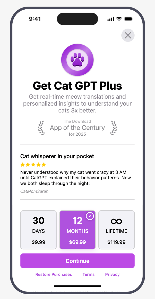
To get started, navigate to the Paywalls page for your Project and click Create paywall. You'll have three ways to build:
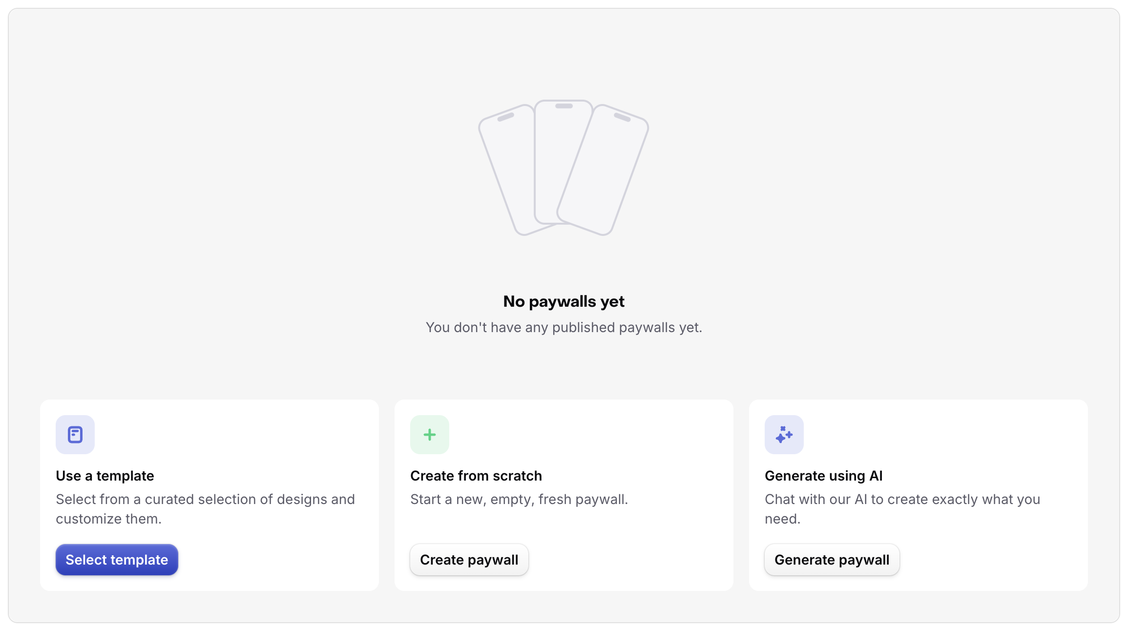
- Use a template — select from a curated set of designs and customize them
- Create from scratch — start with a new, empty paywall
- Generate with AI (beta) — chat with our AI to create exactly what you need
Unless you have a very specific design in mind, we recommend starting with a template or generating with AI — both give you a complete starting point to customize from, and are the fastest way to get your first paywall live.
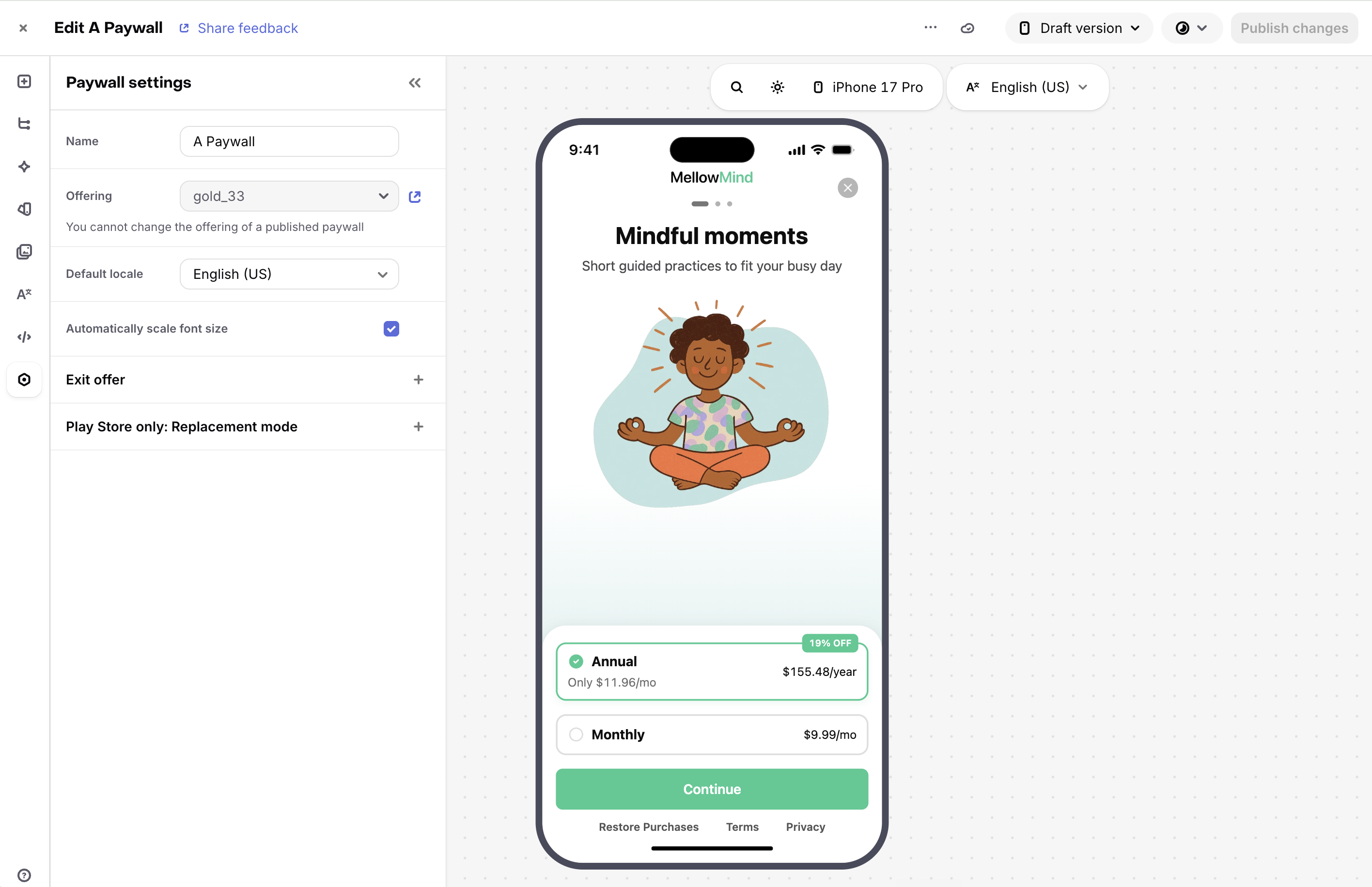
Using the editor
The Paywall Editor is where you build and configure your paywall. It has the following sections:
-
Left-hand sidebar: The tabs in the left-hand sidebar include:
- Add component: List of components you can add to your paywall.
- Layers: The list of components on your paywall, their hierarchy, and their options (rename, duplicate, etc).
- AI Editor: Chat with our AI to make changes to your paywall.
- Branding: Update your saved colors and fonts for quick access when building.
- Media gallery: Where you can view and add images/videos.
- Localization: Content of the Localizations used in your paywall as well as where you can add support for more languages.
- Paywall settings: Where the overarching settings for your paywall live
-
Preview: A live preview of your paywall. You can also preview on a real device using the RevenueCat app (iOS, Android).
-
Control panel: The options to change the locale, light/dark mode, and other preview settings to see how your paywall looks in various scenarios.
Paywalls AI Editor
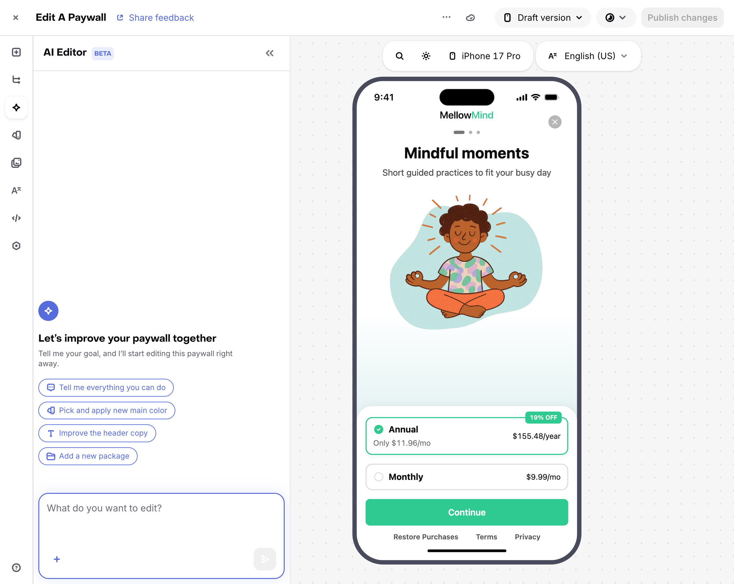
Generate a production-ready paywall from a text prompt, or edit any existing paywall using natural language.
To create a new paywall with AI, click Create paywall and select Generate with AI. Describe what you want — layout, colors, plan structure, style — and the AI generates a complete paywall for you. You can also start from a template and refine it using the AI Editor.
To edit an existing paywall with AI, open any paywall and select the AI Editor tab in the left-hand sidebar.
You can use the AI Editor to:
- Rewrite copy — headlines, CTAs, pricing labels, and plan descriptions. Use variables like
{{ custom.first_name }}to personalize copy, or{{ product.price }}and{{ product.relative_discount }}to reference pricing dynamically. - Adjust visual design — colors, spacing, typography, and contrast. Add or adjust light and dark mode versions of your paywall independently.
- Generate and swap images — create or replace hero images and backgrounds to match your brand.
- Use a screenshot for inspiration — attach an existing paywall or design screenshot and the AI will use it as a visual reference.
- Provide a design spec — add a
design.mdfile to define your brand colors, fonts, and styling guidelines for the AI Editor to apply. - Add and rearrange components — drop in feature lists, testimonials, carousels, comparison tables, headers, and more. Reorder or remove any existing section.
- Add localizations — translate and update copy across every component in your paywall.
- Audit before launch — ask the AI to flag conversion issues like low-contrast CTAs, clipped pricing cards, or a missing restore purchases link.
Adding components
Components can be added to a paywall in two ways:
- Directly to the main paywall with the +Add Component tab in the left-hand sidebar
- Directly within a parent component, such as a stack, with the + button in that component's row in the components panel.
Once a component has been added to a paywall, you can determine its order on your paywall by dragging it vertically in the stack, or determine its parent component by dragging it underneath the desired parent and indenting it horizontally.
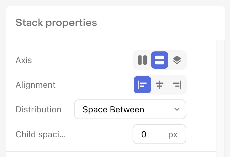
A child component will be subject to the axis, alignment, distribution, and child spacing properties of the parent component; and will be impacted by other properties such as margin and padding.
Modifying components
When you click on a component in the components panel, you'll see it displayed in the component properties panel on the right side of your screen. These properties represent the configurable elements of each component that can be used to give it a unique look and feel.
Many properties for controlling layout, size, and appearance are shared across components. Each component also has its own properties specific to its purpose.
Learn more about component properties.
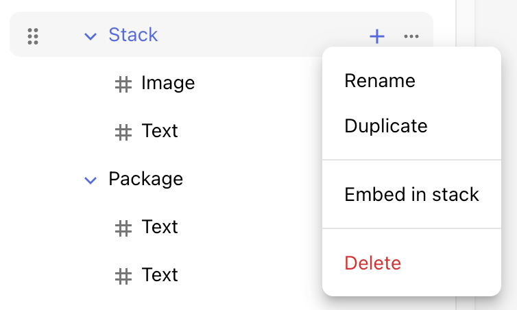
In addition, by clicking on the ... option in a component's row in the components panel, you can rename, duplicate, or delete any component.
You can use common keyboard shortcuts to undo, redo, and save your changes in the editor.
- Undo:
⌘ + zon Mac, orCtrl + zon Windows - Redo:
⌘ + yon Mac, orCtrl + yon Windows - Save:
⌘ + son Mac, orCtrl + son Windows
Saving a paywall
When saving a paywall, there are two different states it can be saved in depending on what you're ready to do with it.
| Paywall State | Description |
|---|---|
| Inactive | Paywalls that you do not wish to serve to customers. You can think of these as drafts, or works in progress. Inactive Paywalls will not be available through the SDK. |
| Published | Paywalls that you may wish to serve to customers. These will always be returned on supported SDK versions. Whether they will be served to customers depends on whether you've configured the associated Offering as the Default Offering, or are serving it via Targeting or Experiments. |
When creating a new paywall, you can save your changes at any time by clicking the Save to draft button at the top right of the page.
This will save your paywall in an inactive state so that you can continue editing it, but it will not yet be sent to your app and made available to customers.
To make your paywall available to customers, click Publish Paywall. Once a paywall is published, it will be available via the RevenueCat SDK and therefore can be seen by your customers depending on how you're serving Offerings to them.
You can also set a published paywall to be inactive, or vice versa, at any time.
Learn more about displaying paywalls.
Importing from Figma
If you already have a design in Figma, use the RevenueCat Figma plugin to import your frames directly into the Paywall Editor. Follow the full import guide in Importing from Figma.
Duplicating a paywall
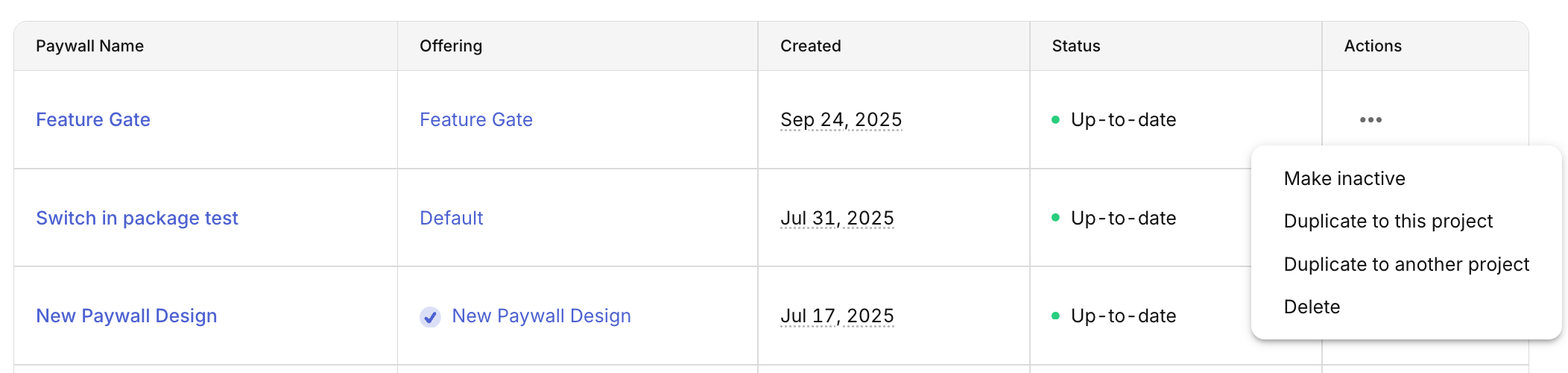
If you want to use an existing paywall as a starting point for a new paywall, you can duplicate it by clicking on the three horizontal dots to the right of the paywall in the list and selecting either:
- Duplicate to this project if you want to make a copy of that paywall within this same project
- Duplicate to another project if you want to make a copy of that paywall within another project you own
If you'd like to create a few of your own paywall "templates" as your own starting points, duplicate the paywall you want to save as a template, and don't attach an Offering to it. It'll be available in the dashboard to edit or duplicate from at any time, without affecting what actually gets delivered to your app.
Unfortunately if you use custom fonts in your paywall, they will not be supported when duplicating to another project. Instead, those fonts will need to be uploaded to that project and manually set for the paywall. When duplicating within the same project, custom fonts settings will be preserved.
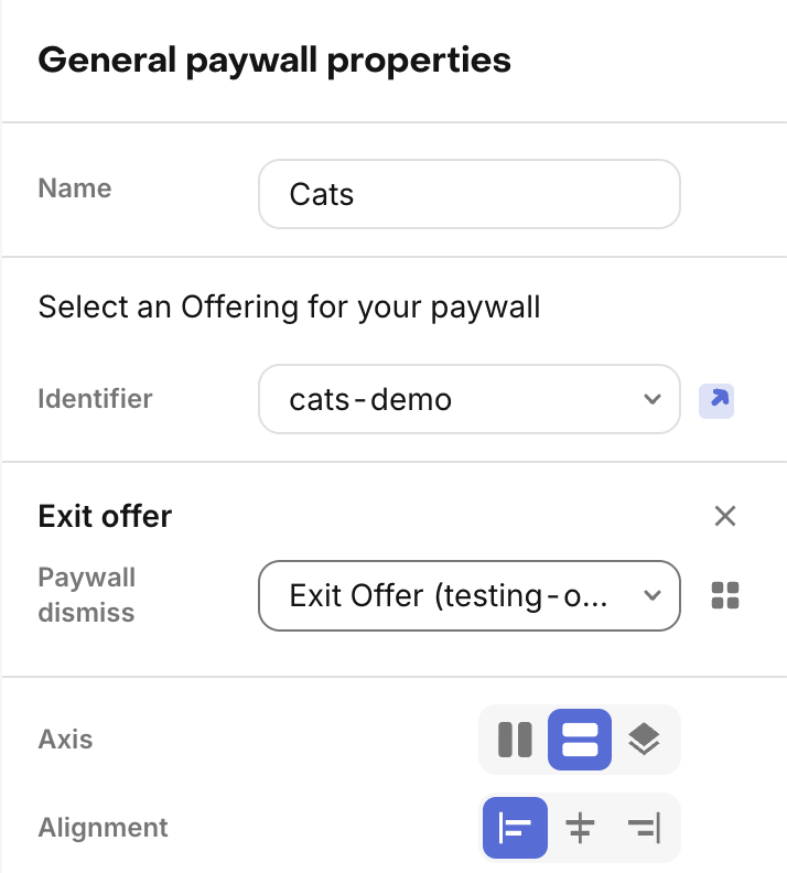
Configuring exit offers
Exit offers allow you to present an alternative offer when a user dismisses your paywall without making a purchase. This can help recover potentially lost conversions by giving users a second chance to subscribe, with a different offer.
To configure an exit offer for your paywall:
- Create a separate Offering with packages for your exit offer (e.g., a discounted package or alternative pricing), and create a paywall for it
- In the Paywalls editor for your main paywall, configure the exit offer settings by selecting the exit offer offering to display
Once configured, the exit offer will automatically be presented when users dismiss the paywall without purchasing. You must also use one of the supported presentation methods.
When designing exit offers:
- Consider offering a discount or trial period that wasn't available in the main paywall
- Keep the exit offer paywall simple and focused on the value proposition
- Don't overuse exit offers. They should feel like a special opportunity, not an annoyance
Learn more about exit offers, supported presentation methods, and platform requirements.
Safe area preview
The paywall preview in the dashboard includes a preview of the device safe area that will impact how your paywall is rendered. RevenueCat Paywalls will automatically handle the device safe area for you when displaying paywalls on device, but there are a few things you should keep in mind:
- All components will not occupy the safe area at the top of the device unless they are being used as header images, which do occupy the space. We automatically detect an image component as a header image if it's the first component taking up vertical space on the paywall (e.g. the first component in the list, or the first component in a stack) whose width is set to fill the entire width of the paywall. If the image is being used within a z stack, any other components above it will not occupy the safe area.
- The footer component will not occupy the bottom safe area, and will automatically add applicable padding to account for it on each platform and device.
- Paywalls which do not use a footer component will occupy the bottom safe area if the content extends that far, as any other view would.
If your paywall will be displayed in a sheet view instead of a full screen view, you can also preview that view in the paywall editor. Just click on Preview settings and select Sheet view.