


We’ve rebuilt RevenueCat’s data infrastructure from the ground up.
That rewrite powers a big upgrade we’re excited to share today: Charts v3 — a new Charts experience that gives you fresh data in seconds, plus a bunch of new ways to slice, segment, and understand your subscription business.
At a high level, this new infrastructure unlocks two big things:
- Real-time updates across almost every chart: instead of waiting hours or days for metrics from App Store Connect or Google Play Console, our new real-time events now flow into your charts as soon as they happen, so you can actually watch launches, experiments, and promos play out in real time.
- A much faster path to new charts: because every chart now runs on the same rebuilt data model, it’s now way easier for us to ship new charts and dimensions — which is why, just in the last year of testing and refining this system, we’ve already added a ton of new charts and charting features.
Charts v3 is now live in the RevenueCat dashboard.
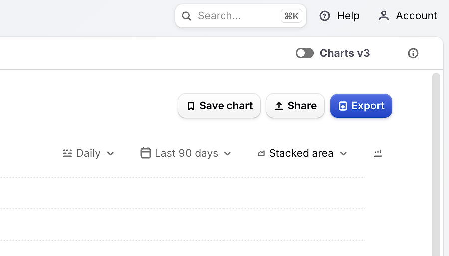
What ‘real-time’ actually means
Previously, charts updated in batches every 2–12 hours depending on the dataset. Now, almost all charts refresh in real time as events come in, giving you:
- Immediate feedback on launches, paywall tests, and promos
- Better intra-day monitoring for spikes, dips, or anomalies
- More consistent behavior across charts, since they’re all driven by the same live pipeline
Charts v3 currently supports App Store, Play Store, Stripe, and RevenueCat Web Billing apps, with support for our other supported stores coming soon.
Why some numbers look different
We’ve also made some improvements to our data definitions, so some numbers in Charts v3 can differ from those in legacy Charts. Here are the three biggest changes:
Subscriptions from every store, treated consistently
We’ve used this opportunity to treat subscriptions from different stores more consistently. Instead of handling each store’s behavior slightly differently, Charts v3 applies the same rules everywhere.
This new model lets us:
- Distinguish product changes (e.g. switching from plan A to B) from simple renewals
- Treat resubscriptions (coming back after a lapse) differently from continuous renewals
- In our Active Subscriptions Movement chart, resubscriptions after a lapsed subscription are now called out as a separate positive line item. In the past, resubscriptions on the Apple App Store were instead shown as negative churn.
Other charts, like Subscription Retention and Trial Conversion, now align more closely with how you actually think about subscriber behavior (e.g. “this user changed products” vs. “this user renewed as normal”).
The change you’re most likely to notice is in Trial Conversion Rate, which will probably go down slightly. It now only counts direct trial-to-paid conversions. Previously, someone who resubscribed after completing a trial would also have counted as a trial conversion.
Refunds no longer rewrite history
Previously, when a payment was refunded, it could change metrics in already-completed periods. That made it harder to trust historic reports, and could cause numbers to ‘wiggle’ days or weeks after the fact.
With Charts v3, historical data stability is crucial:
- Revenue is added on the day the purchase happens
- If that payment is later refunded, the revenue is subtracted on the day of the refund, not retroactively
This means historical revenue for completed periods stays stable, and you’ll see negative revenue entries on refund dates.
The same behavior applies to conversions and LTV. The original purchase contributes to all relevant timeframes, and if it’s refunded, those contributions are removed only in the periods where the refund falls. Completed periods don’t keep shifting under your feet.
Changes to cohorting
We’ve also updated the cohorting methodology for Cohort Explorer and Prediction Explorer. Instead of defining big cohorts (like a whole month) using just the first and last calendar days, we now calculate each customer’s lifecycle relative to when they actually started, then aggregate the data.
In practice, this means:
- Late-joining customers no longer have their early revenue ‘pushed’ into the next period
- Cohort-based metrics like 0–30 day LTV are more consistent and easier to compare across time
Quick Reference: expected metric changes
New charts and capabilities unlocked
Because the data model is now more flexible, we’ve been able to ship a bunch of new charts and features on top of Charts v3 already — with more on the way.
Period-over-period comparisons
A big upgrade built on Charts v3 is period-over-period comparisons. You can now compare your selected date range against the previous period with a single toggle in the Compare dropdown.
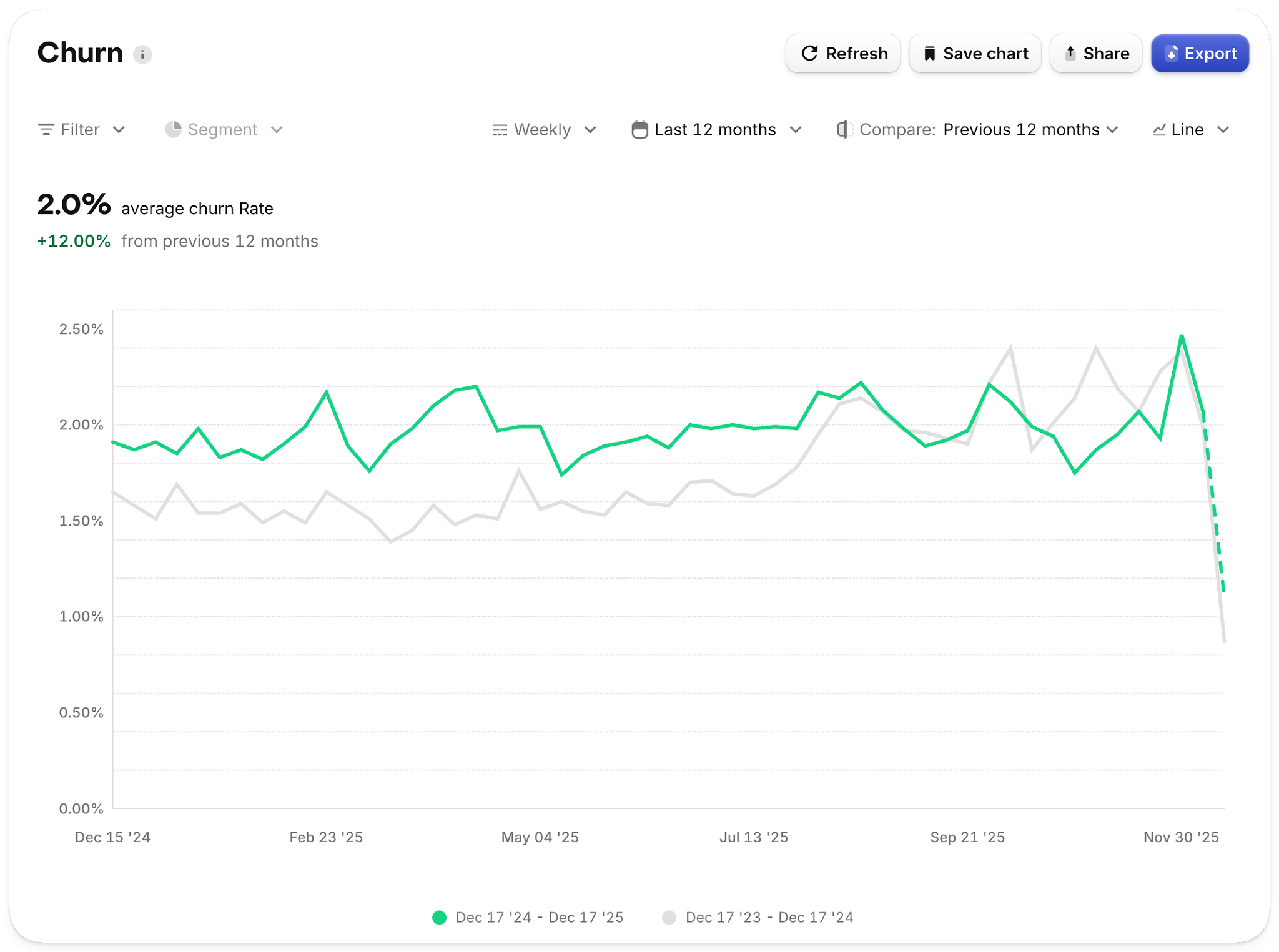
Churn rate over the last 12 months compared to the previous 12 months.
When enabled, charts will:
- Plot both the current period and comparison period as separate lines
- Show total values and percentage change in the summary
- Let you hover over any point to see the percentage change vs. the previous period at that moment in time
Period-over-period is available on key charts like Active Subscriptions, MRR, ARR, Churn, New Customers, New Trials, Conversion to Paying, Refund Rate, and more.
New and improved dimensions
Charts v3 introduces new dimensions and tightens some existing ones, so segmentation matches how you actually reason about your business.
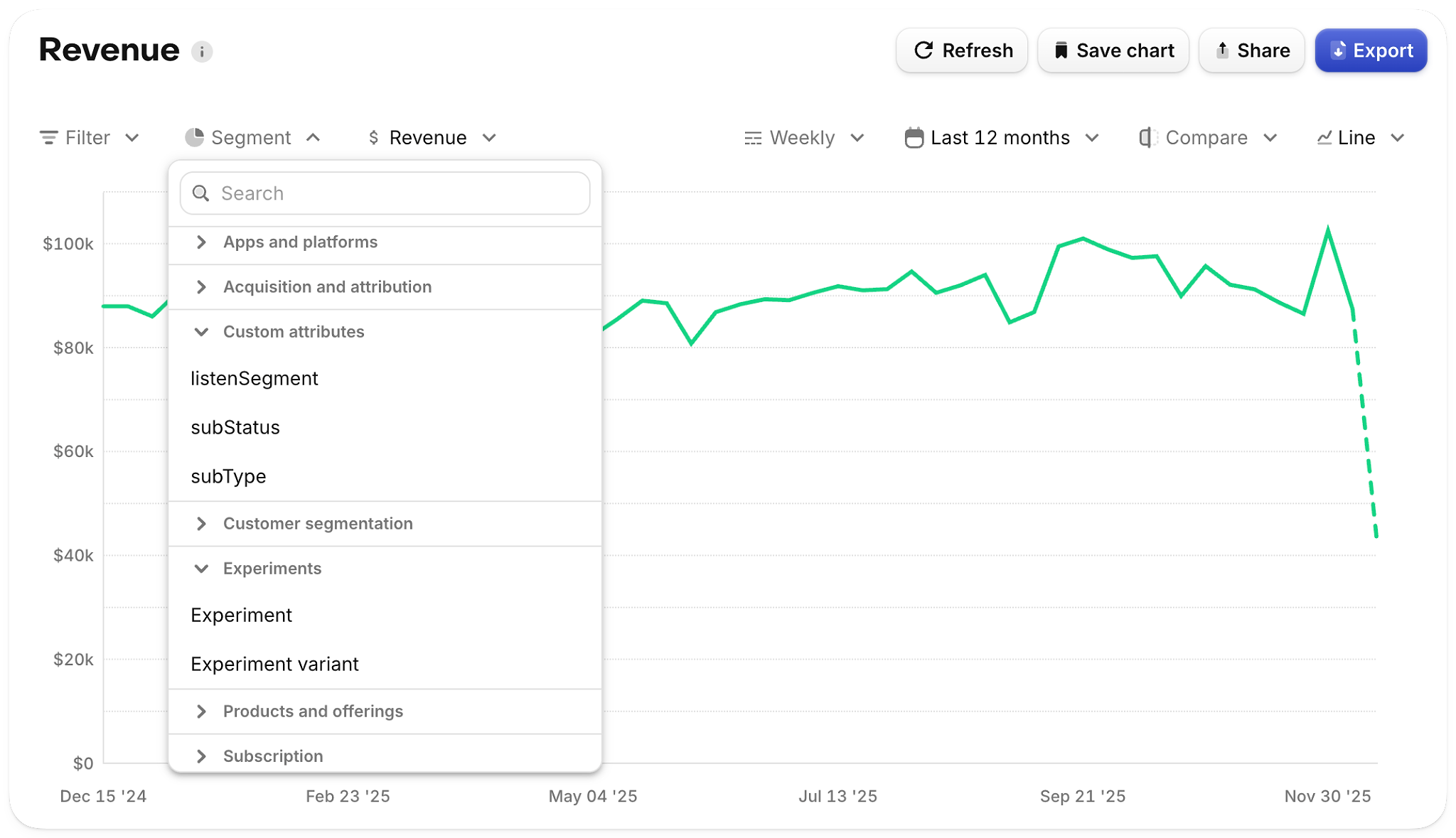
The segment picker has new grouping and now includes search to make it easier to find the right dimension.
New dimensions include:
- Custom attributes: segment by the custom attributes you set on customers
- App version: analyze metrics by the first app version a customer used
- Attribution: filter/segment using Source, Campaign, Keyword, etc.
We’ve also improved existing dimensions:
- Platform now refers to the customer’s first seen platform (where they originated), not the last platform they touched — so segmenting by platform is more stable over time
- Country now prioritizes the app store storefront over IP-based location, aligning charts more closely with how revenue and subscribers are actually distributed across markets
One thing to note: customers you create through the RevenueCat API don’t have a platform, country, or SDK version attached, so they can’t be segmented or filtered by those dimensions.
For full definitions and edge cases, see the Charts v3 docs.
New Active Customers Chart
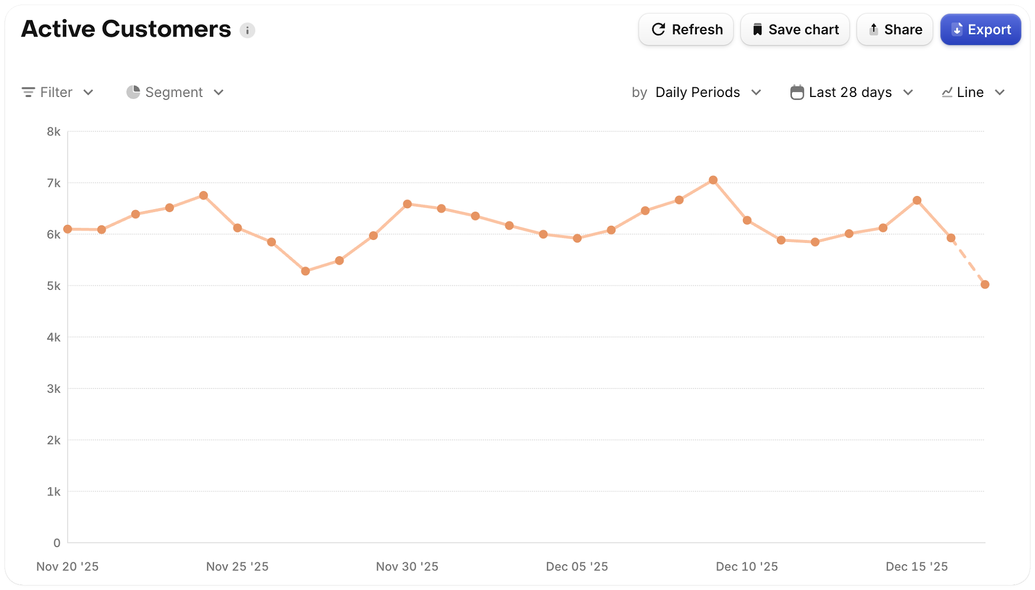
The new Active Customers chart plots all users that were seen in the period being measured, regardless of whether they’ve made a purchase. This works well to plot out your daily active users (DAU). An important note is that this chart does not yet correct for aliased customers, so in cases where the same customer appears under multiple linked app user IDs, active customer counts may be overstated.
Trial Conversion Rate
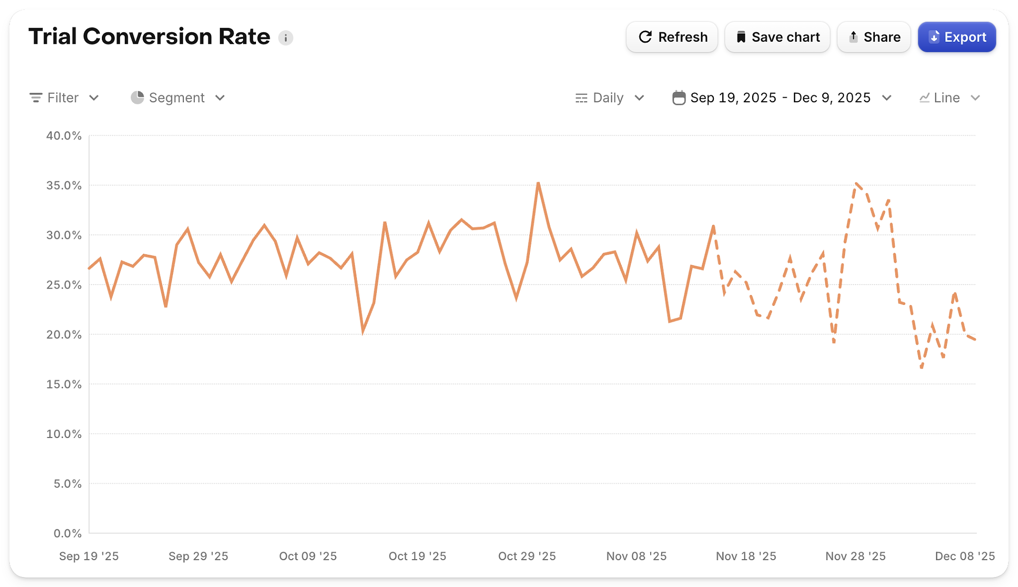
The new Trial Conversion Rate chart is cohorted by trial start date and focuses purely on the trial-to-paid step conversion, making it easier to understand how changes to acquisition, pricing, or paywalls affect payment behavior over time.
Updated Active Subscriptions Movement (state bar chart)
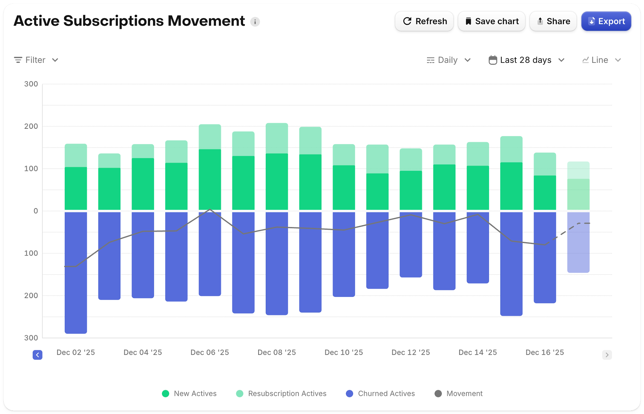
We’ve refreshed the Active Subscriptions Movement chart to better visualize how subscribers move between states (new, renewed, churned, product changes, resubscriptions, etc.) using a more intuitive state bar format.
Paywall charts
New Paywall Charts give you a dedicated place to understand paywall performance: conversion, drop-off, and downstream value, all segmented by the same dimensions you already use across RevenueCat.
You can also now filter and segment other charts by RevenueCat Paywalls, making it much easier to tie conversion and revenue outcomes back to specific paywall experiences and experiments.
Try Charts v3
Charts v3 is available in your dashboard today for apps using the supported stores.
If you notice differences in your metrics after switching, refer to the Charts v3 docs for a chart-by-chart breakdown of what’s changed and why — and, as always, we’d love your feedback as you start using it in your day-to-day decision making.