
Build no-code web funnels in RevenueCat
Unlock the flexibility and profit of web-to-app with our new funnel builder: create custom onboarding, surveys, and checkout flows in an instant. Free and included in your regular plan. Learn more.
We all say you shouldn’t copy your competitors, but the truth is, a handful of great examples can save you a lot of time. When it comes to web-to-app, some subscription apps have been doing this long before it was trendy, tirelessly testing and optimizing their funnels along the way. Besides, didn’t our parents always say imitation is the sincerest form of flattery?
To help you on your own web-to-app journey, here are a few of my favourite examples — plus what you can learn from them. Because there’s no point copying a funnel if you don’t understand why it works, or how to adapt it to your own brand. And don’t worry, this isn’t just a list of quiz funnels. There are plenty of ways to approach web-to-app, so we’ll cover a variety of funnel types.
That said, let me start with one of my favourite quizzes, and then I promise we’ll move on to some alternative approaches.
1: Calm’s web-to-app quiz funnel
Web funnel type: web quiz → trial offer → app install
Let’s start with what Gen Z would call the GOAT of quiz funnels (Greatest Of All Time, according to my little sister). Calm, the meditation app has long been a standout example of a web-to-app quiz funnel: simple, elegant, and remarkably effective.
I reviewed every quiz variant to understand why this flow has remained largely unchanged for years. Here’s what the full funnel looks like, but don’t panic at the sheer detail. I’ll walk you through it step by step. If you want to explore this flow (or any of the other examples) at your own pace, you can see them all in their full flowchart glory here.
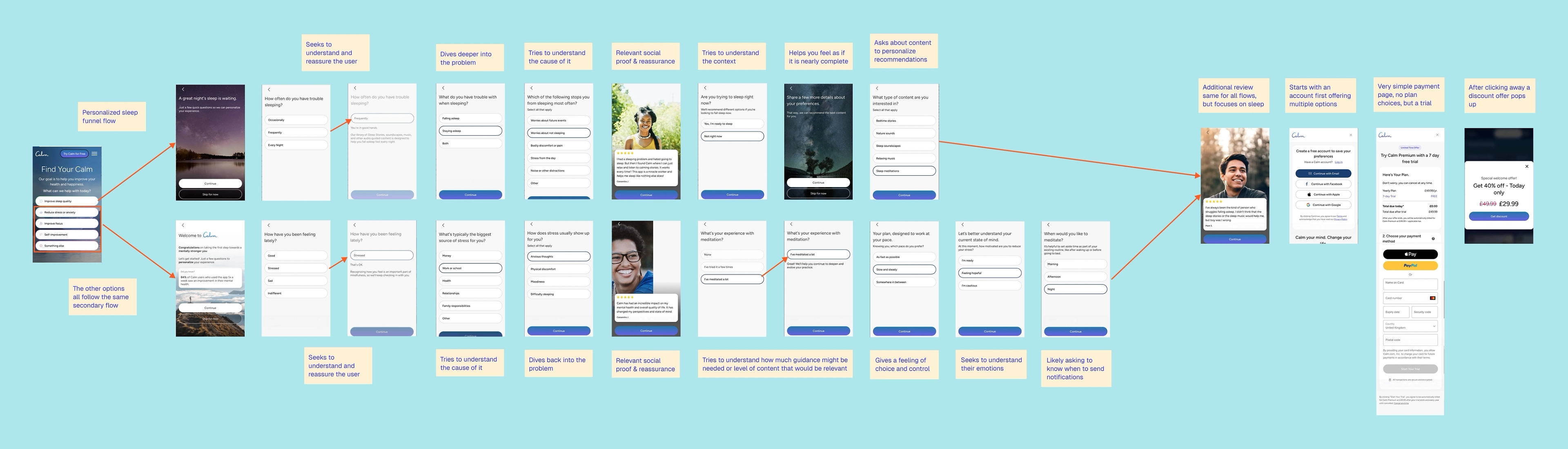
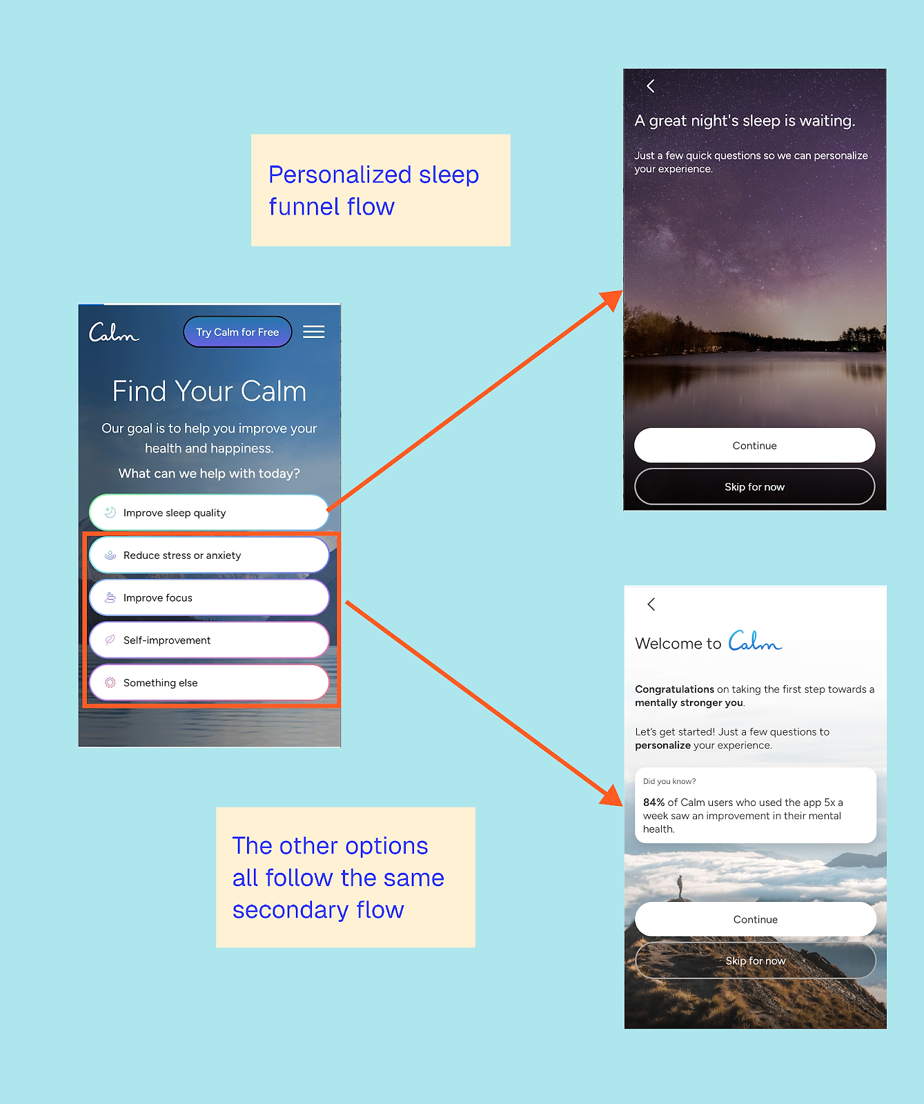
The first thing to note is that Calm only truly personalizes the sleep flow; the other four options all lead to a standardized journey. This is a great example of intent-based segmentation, dividing up users according to their goals. Sleep is a high-urgency, emotionally-charged problem, so it makes sense to invest in deeper personalization. The other goals are more exploratory, so a lighter-touch flow is a pragmatic choice.
This is a tactic I often recommend to app testing teams: don’t try to personalize everything at once. Start with your highest-priority audience, then measure, learn, and iterate from there.
The sleep quiz flow
Let’s walk through the sleep flow first. It starts by asking how frequently you face this challenge.
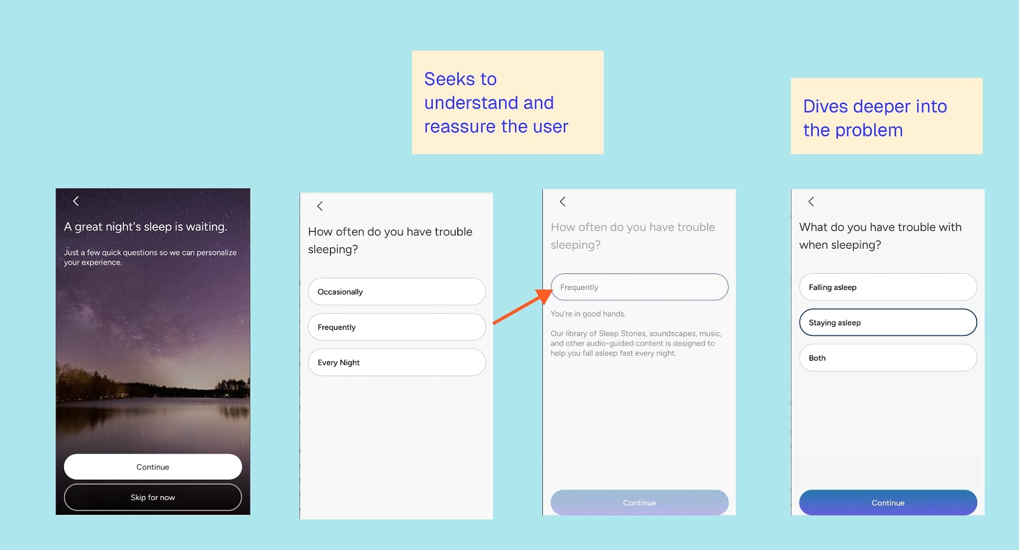
It does something simple but effective: it gives immediate feedback on your answer.
This isn’t a separate screen; it’s a quick reassurance: “You’re in good hands.” From there, the quiz delves deeper, distinguishing whether you struggle to fall asleep or stay asleep, before exploring potential causes of your sleep challenges.
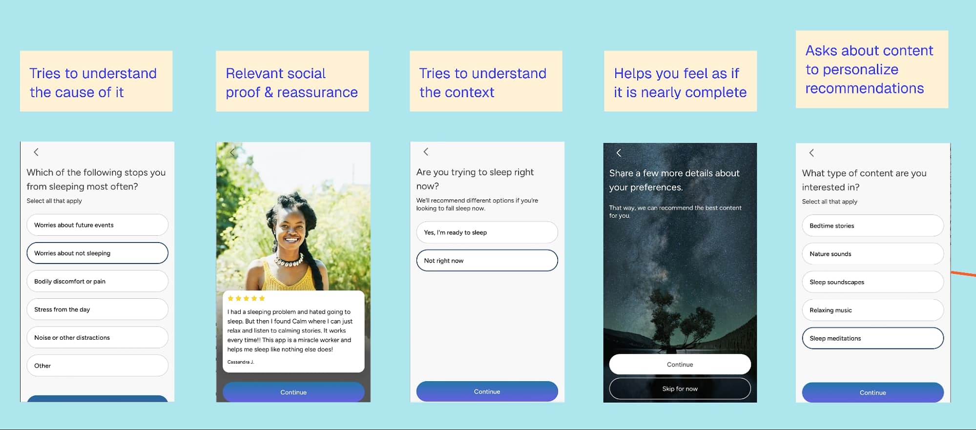
As a struggling insomniac, this felt great. There’s no judgment or irrelevant questioning, just a respectful interest in my challenges. I also like that you can select multiple options for both questions, rather than being forced to choose just one.
Next, a relevant review appears from someone I can relate to. The imagery and name make it feel personal, though not knowing the source slightly undermines its credibility. That said, Calm’s brand is already well known in the space, so the funnel doesn’t need to lean heavily on social proof beyond a simple, relatable review.
I also appreciate that Calm asks for context: Am I trying to sleep right now? Too often, we assume someone is using an app the moment they open it, when for many fitness and wellness apps, that may not be the case.
Interestingly, selecting either option doesn’t change the immediate next steps. But I can imagine it influences what comes later in the flow; for example, what Calm sends or shows you after signing up, like a general meditation versus a sleep story tailored to the moment.
Next, they ask you to set your preferences for the type of content you’re interested in. My only issue is that you may not yet know what you want; you may simply be seeking recommendations or open to exploring. Calm could do a better job of highlighting their suggestions and explaining why they recommend these.
Before we move on to the final screens (which are the same for all flows), let’s take a look at what happens when you select one of the other options:
- Reduce stress or anxiety
- Improve focus
- Self-improvement
- Something else
Calm’s alternative quiz flow
I tested all four options and ended up with the same flow each time. It starts with a clarification question about how I’m feeling, accompanied by the same kind of reassuring feedback used in the sleep flow.
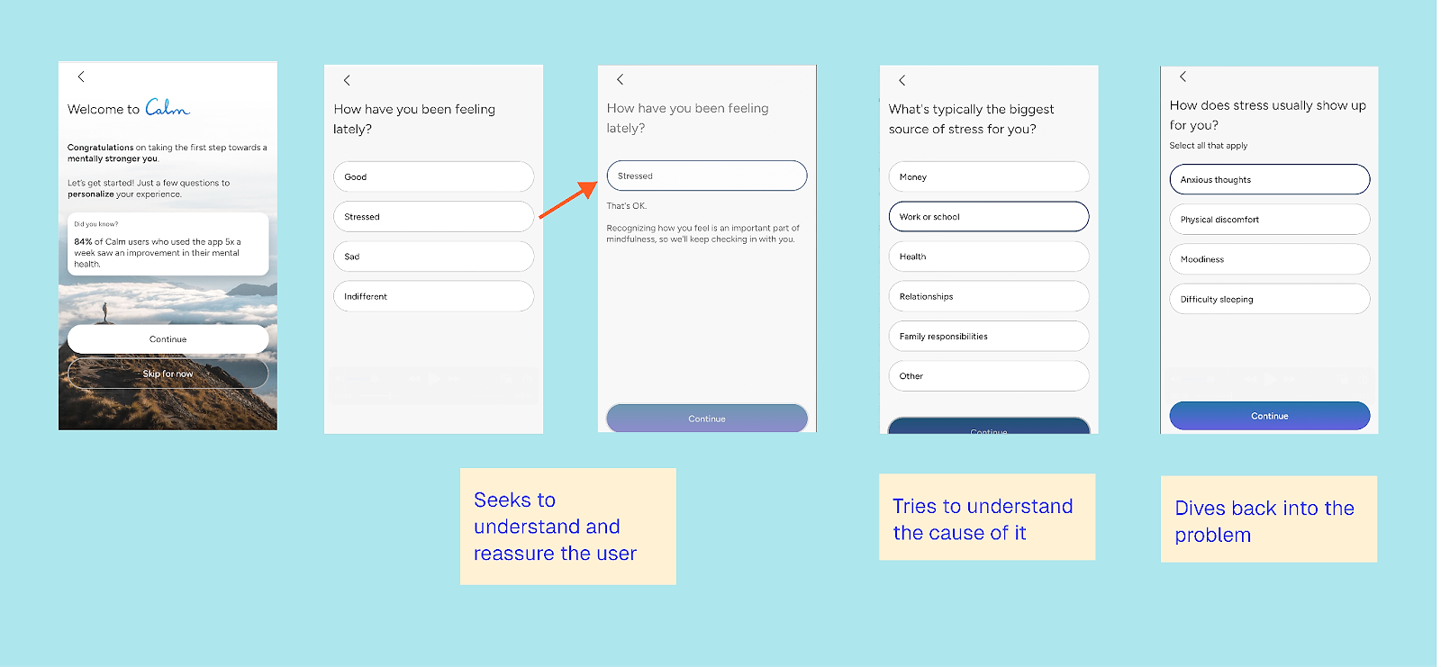
Here, the flow first explores the cause — interestingly — and then loops back to dig deeper into understanding the problem.
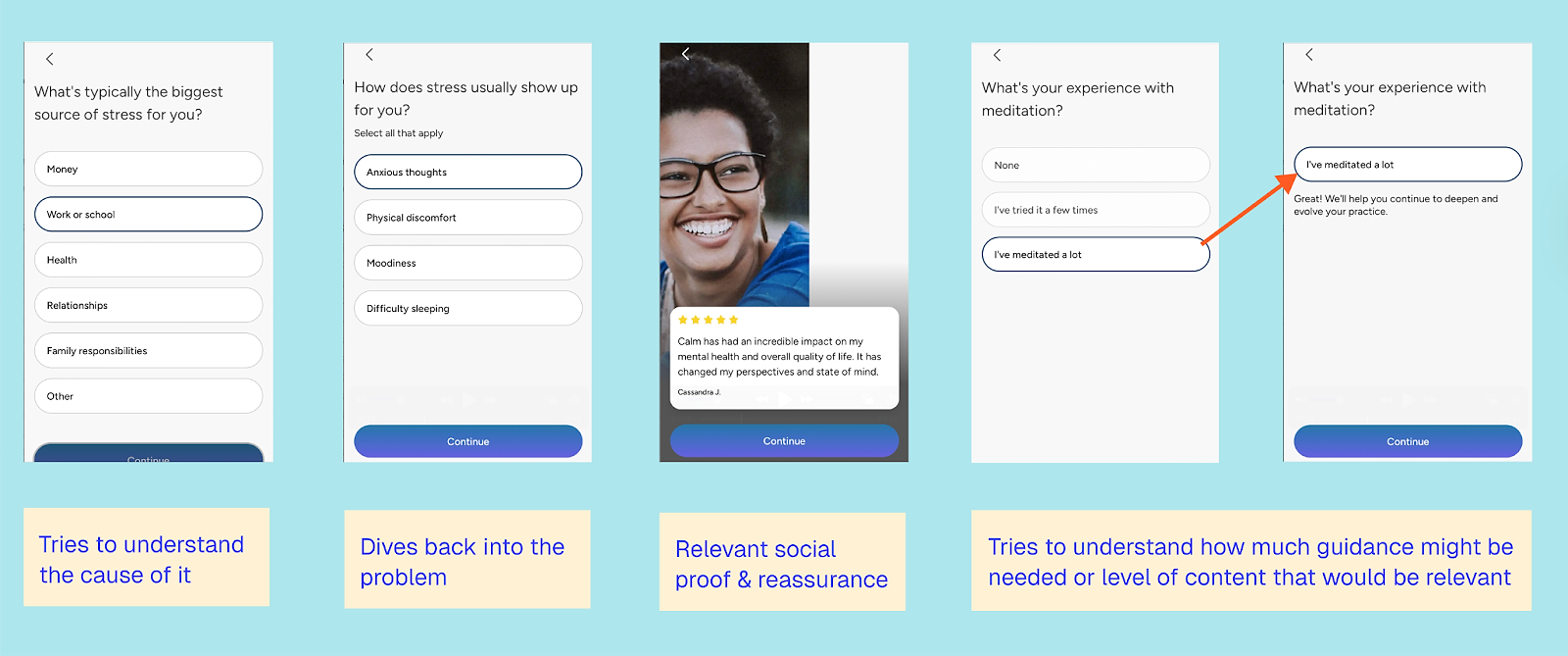
We see a similar review slide again; this one is quite generic and doesn’t change across different responses. Given what I’ve shared so far, I would have expected a bit more personalization.
I do like that Calm asks about my level of experience and provides reassurance based on that. As someone who has endlessly tried to meditate, having the basics repeated over and over isn’t helpful; it’s frustrating. This step also signals to the user that the app works for them, whether they’ve meditated before or not.
The final part gives the user a sense of control:
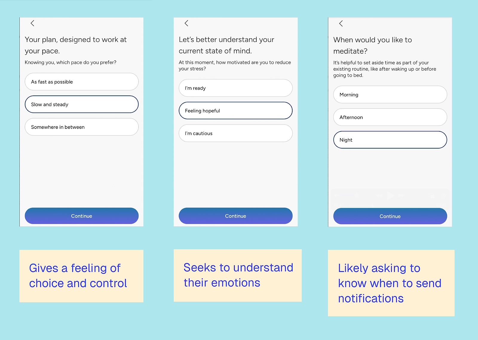
Meditating can feel like just another task, so the app aims to strike a balance: not asking the user to do too much, nor too little, when they’re in a mindset of full dedication. It then attempts to understand the user’s current emotional state and when they plan to meditate, so the app can tailor push notifications and emails.
While I appreciate the continued focus on emotional state and problem-solving, the order of the questions sometimes feels random.
Post quiz steps (all flows)
The final steps are the same for all flows. There’s an additional review that, while identical for everyone, focuses more on sleep before prompting the user to sign up for an account.
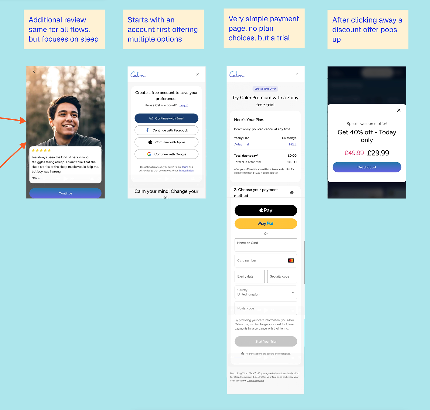
This pattern isn’t uncommon in web funnels, especially quizzes: by this point, the user has already provided substantial input, and Calm subtly leverages loss aversion by encouraging them to save their preferences.
I find it interesting that Calm doesn’t provide any content feedback at the end of the quiz. While the quiz clearly aims to personalize the experience, that personalization only becomes visible after account sign-up. Users can access recommended content for free, but at this stage, they don’t yet know that.
This suggests the quiz is designed less for immediate conversion gratification and more for downstream personalization. Rather than rewarding the user right away, Calm seems to optimize for what happens later inside the app, through recommendations, notifications, and lifecycle messaging. This approach also makes sense given the sensitivities around mental health, but it does leave the ‘look what you could get!’ factor on the table.
By this point, the user has invested time, emotion, and data, making the trial feel like a natural next step rather than a hard sell.
The payment page is deliberately simple: a single 7-day trial tied to an annual subscription, without overwhelming the user with choices. If you don’t sign up right away, Calm often follows up with an additional discount to encourage conversion.
What can other apps learn from Calm’s web-to-app funnel?
Here are the lessons to learn from Calm:
1. Personalize where intent is highest
Calm doesn’t try to personalize everything. Sleep gets a dedicated flow; other goals don’t. That’s a good reminder that effective personalization is about focus, not coverage.
2. Emotional reassurance builds commitment
The quiz works because it validates the user before requesting any information, such as an account or trial sign-up. By the time pricing appears, the user already feels understood.
3. The real value of the quiz shows up later
Calm collects a lot of input without immediately providing feedback. This suggests the quiz is designed more for later personalization and retention than for immediate conversion payoff.
4. Simplicity still wins at the paywall
After a long quiz (though not unusually long compared to other apps), Calm deliberately removes choice: one plan, one trial — no extra decisions.
5. Brand trust can replace heavy social proof
Some elements — such as generic reviews and limited sourcing — would disadvantage smaller apps. Calm can rely on its brand within the funnel, but other apps would need more social proof to build trust.
6. Even strong funnels aren’t perfect
The order sometimes feels random, and some personalization is underused. But this is actually reassuring. You don’t need perfection for your first (or even your hundredth) web-to-app funnel to work well.
Create web-to-app funnels in RevenueCat
With RevenueCat Funnels, you can build no-code custom onboarding, surveys, and checkout flows that unlock seamless in-app access. Learn more ↗️
2. Blinkist Content Led Funnel
Web funnel type: landing page → app install
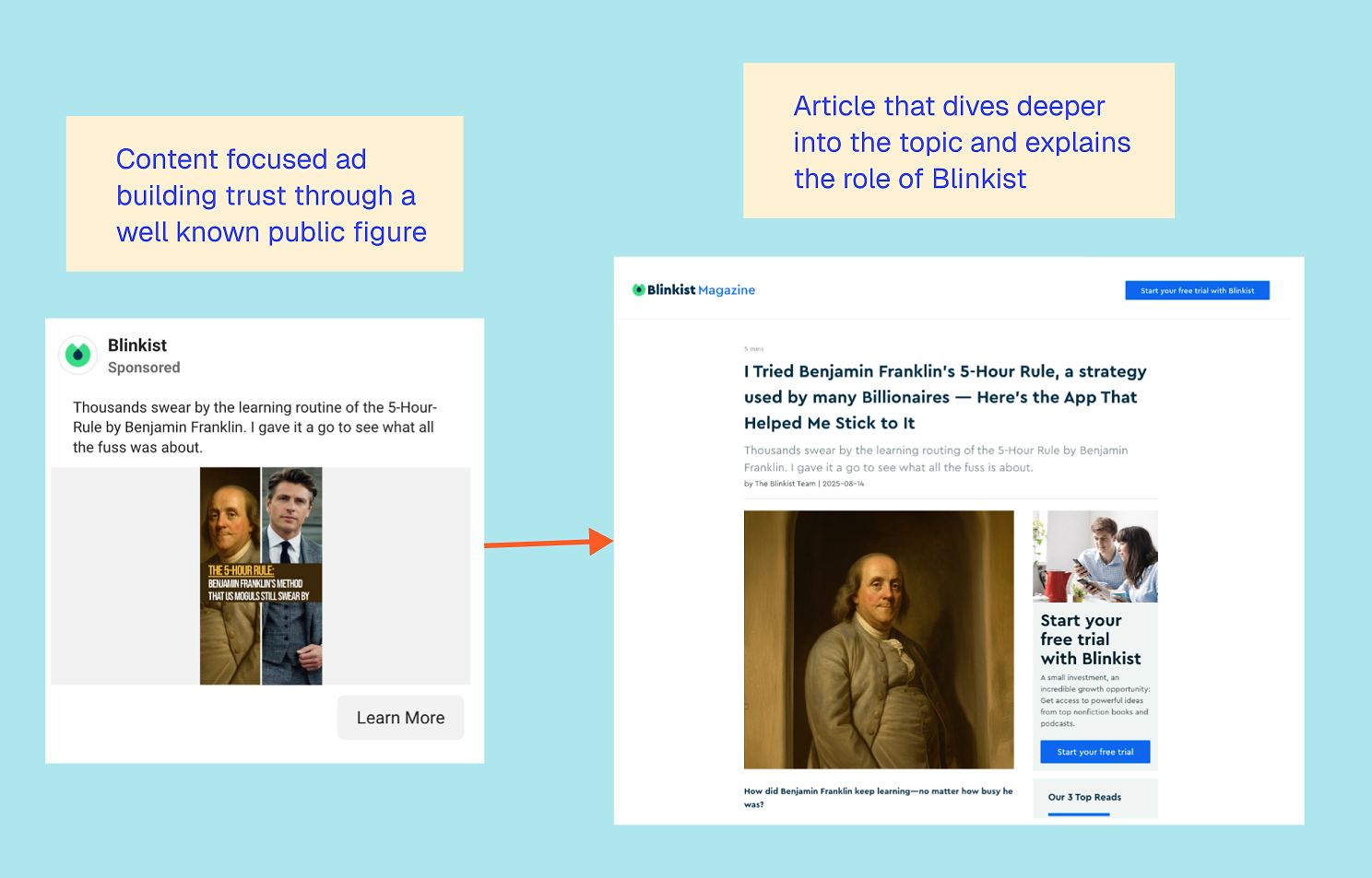
The value of Blinkist, the learning and personal development app, is rooted in content, so it makes sense that content sits at the very front of their acquisition funnel. Rather than leading with app features or promises, Blinkist leads with ideas: you learn something first, then discover the product that enables you to experience more of it.
Over time, Blinkist has built a strong content growth engine around short, insight-driven articles that summarize ideas. These articles are distributed both organically and through paid channels, helping build trust before asking users to download or subscribe. The same content formats are reused across paid ads, partnerships, and owned media, making this approach highly scalable.
Marcus Burke noted that, at one point, approximately 70% of Blinkist’s acquisitions came through web-to-app flows, proving just how central this content-led approach has been to their growth.
What does the typical Blinkist web-to-app journey look like?
A typical Blinkist journey starts with an ad promoting a piece of content, rather than the app. The ad leads to an in-depth article exploring a concept, principle, or idea. Within that content, Blinkist positions itself as the tool that helps you go deeper or learn more efficiently.
This is just one of many variations on the same pattern, but the overall structure remains consistent.
Here are several other articles Blinkist is currently driving paid traffic to:
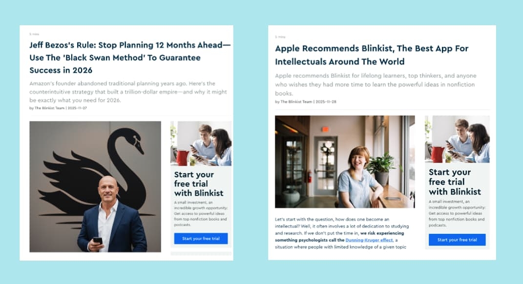
Across their content, Blinkist relies heavily on social proof. Sometimes this appears as Apple features or App Store recognition. Other times, it comes from the authority of the author, thinker, or public figure behind the idea being explained. This approach transfers credibility from the content to the product, without feeling overly salesy.
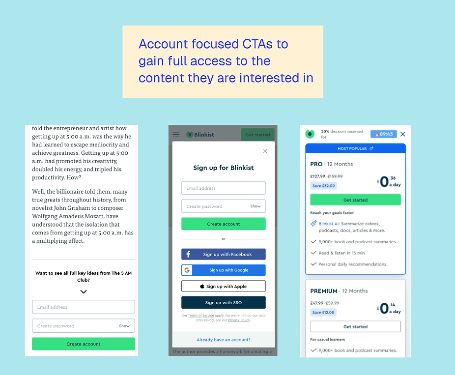
The calls to action are usually either “Start your free trial” or “Create an account”. Trial CTAs often lead into a web onboarding quiz similar to Calm, while account CTAs keep users on the web, letting them continue exploring content.
Where does monetization happen?
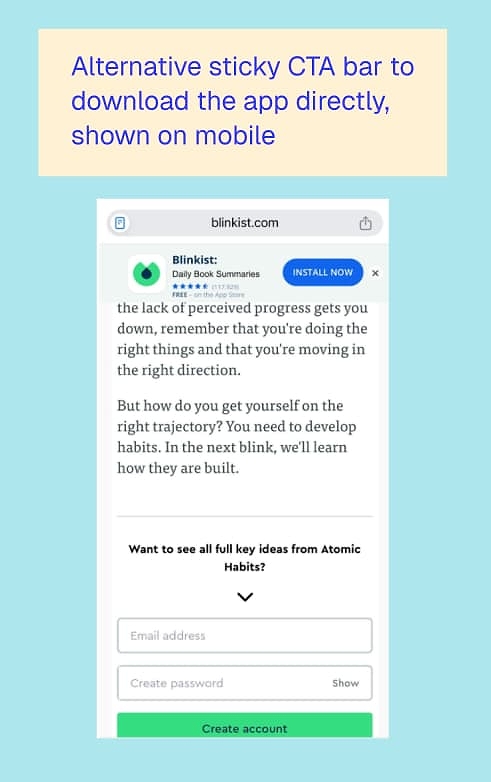
Once users create an account, they can browse a range of book summaries. Clicking any summary triggers a paywall prompting a web subscription. On mobile, Blinkist also nudges users to download the app, creating a true hybrid of web discovery and app-based consumption.
What’s powerful about this approach is that Blinkist brings its aha! moment forward. Users experience “I learned something useful” before ever creating an account or starting a trial. While the sign-up rate may be lower than on a direct, conversion-focused landing page, this strategy allows Blinkist to reach a much broader audience and build trust upfront. That trust likely translates into stronger intent and higher-quality conversions once users do decide to sign up.
Trade-offs and risks to be aware of
There are trade-offs to this strategy. Organic traffic to Blinkist’s website appears to have dropped significantly over the past two years, likely influenced by shifts in search behavior and AI-driven content discovery.
Source: SemRush — Worldwide Organic Traffic for Blinkist.com
Meanwhile, what Semrush measures as paid traffic is more stable, but still smaller.
While this can be a powerful way to build trust online, especially with larger audiences, it’s important to be strategic about ensuring the content is seen and stays relevant.
What can other apps learn from Blinkist’s web-to-app funnel?
1. Bring the aha! moment forward
Blinkist shows that demonstrating value before asking for a sign-up can drive stronger intent later. Users convert because they’ve already learned something, not because they were sold on features.
2. Content can be the product preview
For content-driven apps, the web funnel doesn’t need to explain the app. It can demonstrate value directly and make the app the natural next step.
3. Web doesn’t need to convert immediately to be effective
Many Blinkist flows use web to educate, qualify, and build trust. Conversion happens later, either through account creation, a quiz flow, or an in-app paywall.
4. Social proof can come from ideas, not just reviews
Blinkist relies less on generic testimonials and more on the authority of thinkers and concepts. This is especially effective for educational apps.
5. Distribution matters as much as content quality
A content-led funnel only works if the content continues to reach new audiences. Changes in search behavior or platform dynamics can quickly impact performance, so it’s crucial to consider how people search today and ensure your content ranks effectively for AI-driven search.
3. PlantIn landing page funnel
Web funnel type: landing page → web purchase or app install
PlantIn, an AI plant care app, uses a fairly classic web-to-app setup, but what stands out is how intentional it feels without being overly fancy. It blends content, app promotion, and a web-based subscription flow in a way that gives users plenty of opportunities to buy in before being asked to actually buy.
See the full flow here
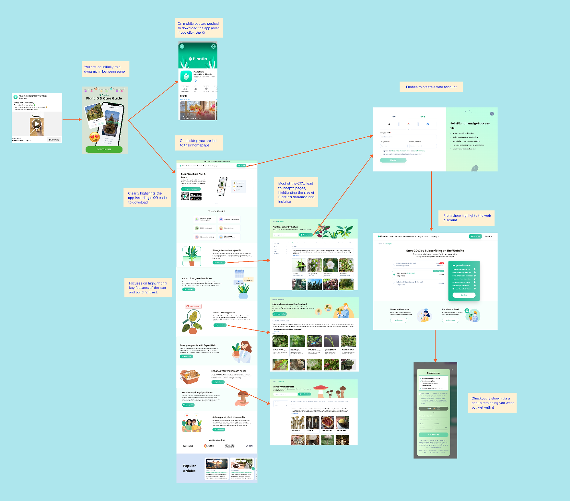
The journey usually starts with content. Ads lead to a dynamic in-between page that introduces the app and its purpose. From there, the experience changes depending on the device: on mobile, users are nudged to download the app (even if they try to click away), while on desktop, they’re directed to the website instead. It’s a small detail, but a smart one, and shows PlantIn doesn’t force an app-first experience where it doesn’t make sense.
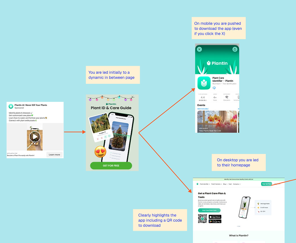
PlantIn’s landing page
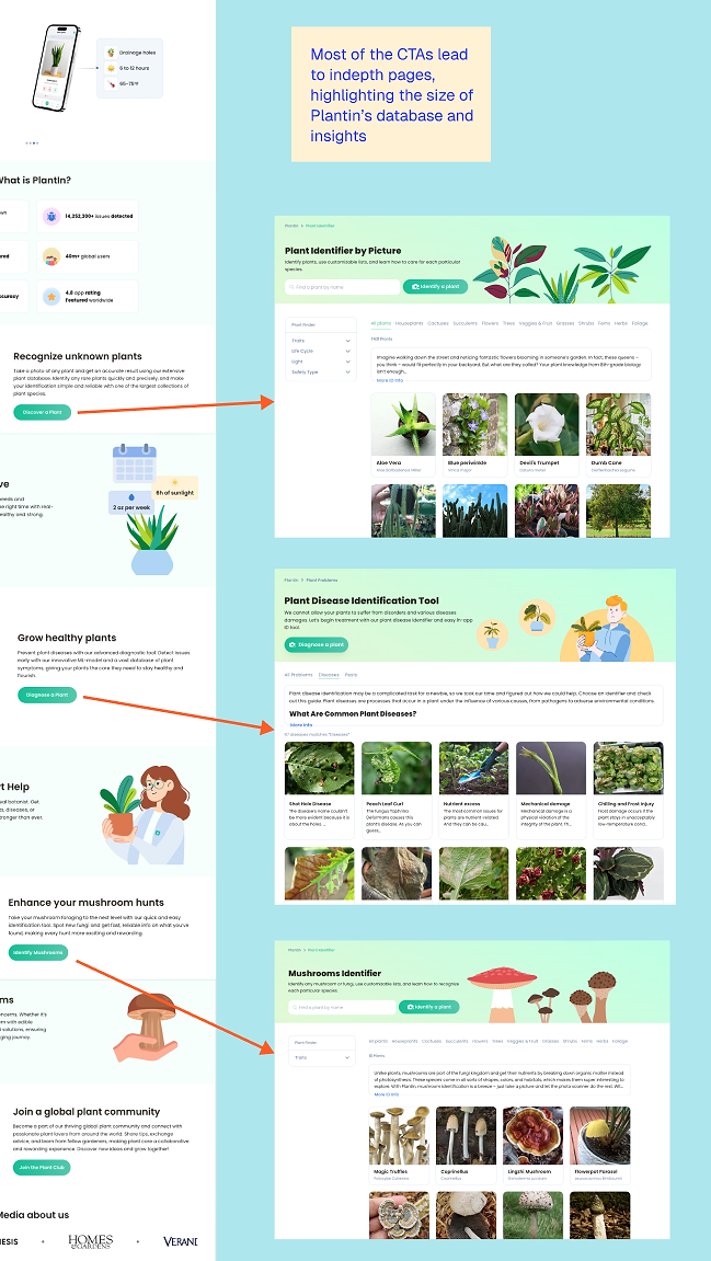
For some web-to-app landing pages, it isn’t always clear that they lead to an app. This can be tricky if you only offer web payments, since you don’t want users clicking through to the app store by mistake. For PlantIn, this isn’t an issue. They lead with a QR code for easy app download, include app store links, and show an in-app screenshot. The screenshot clearly highlights the value users can get from the app.
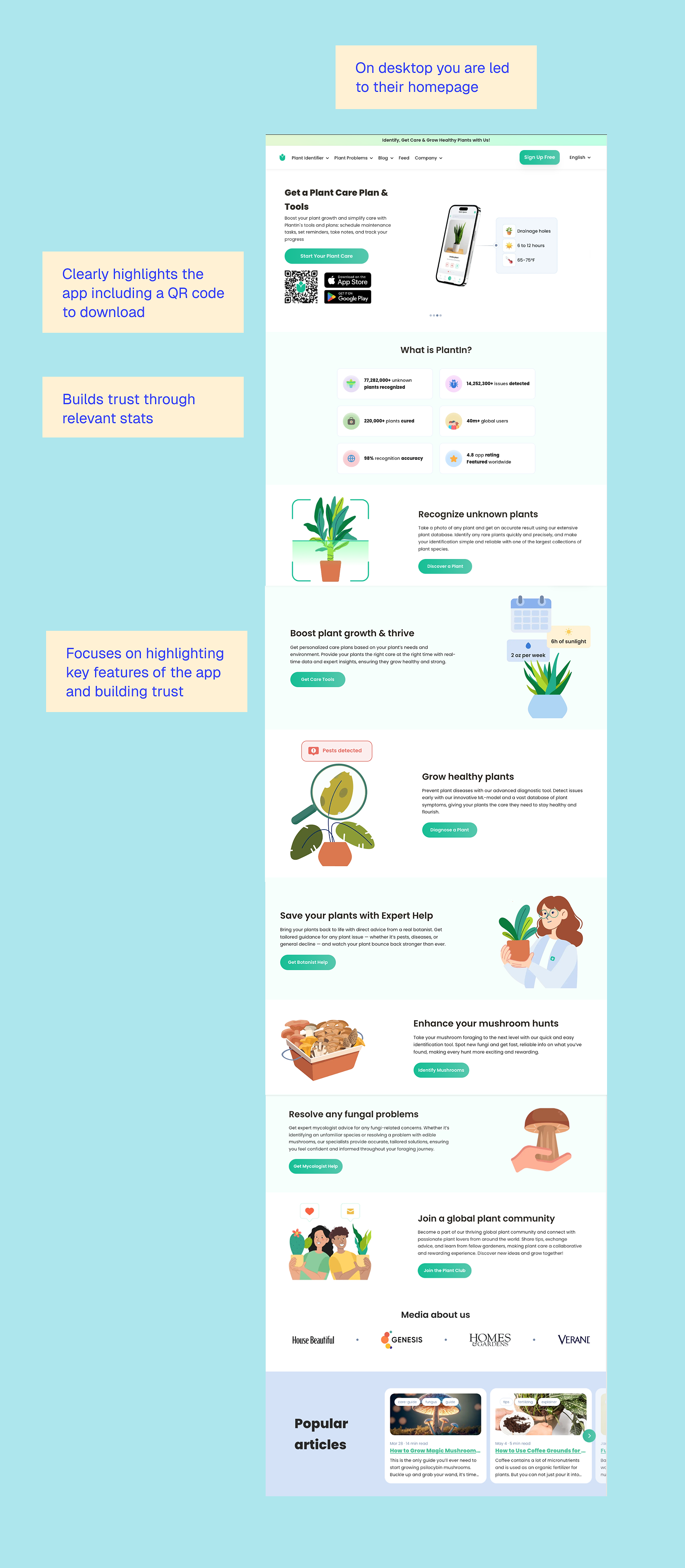
The next section, “What is PlantIn?”, appears to explain what the app does, but it’s actually a statistical trust builder. It highlights six key stats designed to build credibility and confidence in PlantIn.
Before moving on to the app’s key benefits, each stat should be explained clearly so users understand how it works. The section then wraps up with a brief social proof example and links to relevant articles — for example, the one on using coffee grounds for your plants (which I can personally recommend).
What’s great about PlantIn is that it doesn’t rush users into conversion. Instead, it focuses on sign-ups and deeper content. It offers a wealth of in-depth pages, like showing plant types, plant diseases, and even mushrooms you can identify. This doesn’t take away from the core value of the app — the ability to identify plants with confidence — or distract from conversion, it shows value and builds trust.
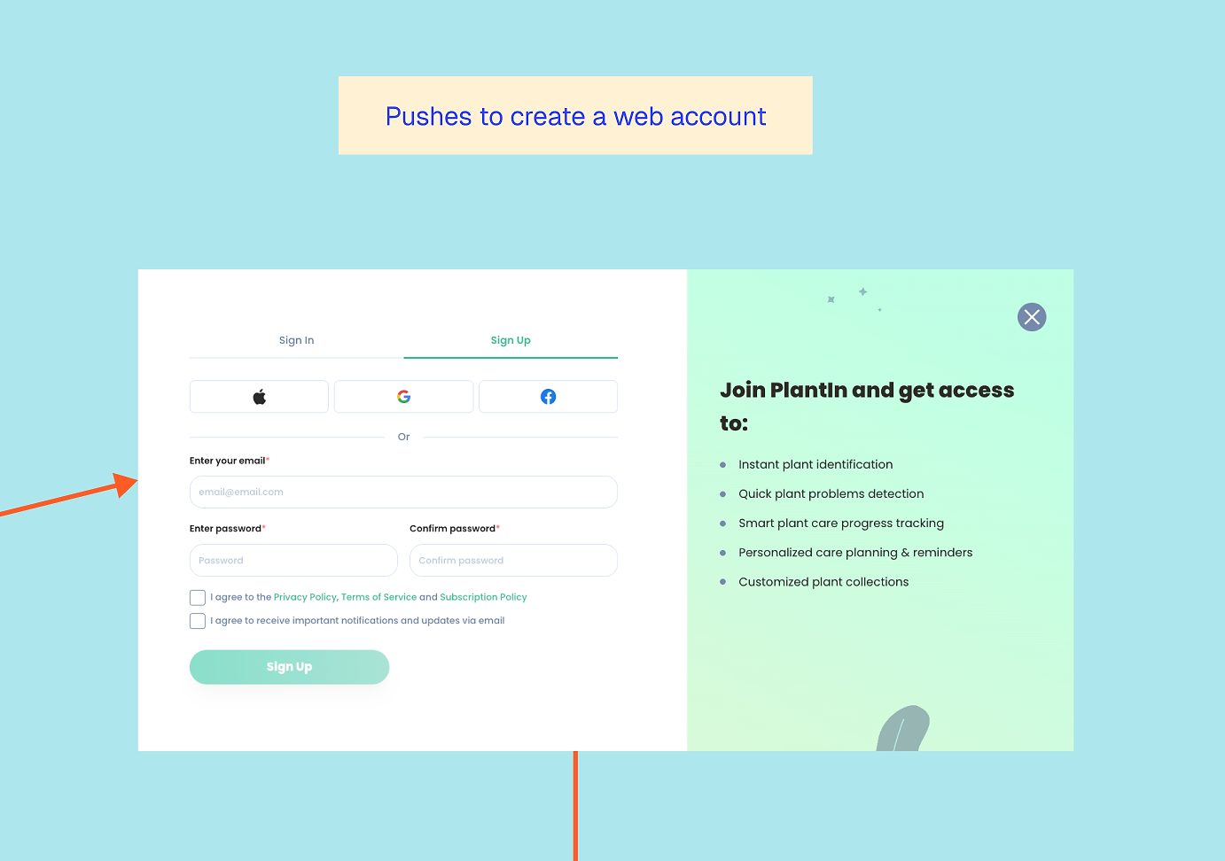
Sign up first, then subscribe
It’s the same classic flow of signing up to purchase. This matters for apps because – without it – if buyers purchase without an account, it creates an awkward post-purchase flow to try and get them set up on the app. It also allows you to encourage them to sign up for emails so you can guide them further.
What I really like about PlantIn’s pricing step is that it clearly shows users how much they save by subscribing online. The app delivers lower fees via the web and stronger retention to the end user.
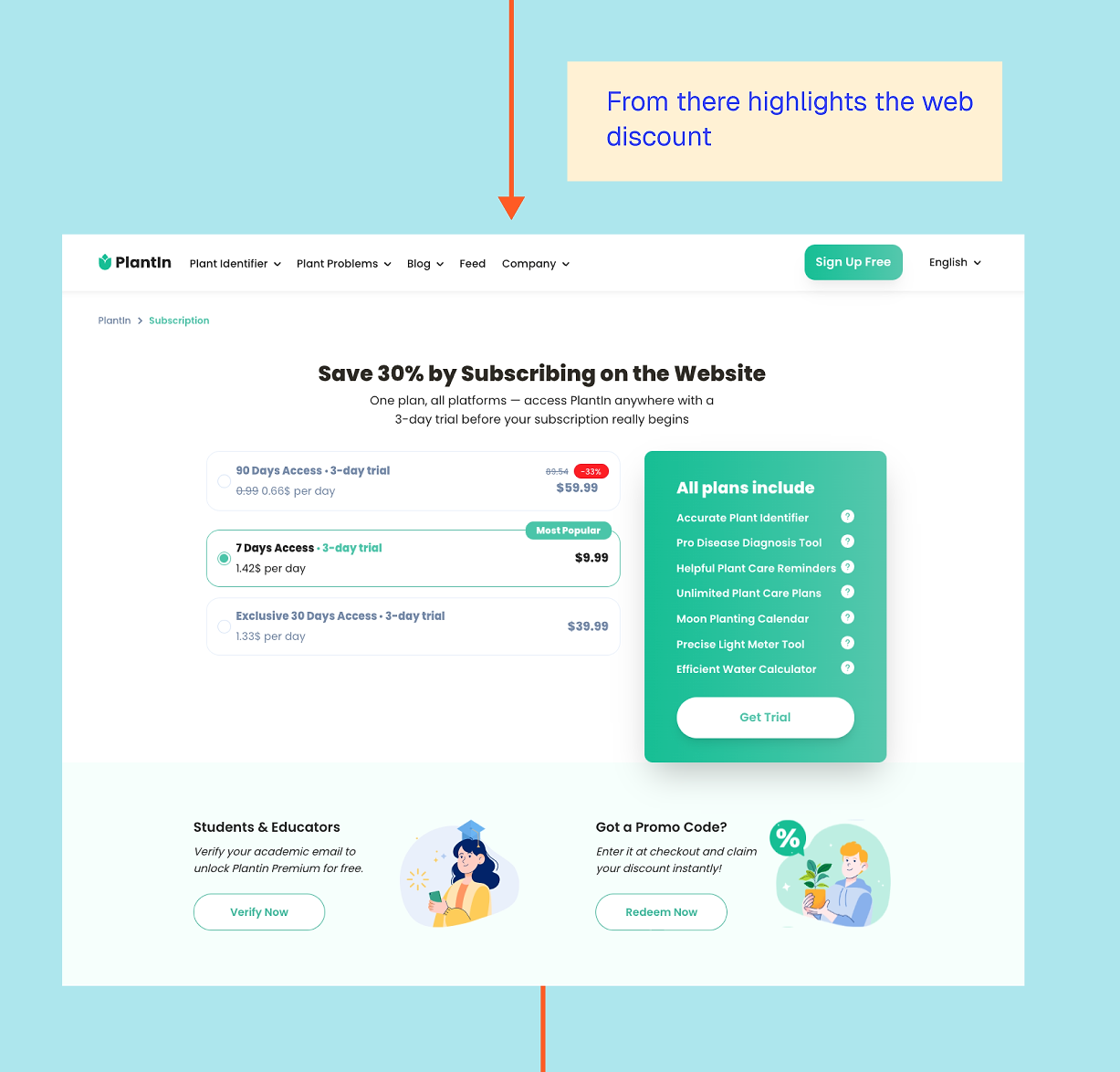
Free trials are less common on web due to fraud risk, so it’s notable that PlantIn offers one. They keep it short, likely to prevent abuse, and because users can see the app’s value relatively quickly.
The checkout appears in a pop-up, making it clear what you’re paying for and what you’ll unlock. By this point, it feels less like a hard sell and more like the logical next step after everything you’ve already explored.
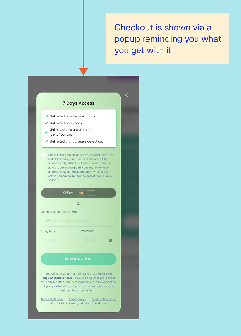
What stood out to me overall is how often PlantIn repeats its value proposition without it feeling aggressive. Each step adds a bit more context, rather than simply pushing the same message harder.
That said, I do find the wording slightly misleading. The title says “subscribing on the web,” but all the plans use the term ‘access’. Only the small text — which oddly omits the dollar sign on the first charge — clarifies that it’s a recurring subscription. This risks unhappy customers who didn’t realize they subscribed. I would use the word subscription or ‘per X period’ clearly in the prices, to ensure it’s clear which options are subscriptions and which are not.
What can other apps learn from PlantIn’s web-to-app funnel?
1. Meet users where they are
Routing mobile and desktop users differently avoids forcing an app download when it doesn’t make sense, rather than treating all users the same.
2. Show the breadth of your app, not just the main feature
PlantIn does a great job of making the subscription feel like access to an ecosystem, rather than just a single tool, while avoiding the trap of presenting itself as an ‘all-in-one’ solution.
3. Use content to reduce anxiety
Especially for users who feel like they’re ‘bad at plants’, the content reassures them before trying to sell.
4. Keep the app visible throughout the journey
Even when monetizing on the web, the app remains front and center.
5. Don’t be afraid to communicate web-specific offerings
The cheaper web subscription is presented as added value, not merely a way to avoid fees.
4. YNAB Workshop Funnel
Web funnel type: workshop → web purchase or web onboarding → email → app install
YNAB… You Need a Budget, don’t we all? This subscription app, which unsurprisingly is a budget app, has an extensive web experience. Given the complexity of entering all the data needed to set up and track a budget, YNAB lets users complete the entire process on the web, with the app introduced much later in the customer journey than you might expect. So late, in fact, that I started doubting they even had an app — but they do!
Workshops and webinars aren’t just effective for B2B apps; they can work really well for consumer apps too, especially when you want to build trust or stand out in a competitive market. I previously worked with a meditation and mindfulness app that offered weekly workshops. They ran multiple 3- and 7-day challenges you could join live, each centered around a theme like stress or gratitude.
These free workshops helped users connect with the coach, and afterwards, they were encouraged to purchase the app. This approach not only drove short-term boosts but also often led to longer-term growth, as users realized they wanted more content from the coach.
Workshops to help you learn
YNAB is built around its unique methodology and does a great job of supporting users and helping them learn.
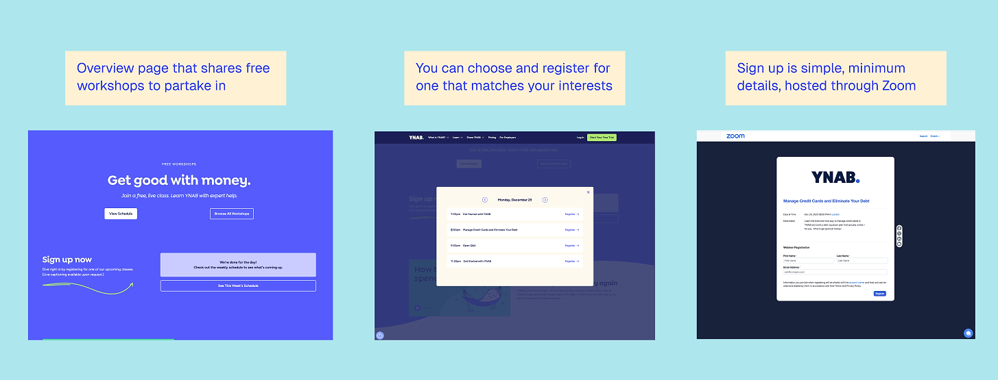
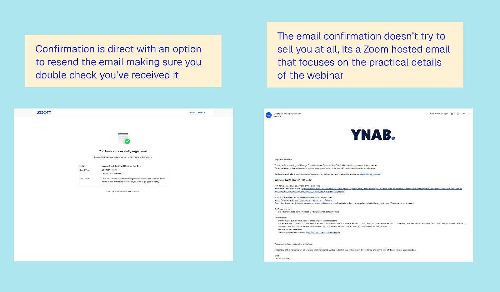
Signing up for a workshop is simple via Zoom, and you receive a confirmation email. At this stage, there’s no mention of the app, and so the approach is refreshingly un-salesy. The focus is purely on delivering value to both existing and new users.
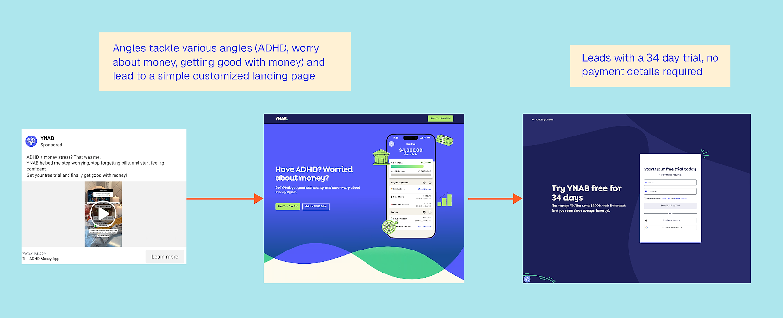
So what happens if you start the web flow? Get ready for a long web onboarding. This flow can be accessed via the website or after a webinar. Note that YNAB also runs ads to a 34-day free trial page, which is personalized to the user’s pain point and also leads into the same web onboarding.
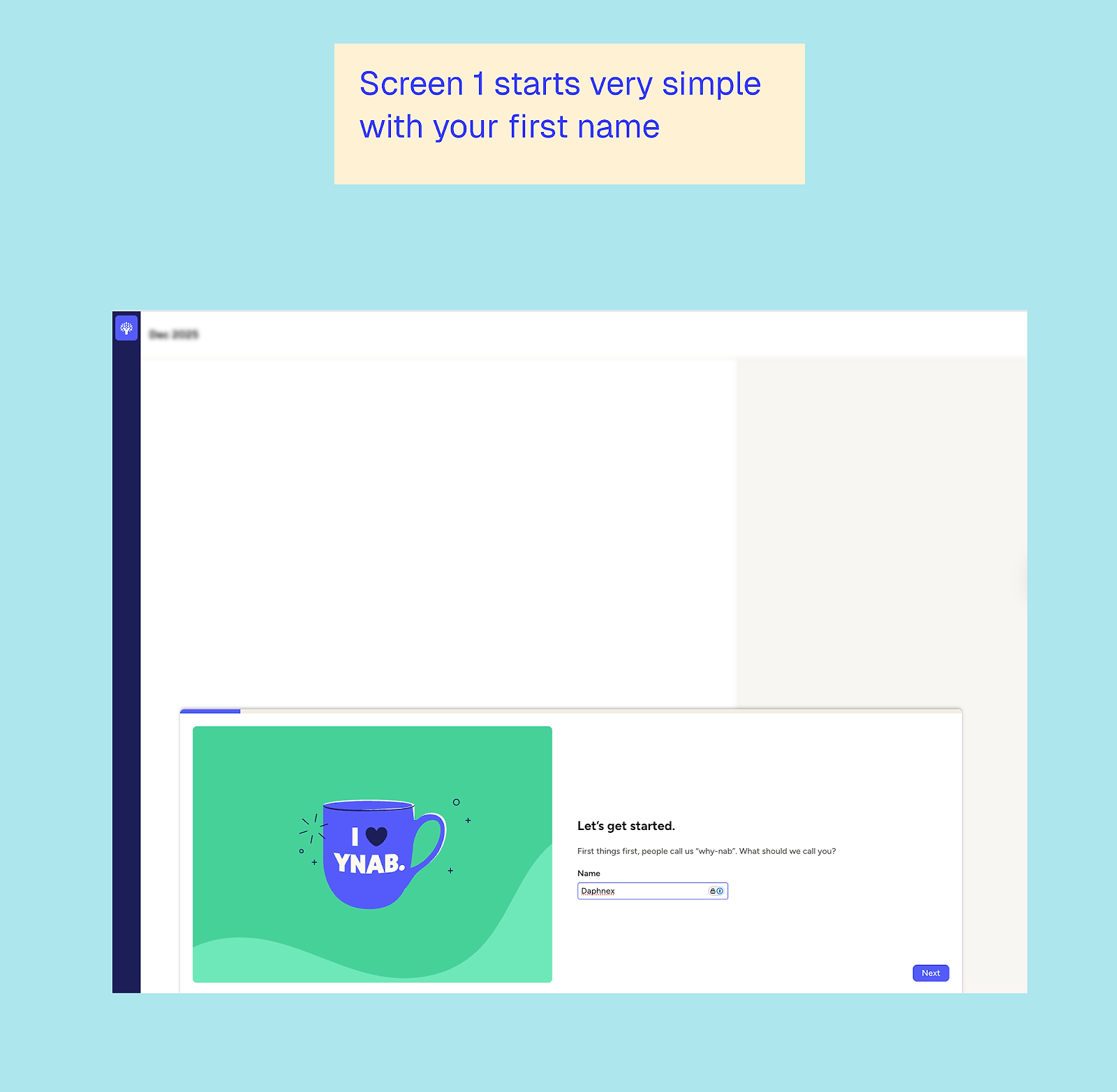
The web onboarding process
I found it fascinating how many steps you go through without any mention of the app or sales. The focus is really on creating a sense of investment, with enough ‘sunk costs’ that you’re naturally engaged. I also didn’t expect the setup to be so easy and enjoyable, despite the multitude of steps.
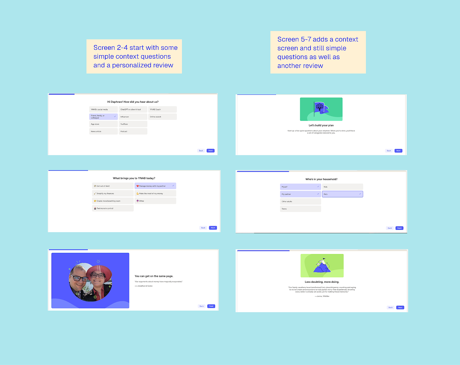
Talking about money can feel a bit icky, and the questions can get personal. Still, I felt surprisingly comfortable sharing complete insight into my financial approach — bet you didn’t expect that in a web-to-app example article!
I did find the setup a bit unusual: the content sits at the bottom of the screen, with the rest left blank throughout the onboarding process (shown in the screen one, but not in the following ones). Given the length of the flow, it sometimes felt incomplete.
In essence, strong web quizzes often blur the line with onboarding, but for YNAB, there is no blurred line: this is pure onboarding. A few highlights are worth noting:
- Customized reviews: I got a completely different review depending on what I said my goal was
- Gradual build-up of the ‘thinking power’ required: the questions started easy and get progressively more in-depth
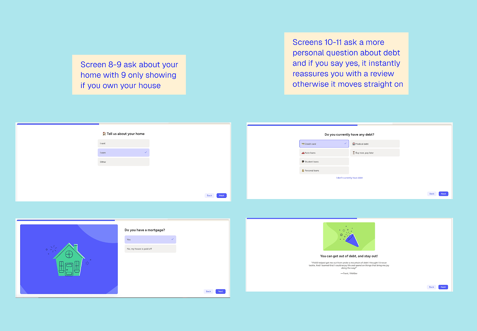
- Personalization of relevant follow-up questions: e.g. if I indicated I owned a house, there were later questions about home insurance etc.
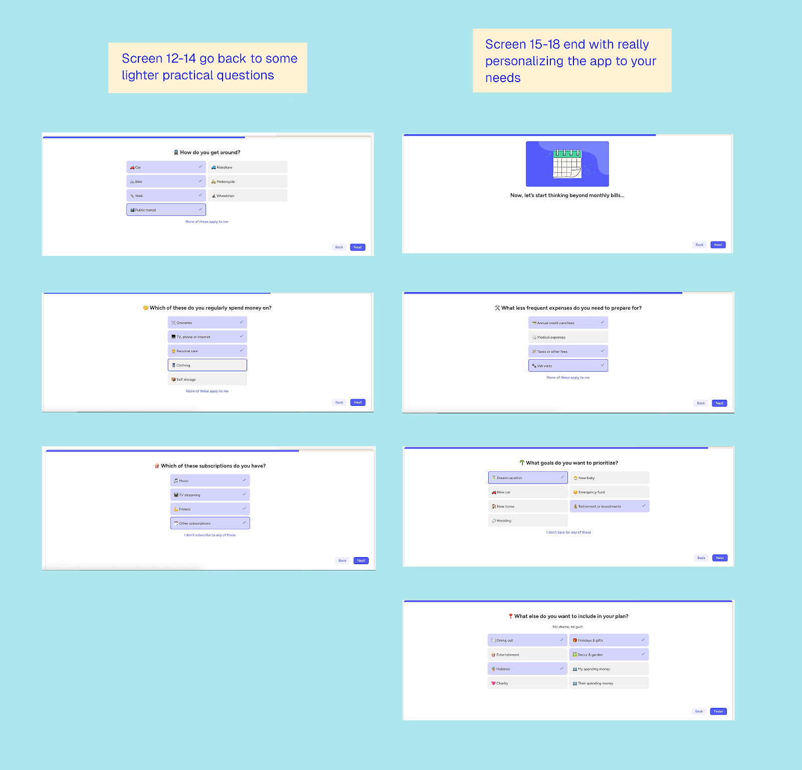
- Initial questions were easy to answer on the spot: later, more in-depth questions arose that felt personal or needed calculation, e.g. how much you want or need to save per month, or your combined income
- Breaking up the questions: it is a lot of questions, but the pauses between for reviews, explanation, and feedback lighten the flow
Even at the end of the quiz, there’s no mention of the app or YNAB’s costs. Since it’s a tool designed to help you save money, spending on it might feel odd until you’ve experienced the value, which is likely why they offer an extensive 34-day free trial. This period spans over a calendar month, allowing you to input data, start achieving your financial goals, and learn more about YNAB.
There’s also a part two questionnaire for account setup and connecting to your bank account, followed by a more explanatory, passive onboarding phase.
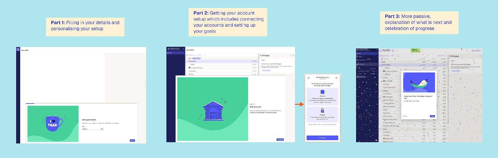
Two highlights stand out here. First, after completing part two of the setup, there’s a celebration moment. When the goal is long-term, celebrating progress like this is powerful; who doesn’t love a bit of colorful confetti? Budgeting has never felt so fun.
Second, the flow is reassuring. I’m quite far along before they make a big, high-trust ask: connecting my bank details. They gently reassure me that it’s secure, which builds confidence before the action.
Yet… still no mention of the app? Not even in the menu.
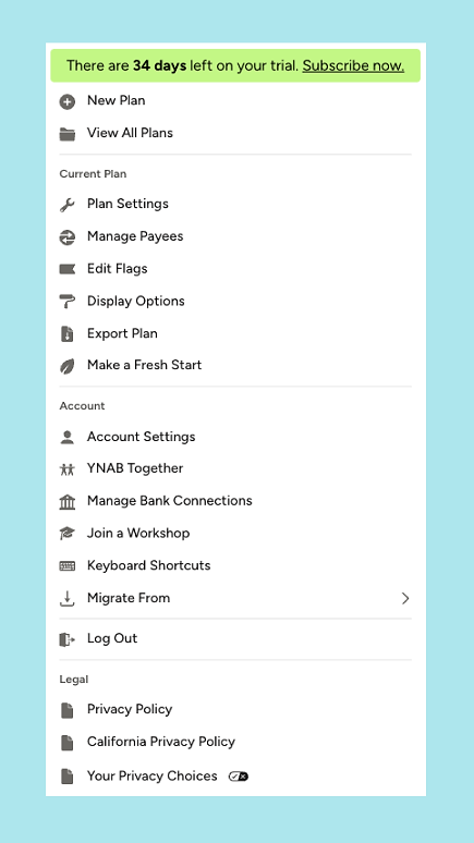
The first time I saw the app was in a follow-up email sent the same day I signed up:
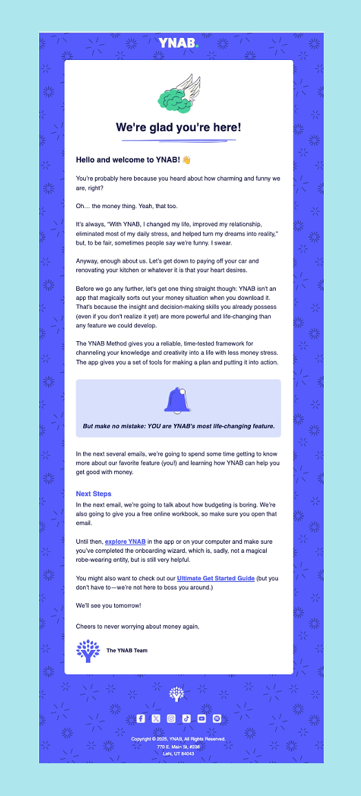
This demonstrates that a strong flow doesn’t need to lead with your app. If your app is primarily a retention tool or requires significant setup and context, it can be more effective to provide an extensive, educational setup on the web first.
What can other apps learn from YNAB’s web-to-app funnel?
1. Web-to-app doesn’t have to lead with the app
YNAB delays the app reveal almost to an uncomfortable degree, and that’s intentional. The app itself isn’t the core value proposition; the methodology is. The web experience does the heavy lifting by teaching, building trust, and getting users mentally invested before the app even enters the picture.
2. Workshops work when education is the product
The workshops aren’t a gimmick or a lead magnet tacked on for growth. They’re a natural extension of YNAB’s philosophy. If your product requires a mindset shift or the adoption of new behaviors, workshops can achieve what landing pages never will.
3. Long onboarding can work if it feels earned
This is a long flow, but it doesn’t feel that way. Questions start easy, gradually get more personal, and are regularly punctuated with reassurance, reviews, and explanations. In this case, pacing matters far more than the number of steps.
4. Delay the ‘big ask’ until trust is established
Connecting bank accounts is a major trust moment. YNAB waits until you’ve invested time, seen progress, and felt understood before asking for it. By then, it feels reasonable rather than risky.
5. Celebrate progress, not outcomes
Budgeting is a long-term game. YNAB celebrates setup milestones, not financial wins. That confetti moment after part two isn’t about money saved, it’s about momentum towards a goal.
6. Free trials should match the job to be done
The 34-day free trial isn’t arbitrary. It gives users enough time to complete a full monthly budgeting cycle and experience the benefits before being asked to pay. The trial length supports behavior change, not just conversion.
5: Photoroom’s free tool funnel
Web funnel type: free tool → web onboarding → trial offer → app install
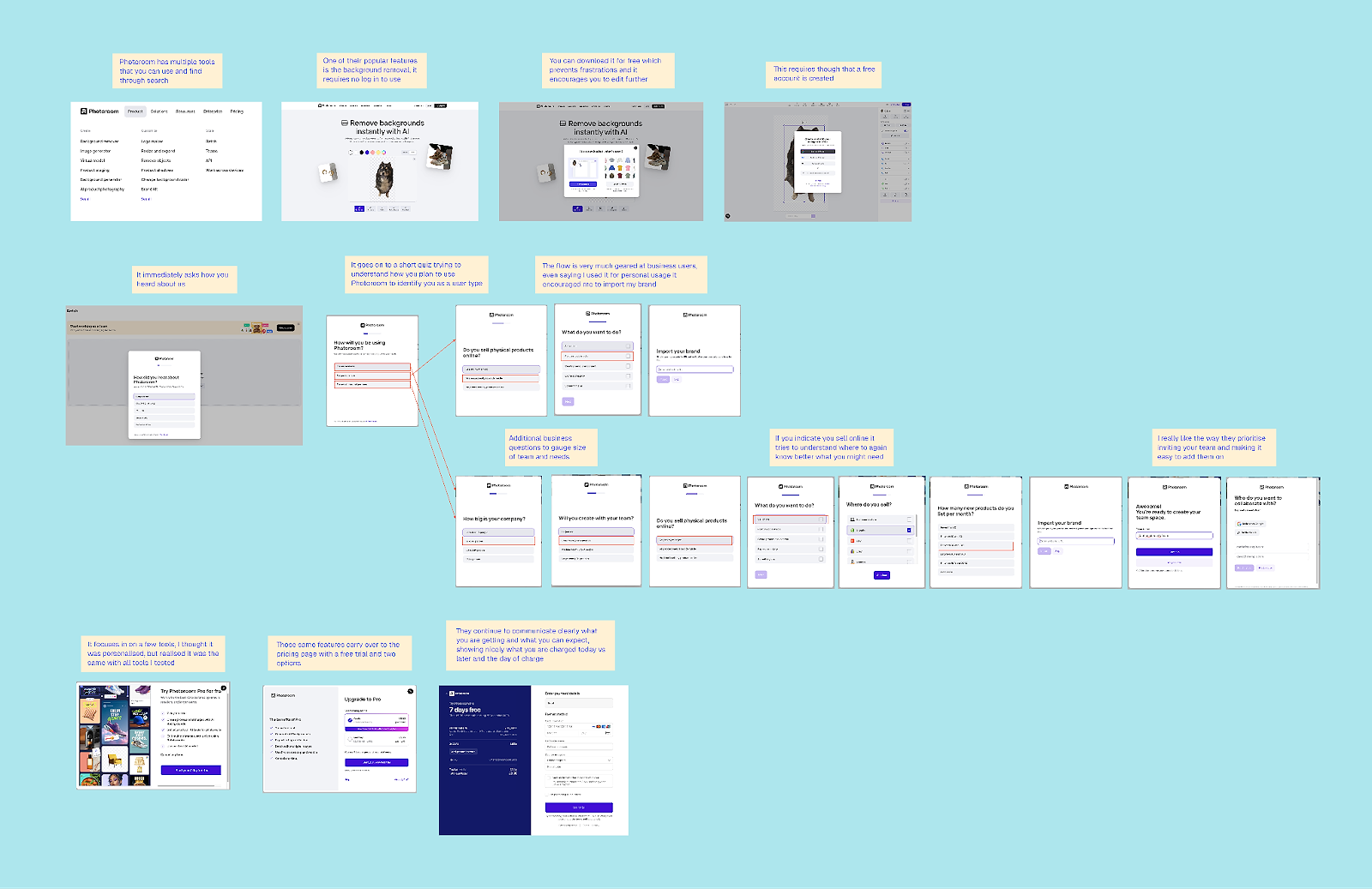
Photoroom, the photo editing app, is one of my favorite examples of how a B2B-focused app can use web-to-app without feeling pushy. Instead of gating everything behind an account or trial, they let you do real work upfront. You can remove a background for free, directly on the web, with zero friction, and that alone delivers value.
What’s interesting is that the web experience doesn’t feel like a stripped-down teaser; it feels like a useful product in its own right. Yet, at every step, it subtly nudges you toward deeper commitment.
The moment you upload an image and see the result, you’ve already had the aha! moment, and that’s when Photoroom starts layering in the next steps.
Reminder: you can zoom in on all the detail right here
Give value first, then ask for commitment
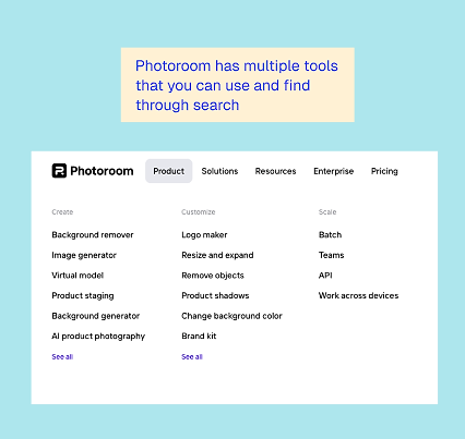
Photoroom offers a range of tools that can be accessed and used directly online:
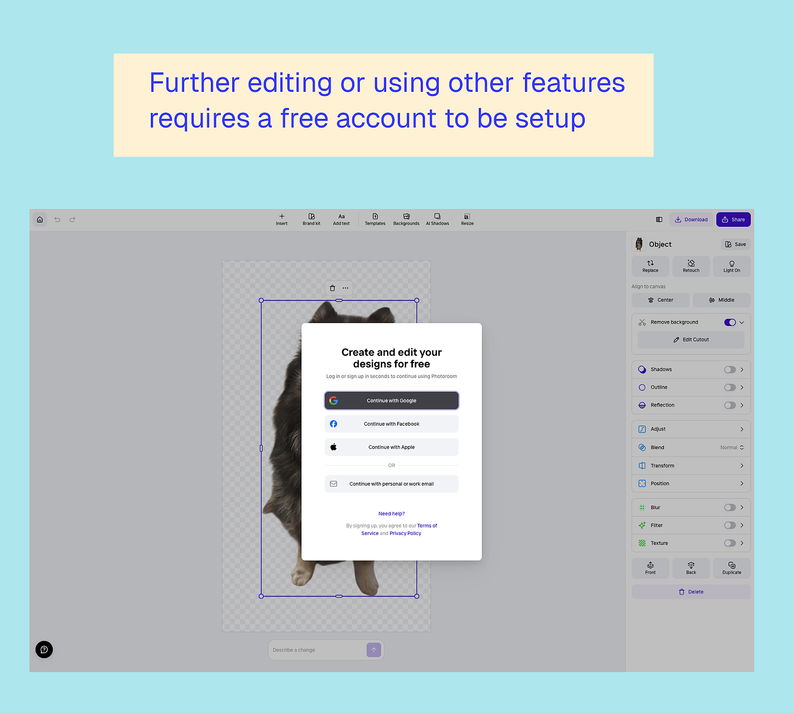
One of the smartest decisions Photoroom makes is not forcing account creation too early. You can complete your first action without signing up, which reduces initial friction, especially for people solving a one-off problem.
But it doesn’t stop there. They use that first success to justify the next ask. If you want to continue editing, export in higher quality, or explore additional features, you’re encouraged to create an account. At that point, it feels reasonable. You’re not being asked to pay, or download anything. You’re not even signing up just to try it; you’re signing up to continue something you’ve already started.
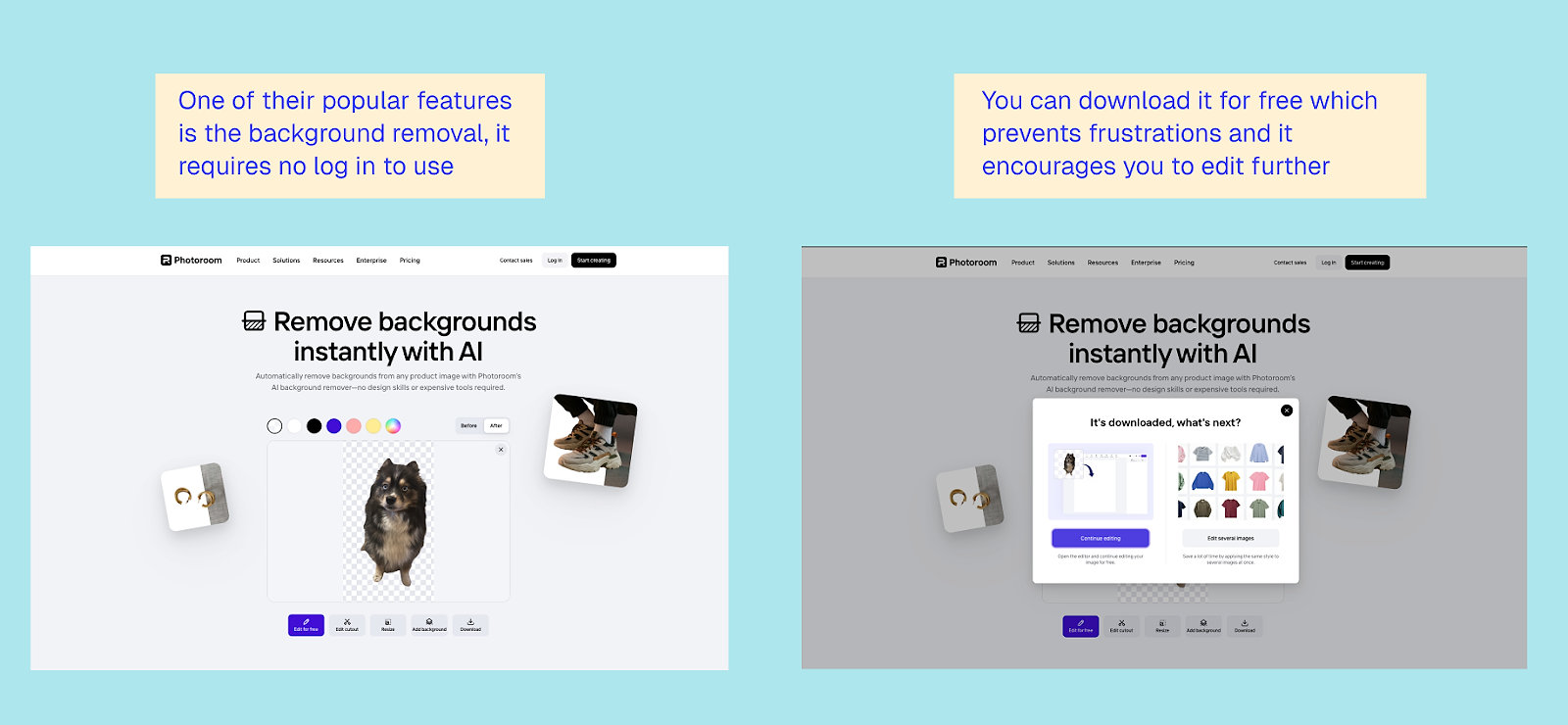
This is a good reminder that web-to-app doesn’t always need a hard gate. Sometimes, letting people experience the core value first is the fastest path to building intent.
Self-employed vs. business: two very different journeys
Once you create an account, Photoroom quickly asks how you plan to use the product. This is where the funnel clearly becomes B2B-focused.
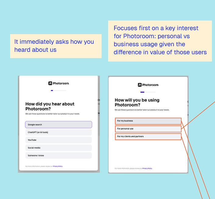
If you indicate that you’re using it for personal purposes, the flow stays relatively lightweight. Even then, it checks whether you have a brand to import:
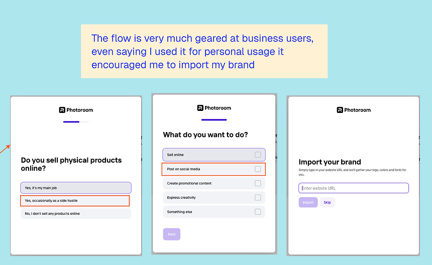
But if you indicate you’re using Photoroom for a business, the experience changes. The onboarding goes much deeper: they ask about your company, your needs, and your expected volume. This doesn’t feel like unnecessary questioning; rather, it feels like qualification.
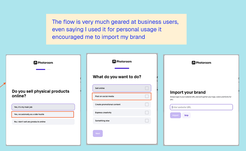
Photoroom is clearly trying to understand what kind of customer you are and what pricing and setup will make sense for you. From a growth perspective, this achieves two things at once:
- Improves relevance by tailoring the experience
- Sets expectations early for more advanced, higher-value plans
This is a strong example of using web onboarding not just to convert, but to properly segment users before the app experience even begins.
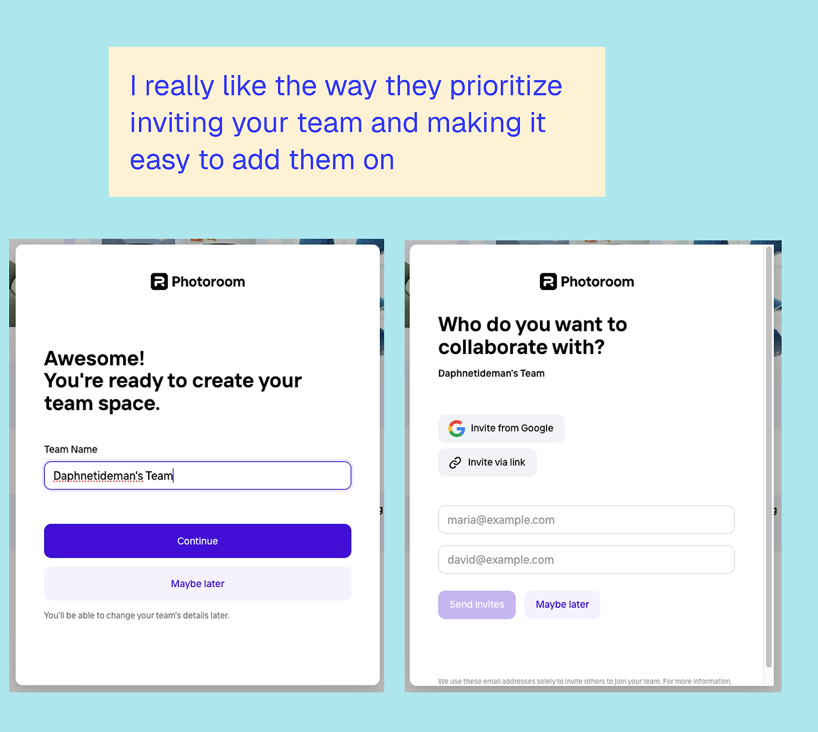
Team setup as part of the funnel
One of my favorite parts of the Photoroom flow is how early they introduce team setup. For business users, inviting teammates isn’t treated as an advanced feature you’ll discover later; it’s positioned as a natural next step.
The interface makes it easy to invite your team and set up a shared workspace. This does two important things:
- Increases switching costs early
- Turns one user into multiple users before monetization even happens
By the time pricing is introduced, you’re no longer thinking as an individual evaluating a tool; you’re thinking as a team adopting a workflow. That shift alone changes how pricing is perceived.
Repetition without feeling repetitive
Photoroom does something subtle but highly-effective throughout the pricing flow: no matter which free tool you start with, you continue to see the same core features and value propositions repeated.
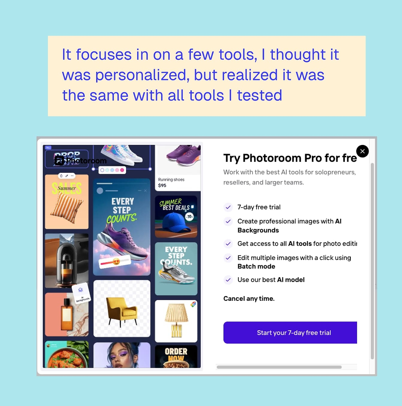
At first glance, it might feel like they’re under-selling the breadth of the product. But I think this is intentional. Rather than overwhelming users with everything Photoroom can do, they focus on a small set of core capabilities and reinforce them consistently.
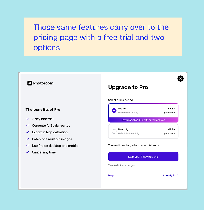
This repetition builds clarity. It’s a good reminder that focus often converts better than completeness.
Pricing clarity and trial positioning
When Photoroom finally introduces the free trial, it doesn’t come out of nowhere. By this point, you’ve already:
- Used the product
- Created an account
- Seen how it fits into your workflow
- Possibly invited your team
The trial feels like a natural extension rather than an aggressive push. They’ve asked several questions and set you up with an account, which helps reduce the risk of failed online charges.
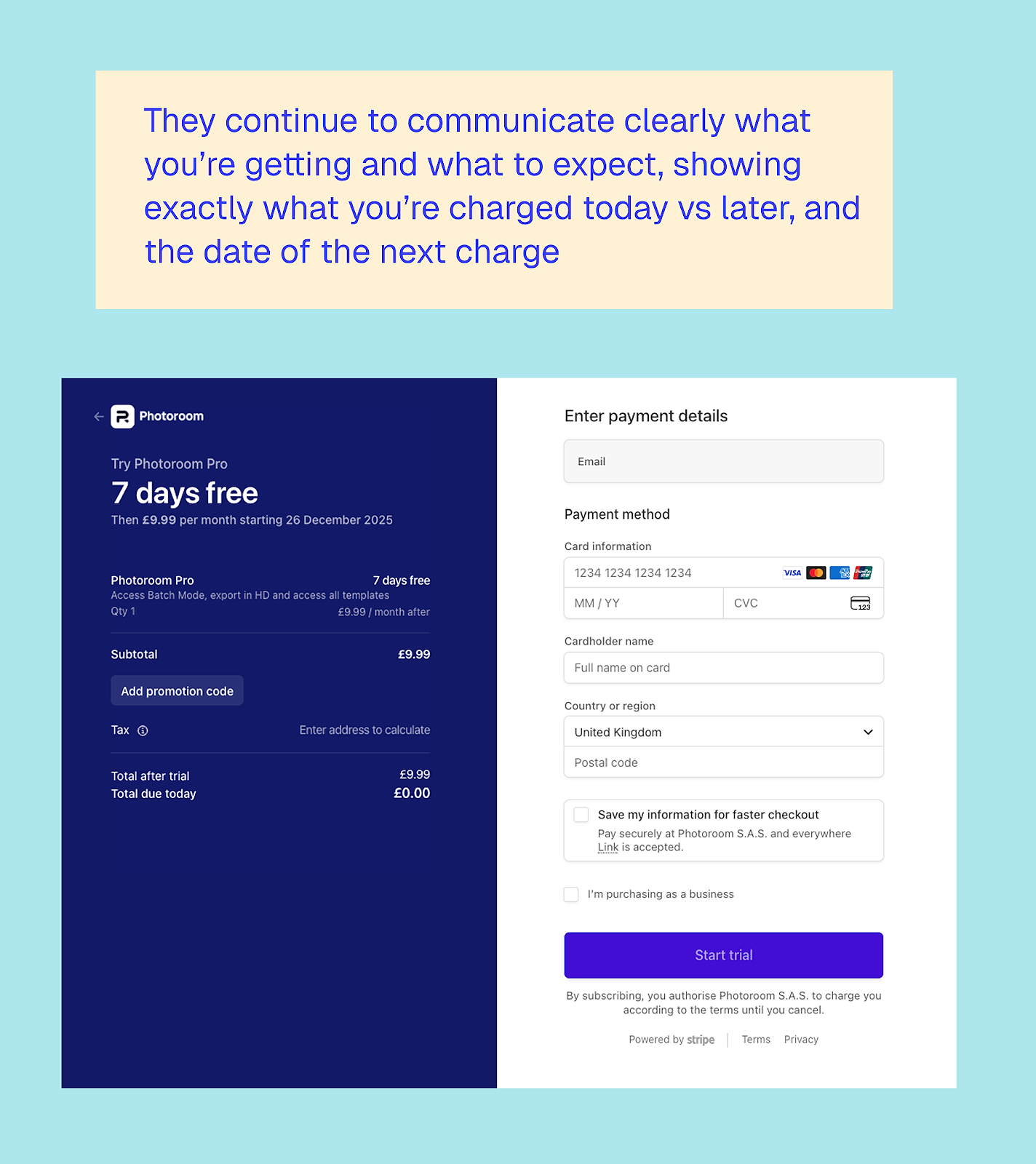
I also appreciate how clearly Photoroom communicates pricing. You know exactly what you’re getting, what you’ll be charged, and when. There’s no sense of being tricked into a trial you might forget about. This transparency builds trust, which is especially important for business users.
What can other apps learn from Photoroom’s web-to-app funnel?
1. Let users do real work for free
Photoroom shows that giving away meaningful value upfront doesn’t cannibalize conversion. It creates it.
2. Use web onboarding to qualify, not just convert
Asking whether someone is a business user unlocks deeper segmentation and more relevant pricing later.
3. Design for teams early
Introducing team setup before monetization increases commitment and expands account value.
4. Subtle repetition builds clarity
Focusing on a few core features across multiple entry points helps users understand (and remember!) what the product is really for.
5. Trials work best when they feel earned
By the time the free trial appears, it feels like the obvious next step rather than a risky decision.
There’s no single ‘best’ web-to-app funnel
Looking across all five examples, the biggest takeaway is that web-to-app isn’t a one-size-fits-all template. Calm, Blinkist, PlantIn, YNAB, and Photoroom all approach it differently because their products, audiences, and jobs to be done vary:
- Some lead with emotion
- Some lead with education
- Some lead with utility
What they all have in common is intention and user value. None of these funnels treats the web as a thin acquisition layer whose only job is to push users into the app as fast as possible. Instead, the web is used to:
- Build trust
- Create commitment
- Reduce uncertainty
- And, in some cases, even deliver the core value itself
If there’s one thing to take away, it’s this: your web funnel should do the hardest work before the app ever opens.
That might mean helping users understand themselves better, like Calm. Or it might mean teaching them something useful, like Blinkist or YNAB. Maybe it’s letting them experience real value immediately, like Photoroom or PlantIn.
The right approach depends on your subscription app, of course, but the opportunity is the same. Web-to-app works best when it’s not just a bridge, but a meaningful part of the product experience that drives high-quality users.