
I’m going to out myself as a non-native Londoner here and admit that I like riding the tube. I know, I know, it’s sweaty, loud, and crowded. But hear me out: I love looking at all the ads. They’re plastered all over the stations and trains themselves.
In fact, there aren’t many places in a city where you won’t see ads. In Love Actually, they say love is all around us. But dare I say that ads are all around us?
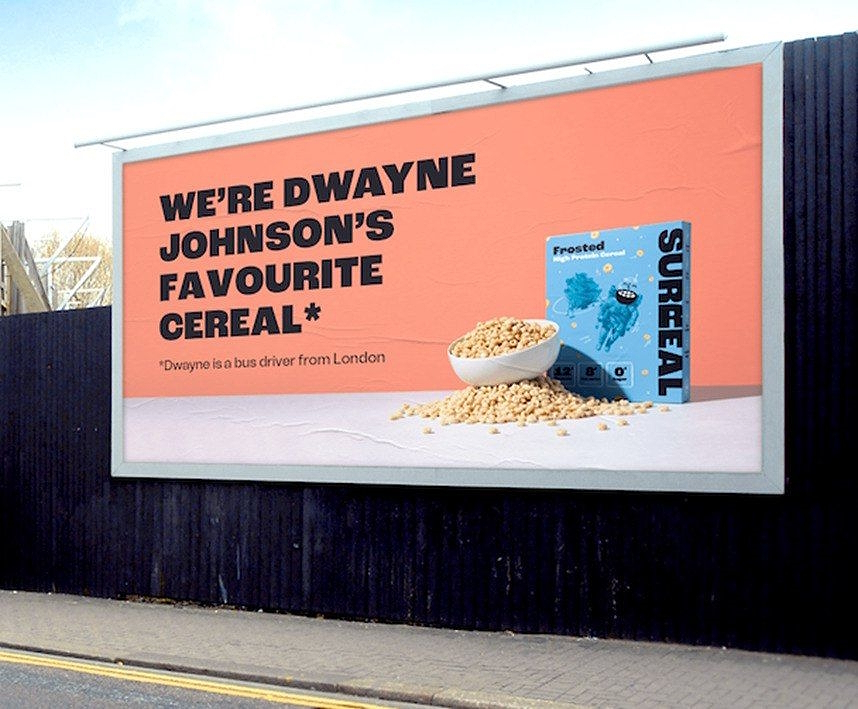
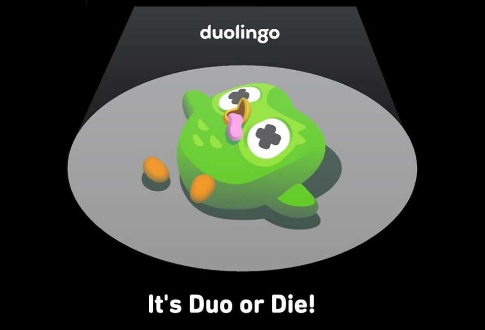
The reason I love them so much is the creativity. In the vicious fight for attention, marketers are pulling all guns out and going in blazing. From Surreal, the breakfast cereal using ‘fake’ celebrities to endorse their cereals to… Duolingo is announcing that the owl we simultaneously love and fear is dead—false alarm. Go do your daily lesson already.
Then I look at app paywalls and just feel… underwhelmed, the most important moment falls flat. It’s always the same setup, with the same few variations… to add benefits or not? Social proof or no social proof?
It’s like all the creative steam ran out by the time they got to that part of the journey. Which is such a shame, especially now that tools like RevenueCat Paywalls make it easier than ever to test and tweak paywalls.
To be fair, you’re asking someone to pay for your app, so of course, you want to come across as professional. But is that all we can do? Maybe it’s time to get a little weird.
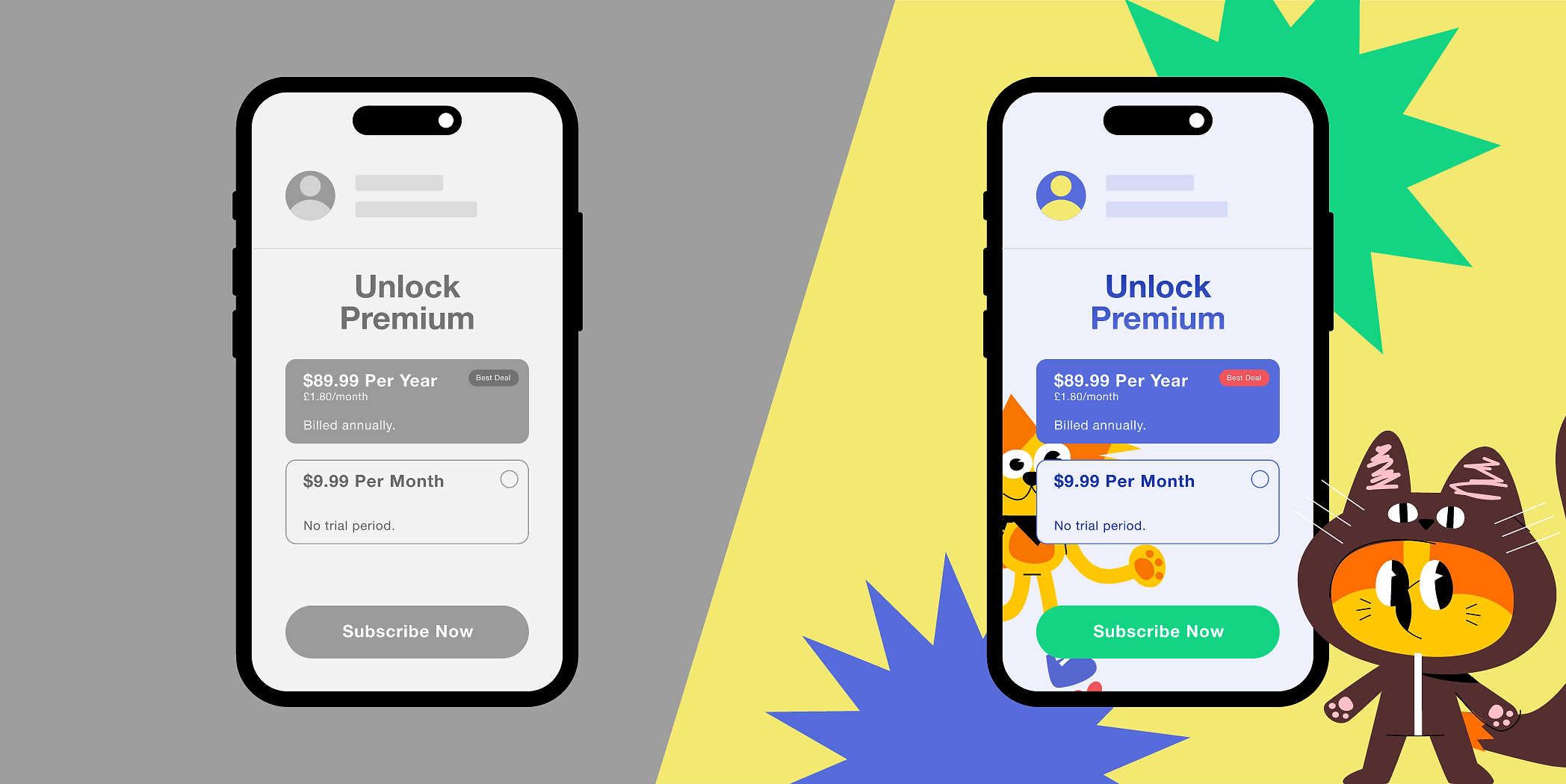
Find inspiration with real paywall examples on Paywalls.com
Browse real examples at Paywalls.com: filter paywall screens by different UI elements, app category, and trending and top-growth paywalls.
Santa Claus is coming to apps
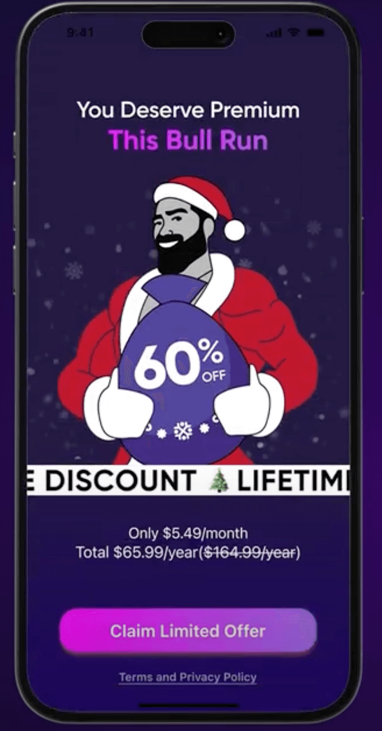
Before you panic, it’s not December. Don’t worry, 2025 is going fast, but not that fast. And yet, Santa Claus is coming to apps. At least, according to CoinStats, a cryptocurrency app. When they presented their paywall experiments at the App Promotion Summit in London in May, I was expecting the usual suspects: an honest paywall, a bit more personalization, maybe a slicker design.
Instead, Tigran Mkrtchyan, their Head of Digital Marketing, unveiled an animated frog, a funky Santa Claus, and a creepy spider… wait, what? Rather than letting the paywall simply appear, they turned it into a full-blown animation that gradually revealed the screen. I won’t lie, I laughed out loud.
This wasn’t your average Santa either. This was Giga Chad Santa Claus. Maybe I live under a rock (okay, I probably do, I regularly need my Gen Z sister to decode TikTok trends for me), but I had no idea who Giga Chad was. Is it just me?!
Turns out, this hyper-masculine meme version of Santa was a hit in the crypto community. They love the guy.
So with their weird paywall, CoinStats managed to hit a triple whammy:
- It nailed situational marketing by tapping into a trending meme
- It was seasonally relevant, tying in with Christmas
- And it broke the expected pattern, making the experience memorable and attention-grabbing
The first two points are especially powerful because so often, people see offers and think, “It’ll probably still be there later.” If we can wait to do something, we will.
We’re bombarded with discounts every day. I can’t be the only one who’s skeptical of countdown timers (though I’ll admit…I still fall for them now and then). But by linking the offer to a trending moment and the time of year, it feels more real. You believe that not only is Santa Claus coming to town just once, but so is that 60% off deal. It also makes it feel more relevant to you, referring to what is essentially an ‘inside joke’.
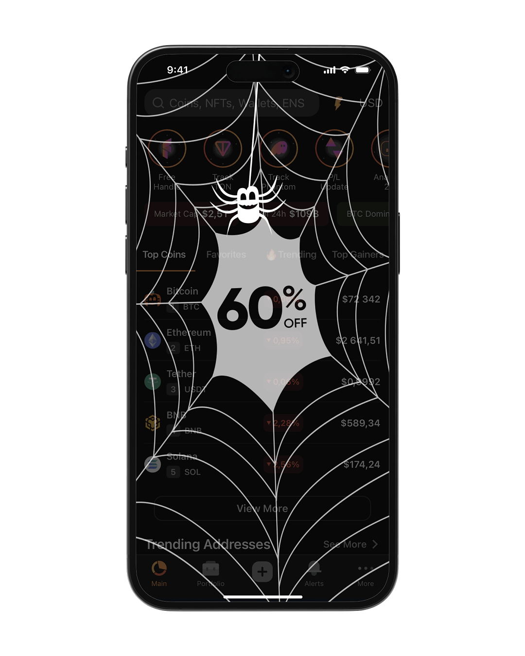
In reality, this wasn’t a once-a-year offer, but part of an ongoing strategy. CoinStats continued to tweak and roll out different versions throughout the year. The Giga Chad Santa paywall was actually a follow-up to a successful Halloween version, where they tested a similar offer with a bitcoin-inspired spider:
But do all these quirky, animated paywalls actually perform? Tigran shared the results from their original froggy campaign that came before Santa Claus, and they were incredible. The early performance was so strong that it paved the way for further experiments.
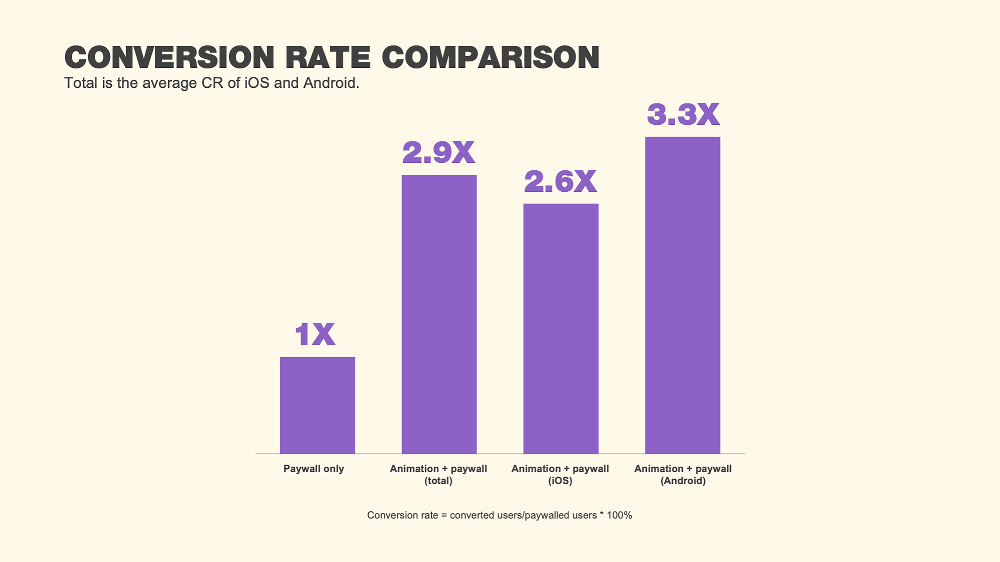
From the results we saw that the conversion rate improved significantly for both Android and iOS resulting in an average lift of 2.9x.
Why else does this kind of paywall actually perform so well? Tigran believes it’s not just about surprise or standing out, it’s also about encouraging an emotional connection by relating to memes and well-known icons. CoinStats had already seen this work well in another case study where they changed the Bitcoin icon to Bobo the Bear—a meme symbol for market downturns—when Bitcoin hit an all-time high. It got people talking, smiling, and most importantly, engaging.
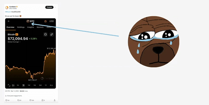
In case you’re as confused as I was to meet Giga Chad Santa Claus, let me break it down for you. A bear market = a downturn, while a bull market (what was referenced in the Christmas paywall) = an upturn. So why show a bear when things are going well? Because poor Bobo (a beloved meme in crypto culture) is sad that it’s not a bull market. The emotional twist struck a chord.
It generated a wave of tweets from large Crypto accounts about the bear, and they saw the highest Google Search traffic of the last 16 months, along with the second-highest amount of App Store downloads in the last year. All because of a sad bear. This is the secondary benefit from getting weird, it can accidentally also increase your word of mouth (if you get weird enough).
While that isn’t quite a paywall, it highlights another example of how breaking the mold gets you standing out and people talking about you.
However, I also appreciate that this may not be the way forward for everyone, so let’s look at some more weird approaches to paywalls you could consider that are a bit tamer.
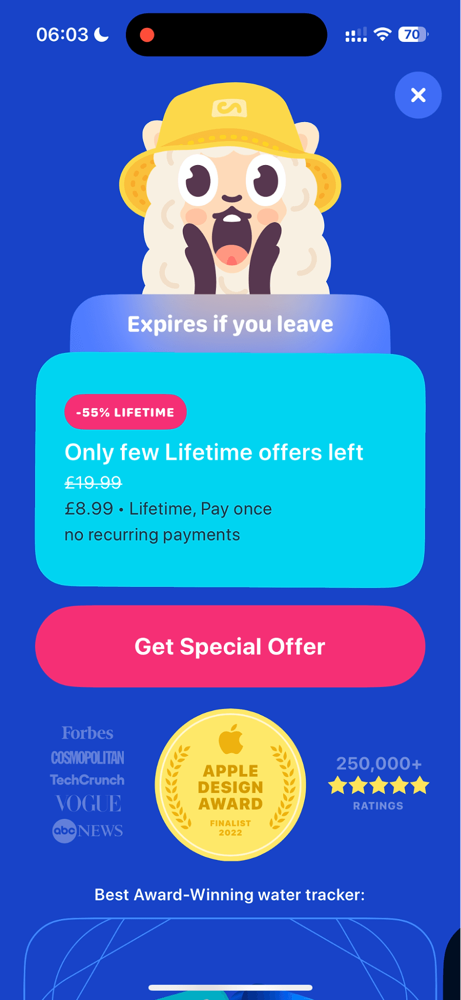
A llama full of water
Waterllama is a water tracker app that helps you build a sustainable hydration habit. This may sound like an obvious thing, but I live with a man who regularly exists on one glass of water a day, usually forced on him by me. Their app shows the animal water tracker getting filled up on the paywall; the llama is thirsty, too.
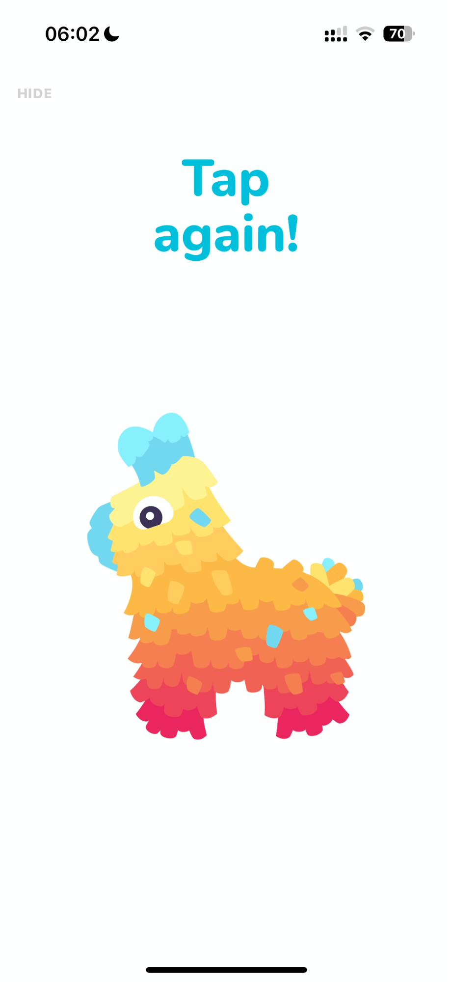
The llama isn’t just for entertainment value; it’s part of a broader carousel that highlights the different features at the top of the screen. They get even more quirky with the llama I realised as I continued to test the app. I got offered to hit (aka tap) a llama pinata to open a special lifetime deal and at the top of that deal there is a very excited llama in a bucket hat (definitely a phrase I never thought I’d say).
With paywalls often consisting of a single screen, it’s easy to miss a small feature callout. Waterllama manages to pack a lot by showing a small animation per feature that brings its relatively standard first screen of a paywall to life:
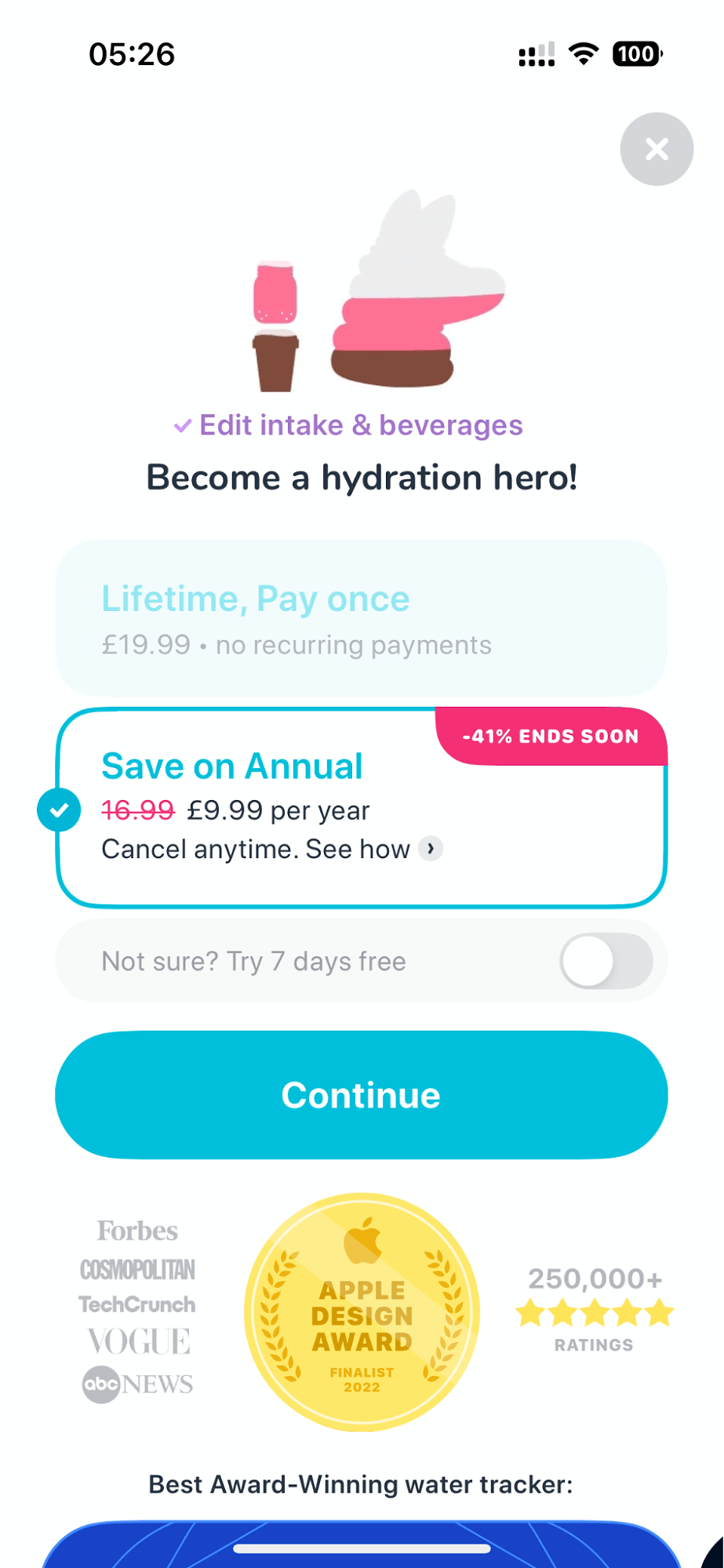
Interestingly, they also offer a landing page-style scroll, where you can scroll further through the various features and social proof. The reviews can be found lower on the page.
This is also referred to as long-form/conversion-focused paywalls (though which paywall isn’t conversion focused?) and allows you to add far more content into your landing page for those not yet convinced to upgrade.
Here’s how they structure the rest of the paywall:
- Awards they’ve won for their app
- A bigger breakdown of each feature
- A review block of the app
Throughout the page, there is a sticky CTA to keep you focused on the upgrade.
My theory is that because the paywall appears so quickly after downloading the app, they want to make sure that if you’re not convinced yet, you’ll be curious enough to look a little closer.
Step away from the paywall
CapCut, an AI-powered video and image editor owned by ByteDance (TikTok’s parent company), takes this concept a step further with their paywall. Instead of simply listing features, their paywall lets you click through examples of all the features on both their standard and pro plans. These features are automatically displayed one by one, with animations that demonstrate how they work. For such a visual app, this is a fantastic way of showing, rather than just telling, what the app can do. It’s interactive and gives users a hands-on preview of what they’re getting, making the paywall feel like part of the experience rather than an obstacle.
The paywall is also a landing page. Now, CapCut breaks two classic ‘rules’ of web landing pages:
- It uses a carousel at the top of the page
- Each feature further down the page can be clicked, meaning you’d leave the paywall.
Cleverly, though, each feature you can click through to has a clear upgrade button at the bottom, making it feel part of the paywall. Given they were estimated to have made $59 million in a quarter last year, I’m assuming they’ve tested this and found it works. CapCut isn’t afraid to color outside the lines, and that clearly works in their favor.
Most paywalls don’t allow scrolling (let alone secondary pages), but it’s an interesting way to show more and convince your audience of your app’s value.
Don’t leave me hanging, what’s the offer?
A paywall that teases you to find out your discount? The cheek, the nerve, the brilliance of it. In my research into funky paywalls, I came across a great newsletter on Retention.blog by Jacob Rushkinn. I’ve never met Jacob, but it turns out we were both pondering the same thing, albeit on different sides of the Atlantic: Why are paywalls so incredibly boring?
While I don’t have the perfect answer to that question either, I loved the example Jacob shared of how Flo, a period and health tracking app, uses an Instagram story-style paywall. It’s not just a straightforward ask for money; it’s interactive. Users are prompted to “swipe to reveal your discount.” It’s playful, engaging, and adds an element of curiosity and excitement to an otherwise mundane part of the app journey. A small tweak like this makes a huge difference in breaking up the monotony of typical paywalls.
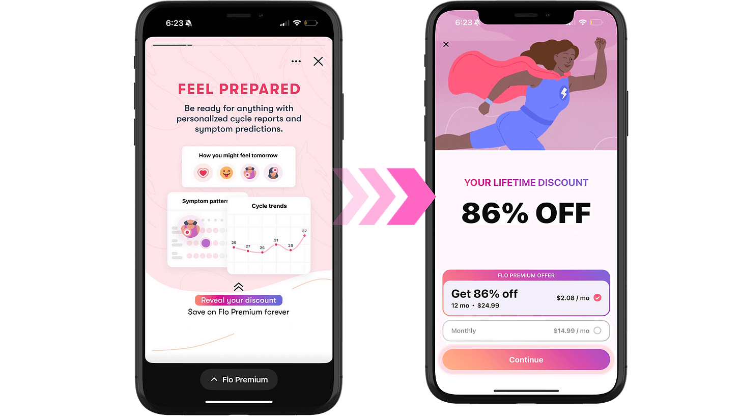
It brings excitement and suspense into the paywall—what will it be?! A quick swipe up revealed a whopping 86% off for lifetime, meaning users could get Flo at just $24.99. And if you decided, “Nah, I’m good,” they hit you with the ultimate emotional manipulation: a crying teddy bear, talk about a guilt trip.
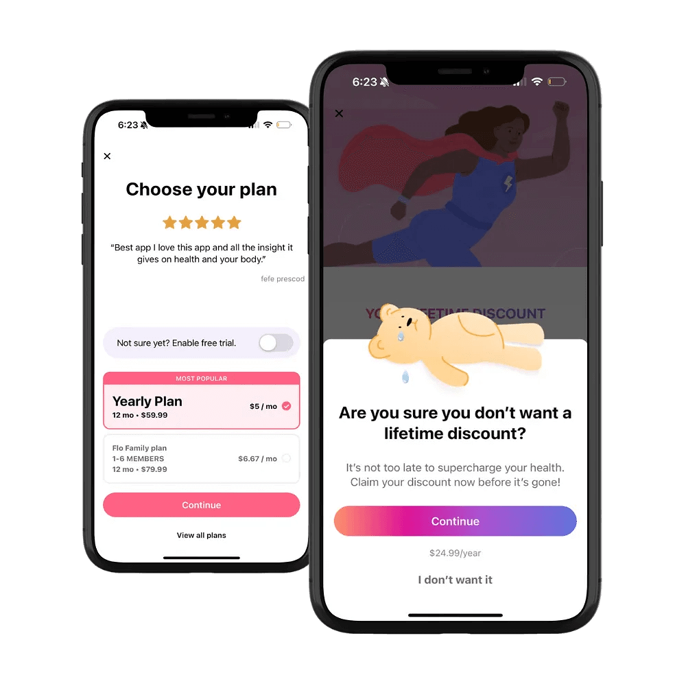
I’m not about to recommend offering 86% off, or relying on high discount offers in general, but I have to admit that this is a great example. I think the format of teasing a discount is unique, or even building in a fun Instagram feel to your paywall, with each story introducing a benefit and value of the app before getting to the paywall. Alternatively it could be a series of transformations of how the app helped individuals achieve their goals before going to a paywall.
Testing out your weird paywall
We’ve covered some wonderfully weird animals—from a bitcoin spider to a water-filled llama to a tearful bear—but weird paywalls aren’t really about the animals. I know, it’s shocking. They’re about breaking the mold, getting creative, and daring to try something different instead of defaulting to the standard copy-and-paste approach.
So here’s a challenge: sit down with your team for a creative brainstorm. Use these examples not as templates, but as inspiration for how you might get a little weird in your own way.
A few ideas to kick things off:
- Animate your paywall entrance
- Tap into a timely or cultural reference
- Add relevant animations to show how features work
- Turn your paywall into an engaging landing page
- Create in-depth pages to explain value, not just list features
- Try a swipeable, story-style paywall
The point isn’t to replicate, it’s to reimagine. I’m not saying that you need to slap buff Santa all over your paywall, as tempting as that might be. Find your own version of buff Santa. Bring in your marketing team, your designers, and especially your social media person. You never know who’s got the perfect quirky idea up their sleeve. Throw out the textbook and think out of the box, as laughing could be the key to opening up your customers’ wallets.