

In my last article I spoke about how many apps have now optimized to a point of being generic, and frankly, forgettable. Builders borrow functionality and patterns from the winning apps, and eventually most apps look the same (just look at every weightloss or period-tracking app for examples). To stand out, you need heart: an authentic understanding of a specific user, expressed in their own language.
Now, my argument is easy to agree with, but it’s harder to act on. Heart alone won’t get you to the top of the App Store. The apps that win in this environment need three things working at the same time:
- Heart: something that resonates — real problems, messaging that lands
- Distribution: well-tuned paid acquisition engine and product loop that earns organic growth
- Monetization: an onboarding flow, paywall, and pricing strategy that systematically converts attention into revenue
Pick one and you are halfway there. Pick all three and you are dangerous. Here's what heart looks like when apps actually do it — and what happens when they don't.
What ‘heart’ actually means in practice
I want to be careful here, because ‘heart’ is the kind of word that sounds meaningful in a conference talk, and fuzzy in a product review. Here is what I mean when I’m talking about building with heart.
1. A sharp understanding of a specific user
Not "women aged 25–40 interested in wellness". Something much more specific: a first-time mom who is three months postpartum, exhausted, and looking for something that fits into five-minute windows between feeds. Or someone with ADHD who has tried 17 productivity apps and abandoned all of them because the onboarding was too long.
The specificity shapes everything: the tone, the visuals, the questions you ask, the order you ask them in. The more specific the mental model of who you are building for, the more everything else follows naturally.
Practical tip
You can test this throughout your funnel in one iteration. I've seen such a re-do bring 5–7% conversion uplifts to paid onboarding paywall.
2. Speaking their language
This sounds obvious, but is almost never done well. Speaking your user's language does not mean labelling them ("for busy moms!"). It means formulating onboarding questions the way the user would actually think about the problem: not the way a product manager would write a spec.
A good test: read your first onboarding screen out loud. Does it sound like something a person would say? Or does it sound like a SaaS landing page?
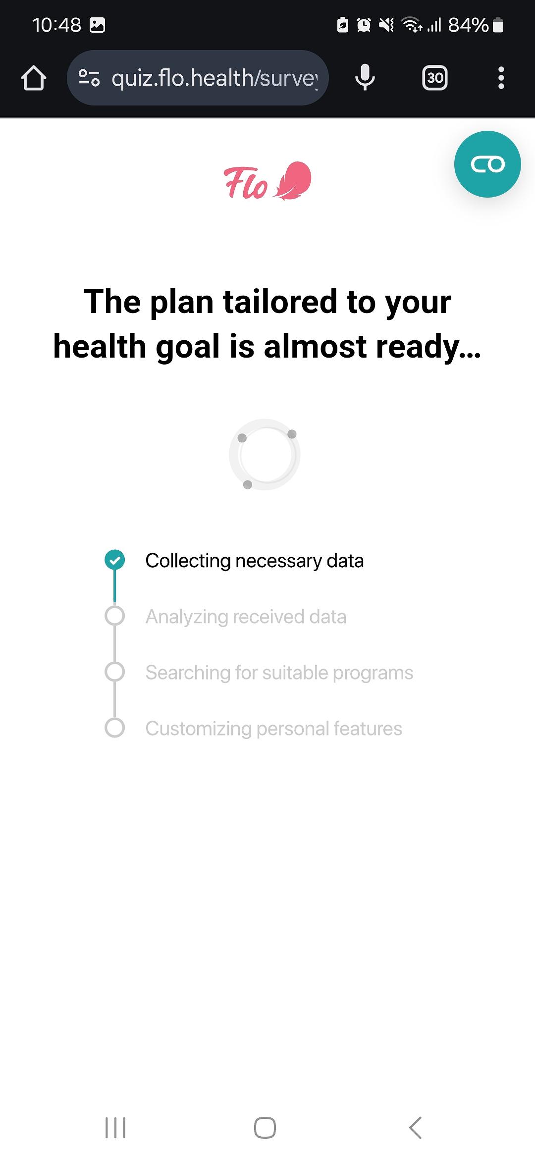
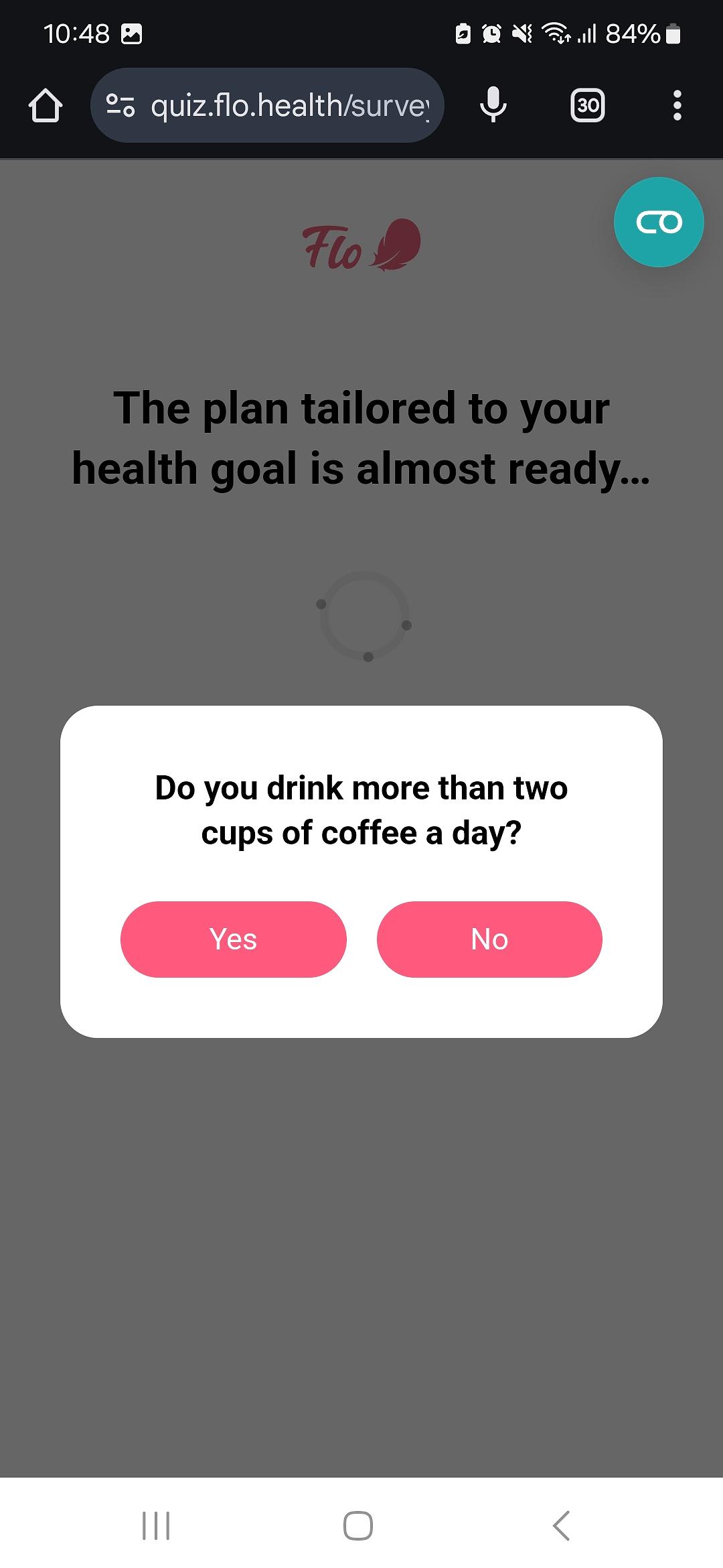
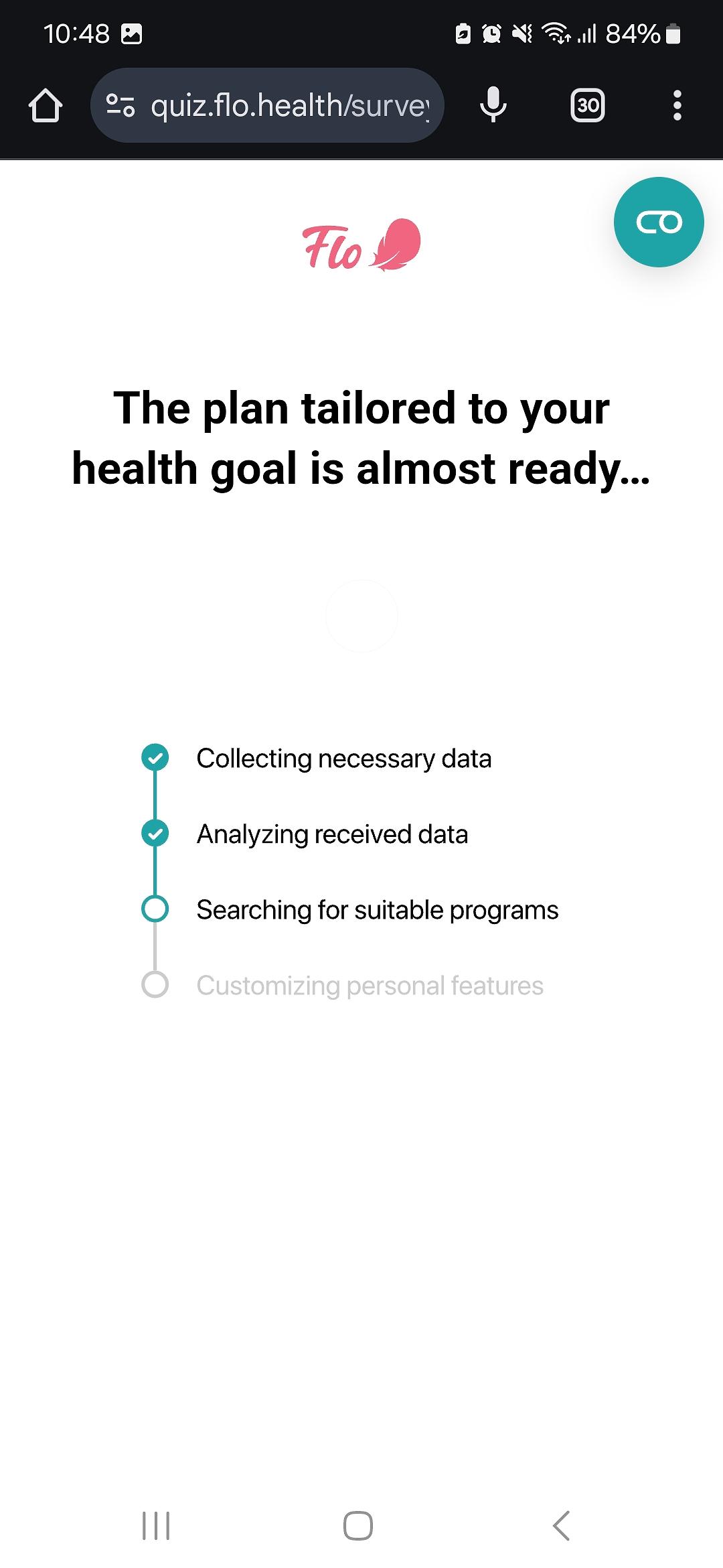
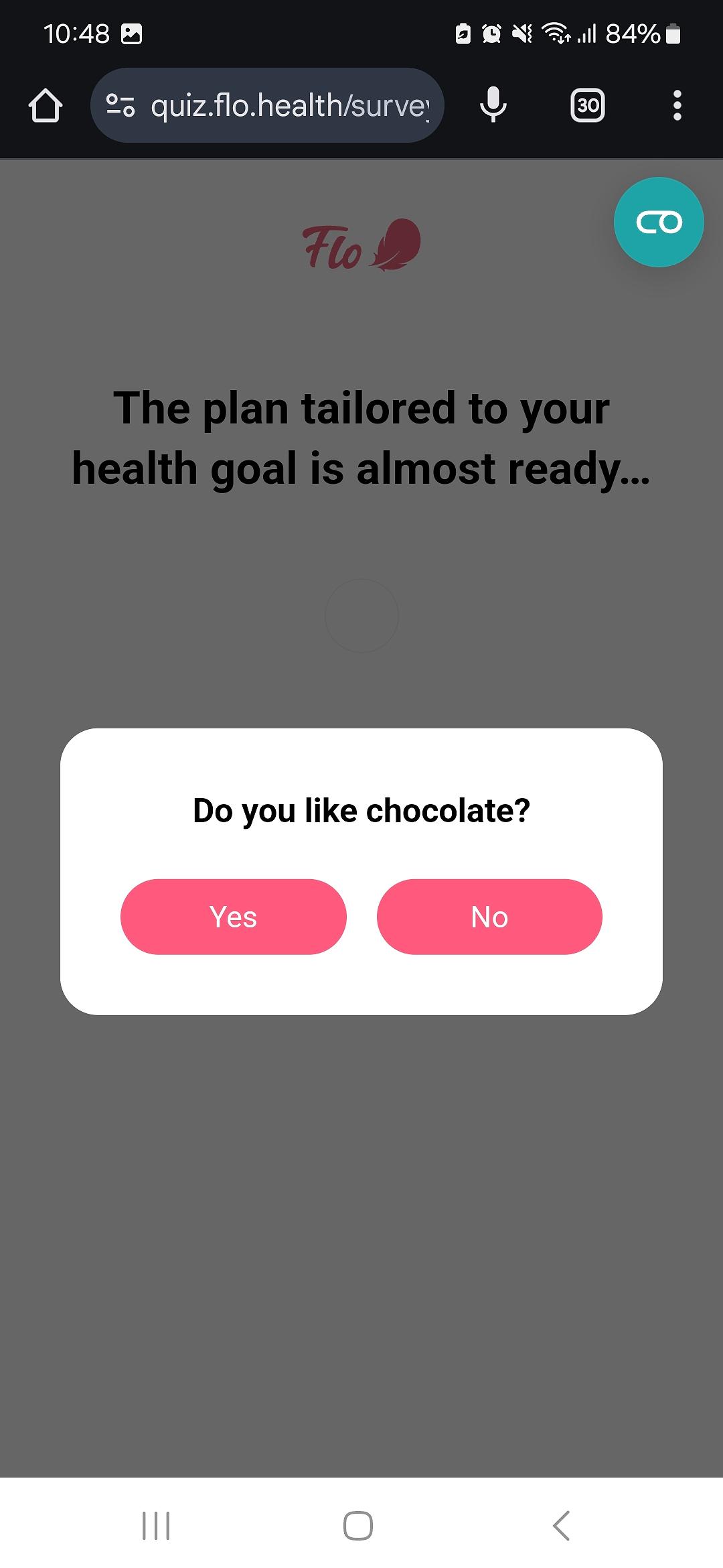
A personal example: when I was leading the onboarding team at Flo Health, I suggested adding an interrupting popup during the loader screen that runs right before the paywall. The popup asked: "Do you drink more than two cups of coffee a day?"
The question came directly from my own experience. I am a mother, and I was pregnant before. Pregnant women are told early and often: no more than two cups of caffeine per day. It is one of those rules that becomes part of how you think. When I was pregnant, I was counting. Every day.
So when we were testing copy for the interrupting popups on the web funnel, I threw this one into the mix. It stuck. From what I can tell, nothing has beaten it since.
Can you guess why the second popup asked about chocolate?
Chocolate also contains caffeine. Most people do not think about this. Pregnant women and women trying to conceive do, because they are already tracking everything. The moment a user sees that question, something clicks: this app knows what I know. It is the feeling of being seen by someone who has been in your exact situation — not a demographic guess.
That is what speaking the user's language actually means. Not clever copywriting, but a question that only makes sense if you genuinely understand the specific situation your user is in. And in this case, I understood it because I had lived it.
3. Small moments of delight
These are the things that die in the roadmap meeting because someone asks "what is the point in this?" and nobody had a good answer. A small animation that responds to user input. Copy that has a point of view. A screen that acknowledges something specific about what the user just told you: not generically, but in a way that shows you were paying attention.
These moments are often cheap to build. But their effect on retention is significant. I've seen 10% lift in onboarding paywall conversion from such aha! moments.
Pro tip
Test in blocks of logical sequences — small changes alone rarely deliver detectable impact.
4. Early aha! moments
This is where I spend most of my time when working with apps, and it is where the ROI is highest.
An aha! moment is when the user thinks: “ah, this is exactly what I need”. It is the point where curiosity becomes commitment. The mistake most apps make is placing it too late: after signup, after onboarding, sometimes only after a purchase.
In B2C apps, the first aha! moment should happen before the paywall. Often before signup, and ideally in the ad itself.
5 types of aha! moment to try
Before we move onto a framework for building apps with heart, let’s dig a little deeper into the forms that these heartfelt aha! moments can take.
Calculations and projections
The user inputs something and gets a meaningful, personalized result back. Noom built much of its reputation on this: after a long onboarding asking about weight, goal date, and lifestyle, the user gets a loader followed by a graph showing exactly when they will reach their target weight. The user thinks "Aha, I can lose this amount by that date. Where do I sign up?" Dozens of apps have since copied this sequence, and it still works, because the graph transforms a generic product into something that feels built for this specific person.
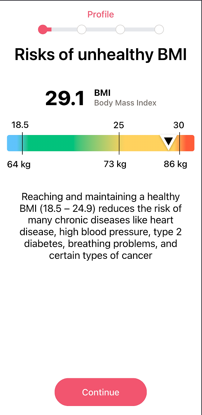
Another weightloss app takes the same principle further by building the aha! across several screens rather than one. When the user enters their weight, a BMI traffic-light scale appears in real time, making the concept easier to understand. The user thinks "Aha, I am in the orange zone."
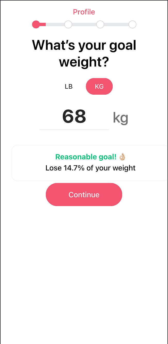
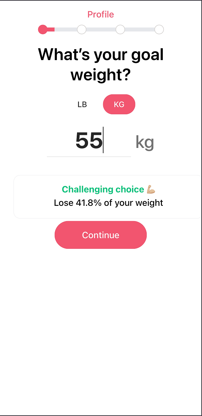
The next screen pre-fills a reasonable weight loss goal — not the aggressive one the user might have entered themselves — and gives feedback if the user insists on a dangerous weight loss goal: "Aha, they’re not going to sell me an unrealistic target." Then the graph arrives. By the time the paywall appears, the user feels the product is already looking out for their best interest and working for them. Each screen adds a layer of trust before the ask.
Seamless transitions into the product itself
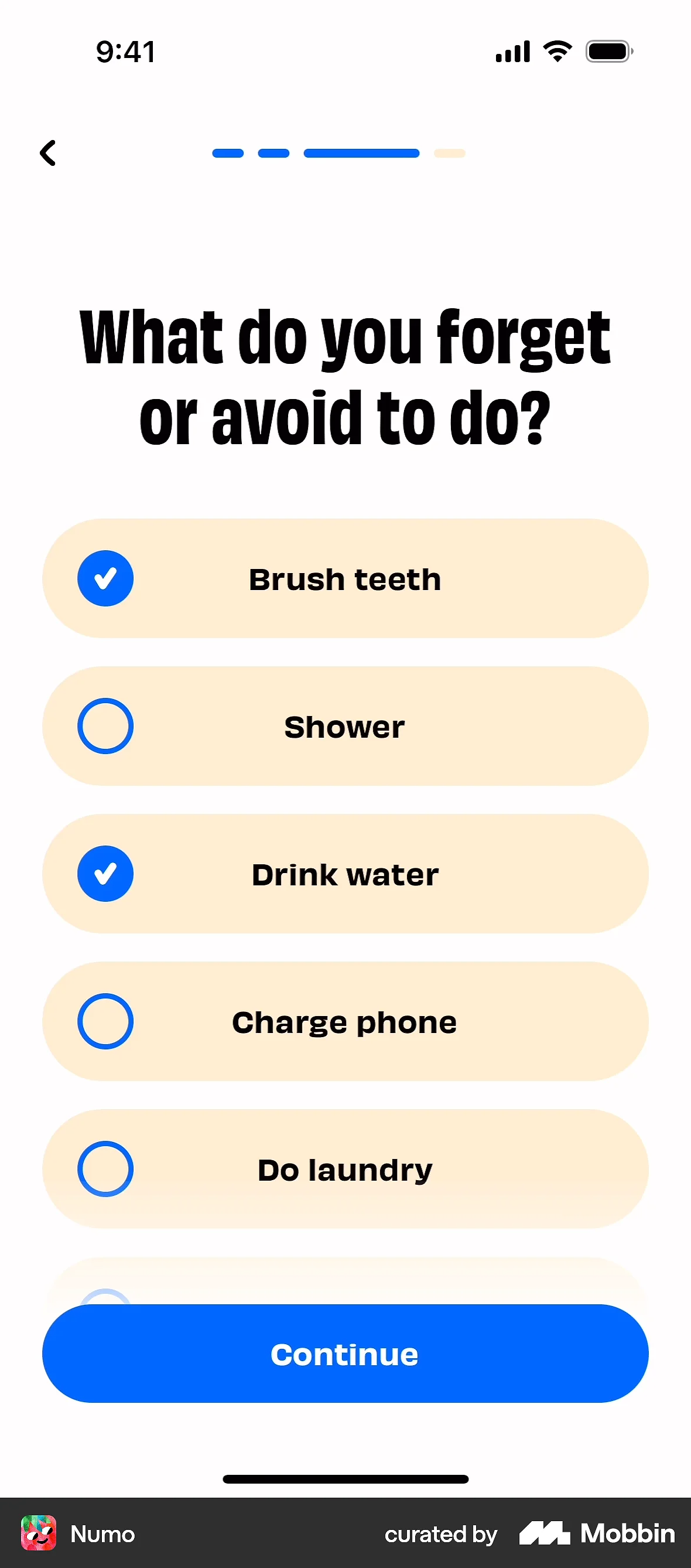
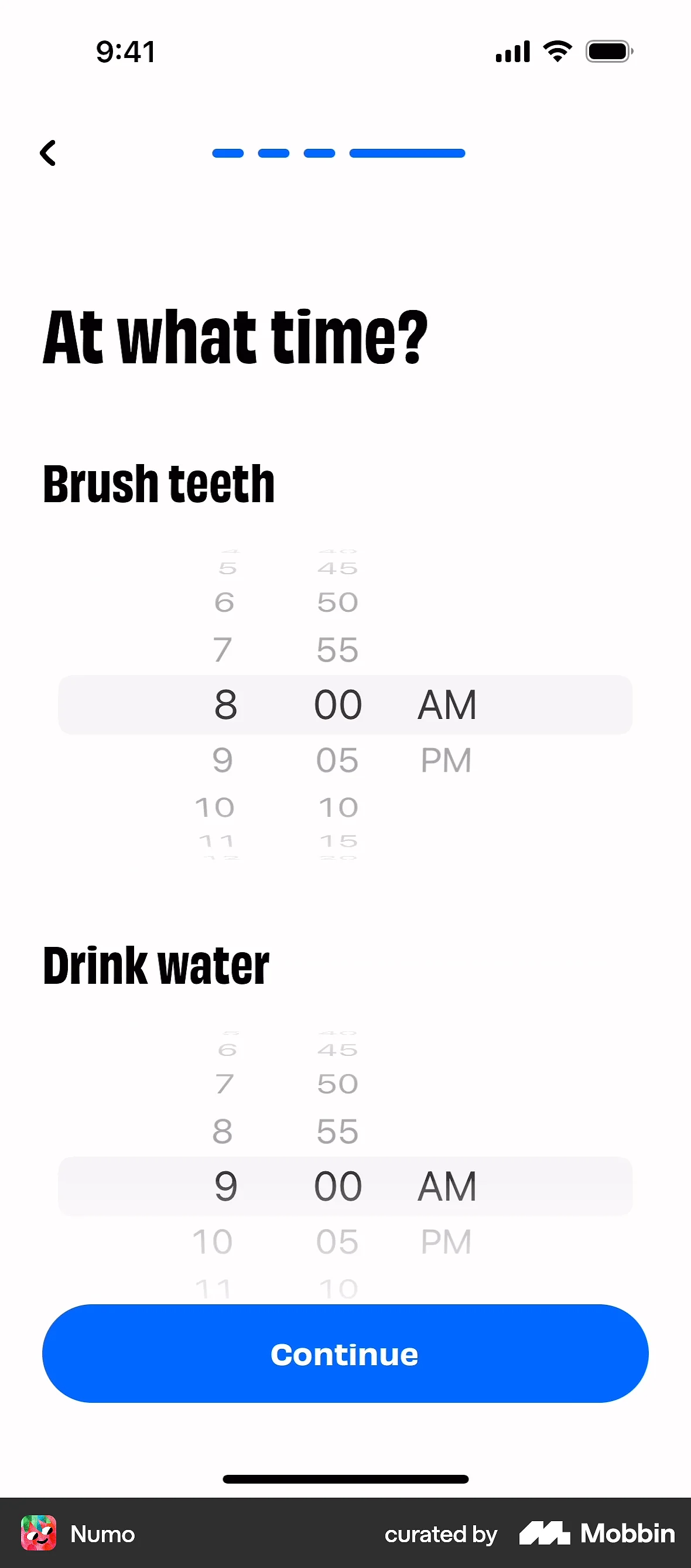
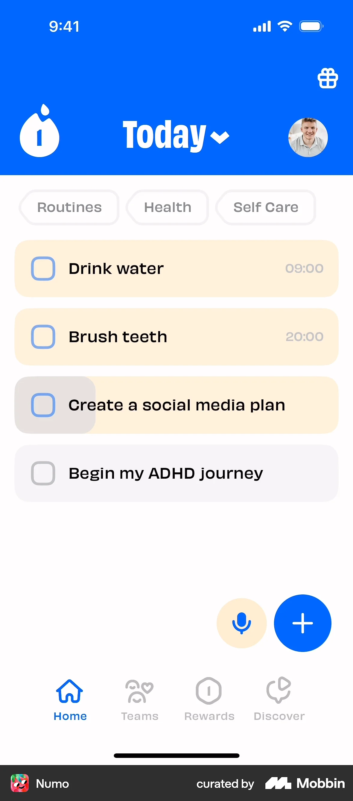
Numo, an ADHD management app, asks users during onboarding about the tasks they keep postponing — the exact struggle someone with ADHD relates to. How do they know? The users have told them.
At the end of the flow, it reveals that those answers have already been turned into tasks inside the app, with reminders pre-set. The user goes from just ‘answering questions’ to feeling that the app is already personalized to their life and working to help them. This aha! moment means they’re not being asked to pay for something they might like; they’re being asked to keep something they now already have.
Aha! moments that start in the ad
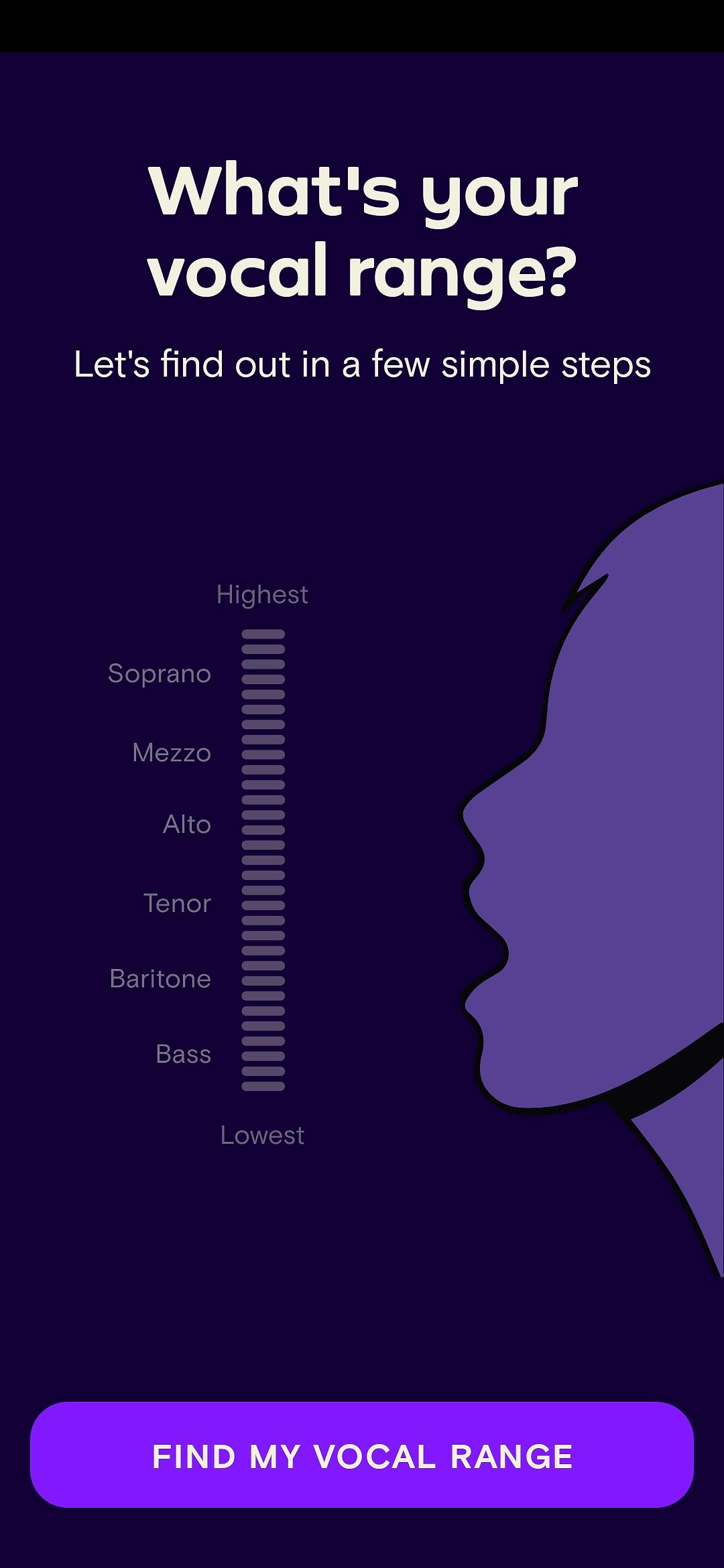
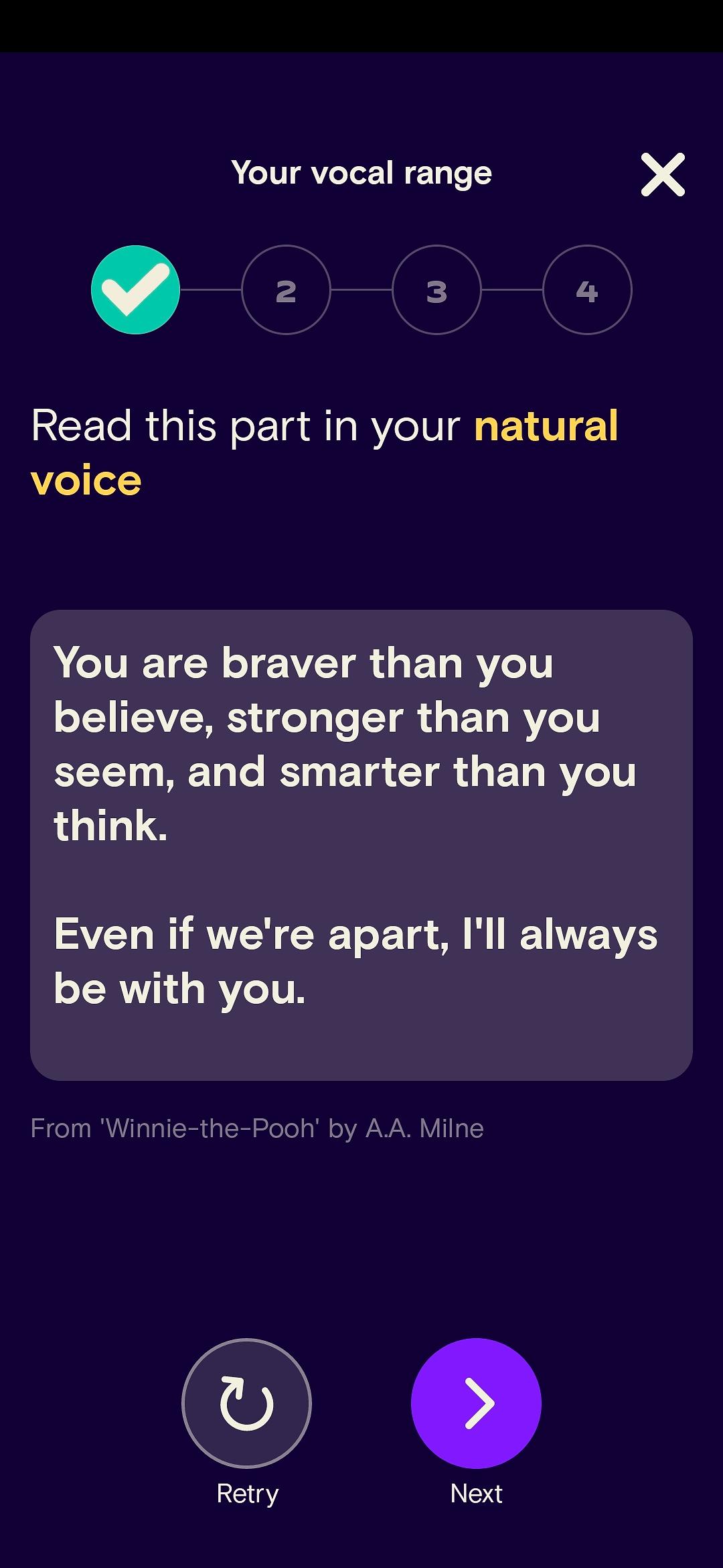
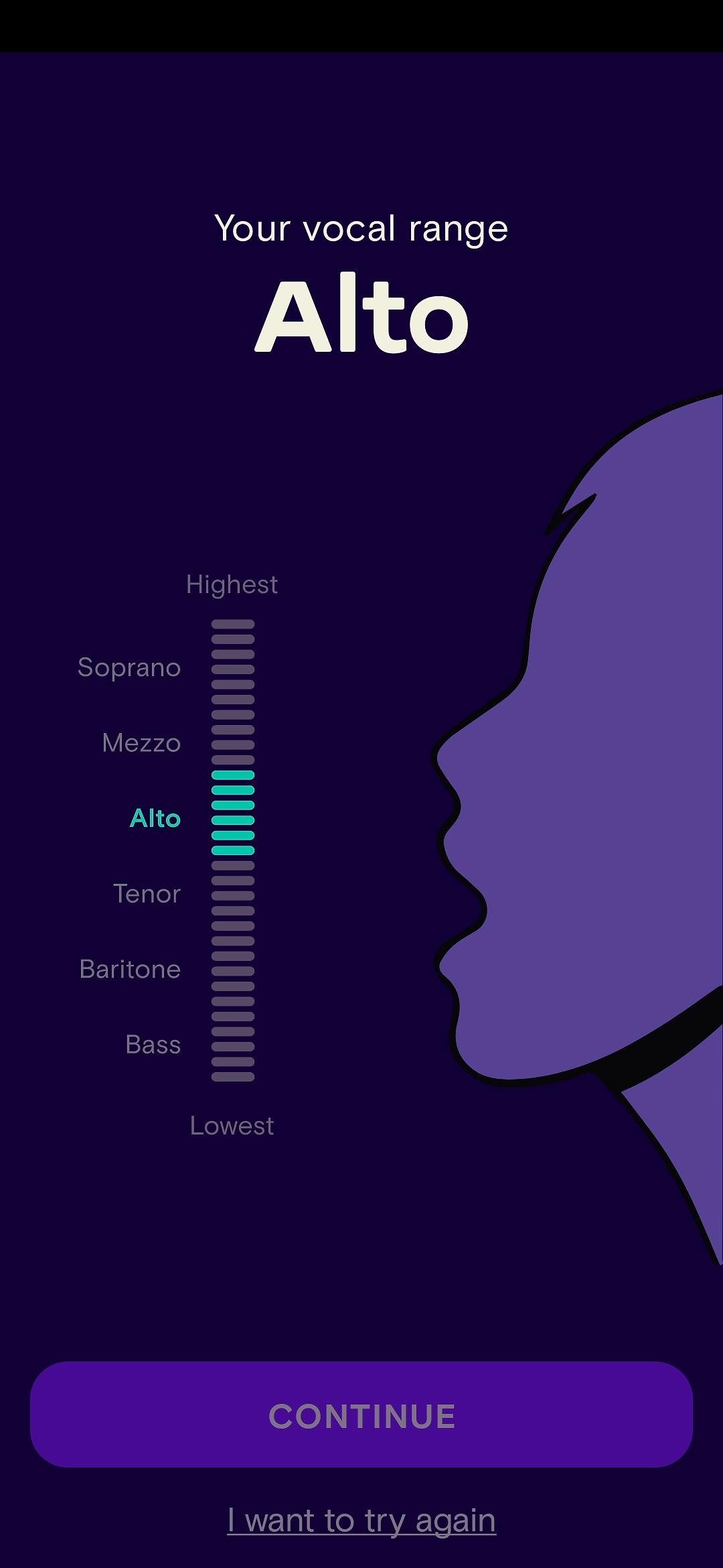
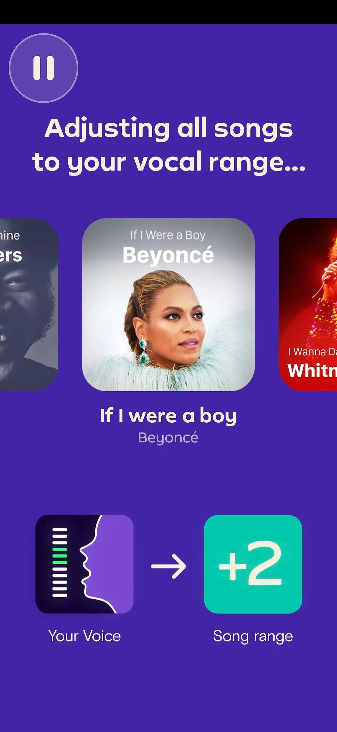
Simply Sing does something rare: the aha! begins before the user even opens the app. Their ads show someone who cannot sing; another person tells them to do simple actions they need to do right now: say ‘hey, hey, hey’ in their loudest voice, hum etc; the song immediately adjusts to the user's voice.
By the time the user taps through to onboarding, they’ve already felt the product's core promise. The onboarding then confirms it, guiding them through vocal range detection, after which all available songs are adjusted to their range. They think: "Aha, I am an alto and can sing these songs.” While most apps treat the ad as traffic and the app as the goal, Simply Sing treats the ad and the onboarding as one continuous experience.

The value proposition itself as the aha! moment
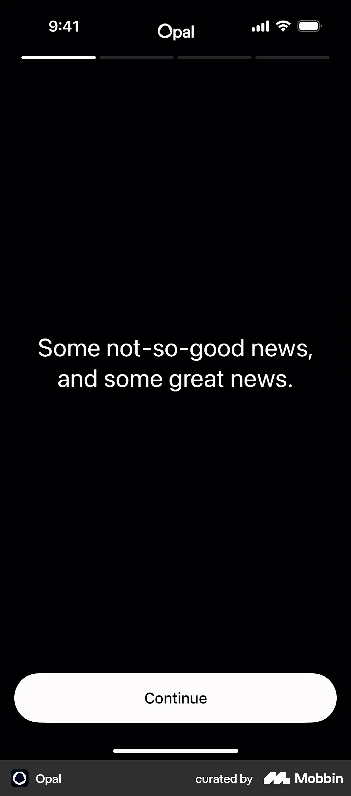
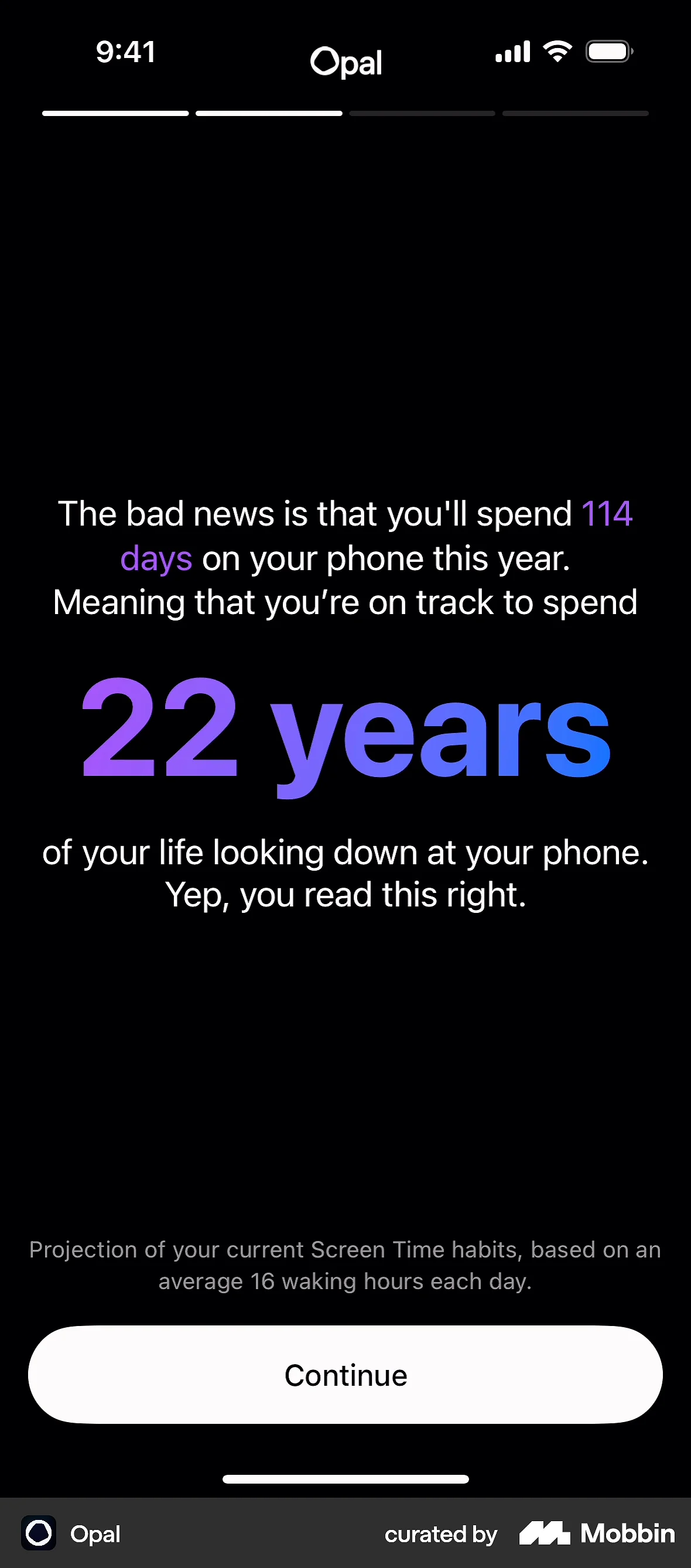
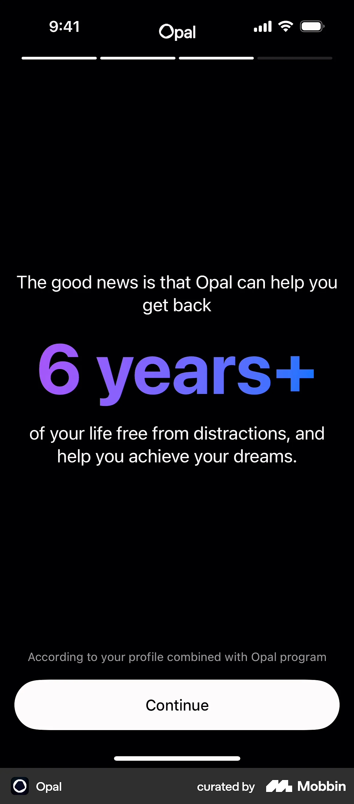
Opal is an app that blocks distracting apps from the user. To illustrate this, their onboarding skips the elaborate quiz format and shows users, in plain numbers, how much time they lose to their phone — and how much they could get back. No graph. No personalized projection. Just the number, framed as time: years of your life.
The user thinks: "Aha, that’s how much time I’m getting back with this app.” It works because the aha! is not about product features; it’s about connecting emotionally, and making the cost of not using the product feel real.

Loaders and processing screens
Some people say they hate loaders, but the data says otherwise. A loader that implies the system is actively working on the user's behalf — building their plan, processing their answers — creates anticipation even when the calculation is instant.
What all of these have in common is that the user feels something before they are asked to pay. They are connecting with the value of the product, and feel the product understands them in return.
Aha! moments are rarely a single screen. Flo Health's opening sequence spans four screens to route the user to the correct product mode, while simultaneously making them feel understood. It’s the same with the BMI screens mentioned earlier. The overall effect is one aha!, but it is built from a series of small confirmations. When mapping your own onboarding, look for the cluster of screens where something shifts for the user, not just the single moment.
Why most apps still feel empty (even when optimized)
Here comes the uncomfortable part. I’ve said this to clients in the past, and I’m sure I’ll say it again. Maybe you’re doing all of these things. That’s fine; awareness is a starting point.
A lot of apps are well-optimized. Clean funnel, tested copy, best-practice paywall, A/B tests run. Yet the app still feels like nothing. There’s content, there’s onboarding, but it just feels… empty.
Here’s what I think is happening:
Optimized funnels with no emotional hook: the flow moves users efficiently from screen to screen, but there’s no moment where they feel understood. The questions are generic. The responses are generic. The user arrives at the paywall having been processed, not engaged.
Surface-level personalization: the onboarding collects the user's name, age, and goal. Then shows them a paywall that is identical to every other user's paywall. The personalization collected data but did not use it. Users notice this mismatch — maybe not consciously, but it registers. It damages trust precisely because the app set the expectation of something tailored, then delivered something generic.
Paywalls before value: a user downloads an app, answers four questions, and hits a paywall before they have experienced anything. Early paywalls assume the user arrived with enough intent to pay before seeing what they are paying for. In reality, most users aren’t ready to pay — they’re curious. The app needs to bridge that curiosity gap before asking for money.
Same messaging everywhere: across the onboarding, the paywall, the post-purchase screen, and the first few in-app experiences, the copy is interchangeable. There is no voice. No point of view. It could belong to any app in the category.
The industry spent years (and a lot of money) optimizing for conversion rates. But in doing so, it has quietly stripped out the things that make users stay. We’ve optimized our way to being forgettable. A high paywall conversion rate is not the goal — high LTV is. And LTV is earned by making users feel, early and repeatedly, that the product is genuinely for them.
The bridge: heart + method framework
Heart without method is invisible. You can build the most thoughtful, specific, emotionally-resonant app in your category. But if no one finds it, or if the people who find it cannot convert, it doesn’t matter.
Likewise, method without heart is forgettable. You might run a clean acquisition funnel, have a well-tested paywall, a solid pricing strategy. If the product feels like every other product in the category, you are just another app in the same auction, competing on who spends more. Some apps do win that way — but only if the creatives are as strong as the funnel, and the budget can sustain it.
Don’t get me wrong, acquisition is a valid strategy. But it isn’t a moat. Users convert, then leave. The apps that will keep users long-term are the ones that have heart and method. Right now, most apps have one of the two. You probably know which it is.
So how do you get both? Here’s my framework for building apps that feel like something, and convert. It’s not a complete growth system, but it is a starting point for connecting the ‘heart’ work to the ‘method’ work.
1. Design early aha! moments before the paywall
Map your onboarding flow. Mark the point where a user first experiences genuine value. If that point is after the paywall, your job is to move it earlier.
Ask yourself: what is the smallest thing we could show or give the user (a result, a projection, a personalized output) that would make them feel like the product is already working for them? Then build it before the paywall.
The benchmark I suggest aiming for is to retain at least 75% of users from the first screen to the second. If you’re retaining less than that, the first screen is not confirming that users are in the right place fast enough. And if they don’t feel confirmed in the first two screens, they will not reach the aha! moment you built further in the flow.
2. Let onboarding feel human
Bring back the things that got killed in previous roadmap meetings because they were hard to measure: question phrasing. Tone of voice. A moment of warmth when a user shares something personal. A screen that doesn’t just collect information but acknowledges it.
These are the differences between a user who converts and stays, and one who converts and churns within the first billing cycle. The former tells their friends. The latter leaves a one-star review because they forgot they subscribed.
A practical starting point is to rewrite every onboarding question in the voice of the user, not the voice of the product. Then read the flow aloud. Fix anything that sounds like copy. Repeat until it sounds like a real user.
3. Use onboarding to tell the story — whatever got them there
Good onboarding does two things at the same time. It tells the user this is for them. And it sells them the better version of their life if they hire this product. When it does both, you get conversion and retention together, not one at the cost of the other.
This is also why your creatives might not always need to be perfectly on-brand to work. Some of the best-performing ads I have seen look almost random — images of discharge, self conscious mirror selfies, things you would never put on a brand moodboard. But they perform because they trigger a deep fear, a curiosity, a problem, or a life moment the user recognizes. The thing they clicked on at 11pm without fully knowing why. I’ll be honest: I have been almost embarrassed by how well some of these perform on CPA. But they do.
If the creative gets the click, then the onboarding tells the story. A user who arrived with low intent can become a paying subscriber — if the onboarding picks them up and walks them toward the better version of themselves.
The creative is the first sentence. The onboarding is the rest of the story.
4. Measure heart experiments on conversion and LTV
When testing heart-led changes to your onboarding, do not measure conversion rate alone.
Sometimes the conversion stays flat. Price plans redistribute, revenue looks the same on paper, you conclude that the experiment did nothing.
Then you look at LTV 60 days later and users are staying longer. The onboarding sold them on committing, not just paying. That’s a win — it just didn’t show up when you expected it to.
TL;DR: measure paywall conversion and cohort LTV together. That is where the real answer lives.
Let’s build heart back into apps
Building has never been easier. Getting noticed has never been harder. The apps that will cut through are not necessarily the most technically sophisticated, or the ones with the largest acquisition budgets. They’ll be the ones that make users feel seen, and give them a reason to stay.
Delight is the one thing you can't A/B test your competitor into having. You can copy a paywall layout in an afternoon — you cannot copy a product that genuinely understands its users.
Start by building the heart in. Then build the method around it.